░░░░░░░ WEEK 9 ░░░░░░░
Consultation w/ Andreas
I have received a lot of design advice from various sources, and while some suggestions contradict each
other, I believe it's ultimately up to me to determine what works best for my project. Taking into account
my roles and the purpose of my Final Year Project (FYP), I have carefully made decisions that effectively
accommodate each role. Despite Andreas suggesting different presentation formats, I found that physical
book formats were more manageable and relevant to my work.
The choice of a book format also took into consideration the possible physical formats I could produce, as
well as their quality and cost. Personally, I value high-quality physical works, as visual aesthetics and
first impressions play a significant role in making a project engaging. I struggle to appreciate badly
done physical works, such as laser-cut acrylic pieces, if they are not executed well. For instance, uneven
edges or chips can be visually displeasing to me, leading to an unfair bias against the project that I
cannot overlook despite understanding the limitations. Which is why I’m trying to prevent that as much as
I can.
For my first two artefacts, I plan to document them in a printed format. As for my third artefact, I'm
still undecided as I have not yet started working on it. However, I am committed to ensuring that
everything ties together seamlessly in the end.
Preparation for Print
Document Setup
Once I had applied all the content and visual styles, I began the process of cleaning up the document.
Firstly, I converted all the images used in my document to CMYK format. Then, I changed all the black
fills to rich black, a necessary step to ensure the printed book maintains a deep, true black hue. I found
that using full C0 Y0 M0 K100 resulted in a grayish tone rather than a crisp black, which was quite
displeasing.
Next, I meticulously checked the alignment of all my content, ensuring that everything adhered to the
correct grid lines. However, in the midst of refining the visual elements, I realized I had overlooked two
crucial aspects: the index page and page numbers. For the index page, I followed a familiar format while
incorporating some of the color styling to maintain consistency throughout the document.
As for the placement of page numbers, I encountered a bit of a dilemma. With consistent margins across all
four corners of the page, I struggled to determine the optimal location. Eventually, I settled on the top
right-hand corner. Although I typically pay close attention to margins, the fact that I'm using a sleeve
with its own 3-5mm margin alleviated some of my concerns.
Paper Choice
I wasn't overly particular about the type of paper since the prints would be inserted into sleeves.
However, I did take into account the reflectiveness of the paper because the sleeve itself is already
quite reflective. I wanted to avoid adding to that reflectiveness with the paper, as it could impact
readability. Additionally, the paper couldn't be too thin because I planned to print double-sided; I
didn't want the artwork to bleed through to the other side of the paper.
Binding
One crucial aspect that I overlooked was the binding of the book. Initially, I planned to use a mini comb
bind clip, but upon receiving the sleeves from Shopee, I discovered that the punched holes did not align
with my clip. After measuring the dimensions, I realized that none of the conventional binding methods
would work, except for a ring bind. However, I felt that a ring bind or ring folder didn't quite match the
contents in the book, so I began exploring alternative binding options.
The form of the book has a curation feel to it, so I was looking for binding methods that could help me
alleviate that sense. My initial idea was to run cables or wires through the holes to lock them together,
hinting at the idea of digital algorithms. However, I found this approach a bit cliché and visually
unappealing. During my testing, a cable tie tangled up my wires, which gave me the idea to use a zip tie
instead.
As I attempted to contextualize the choice of a zip tie, I found that it worked well in hinting at the
concept of assembling or curating. It also aesthetically complemented the sleeves better than a ring bind.
Since both types of binding evoked different feelings, the zip tie approach felt closer to the thematic
direction I wanted to convey.
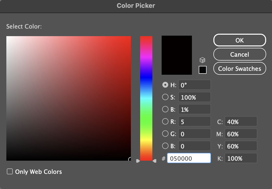
Rich Black CMYK Code
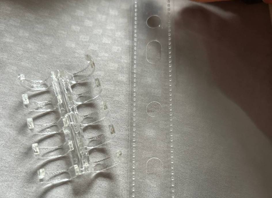
Misalignment with Bind Clip
Reconceptualising Cover
I already anticipate revisiting this project as I wasn't satisfied with the initial iteration of the
cover. Considering the book's form, I aim to conceal the binding to prevent the cable ties from being
visible externally. However, this would require printing on a paper larger than A3, which presents
challenges. Most print shops I use offer a limited selection of papers primarily for posters, and bringing
my own paper isn't an option. Moreover, my inner sheets are already over 300gsm, necessitating a thicker
paper, ruling out printing larger than A3. To work around this, I plan to wrap a thick paper around the
book without printing on it and use a sticker for the title and abstract on the cover.
Approach 1
To test this approach, I acquired a piece of holographic paper, which I believed resonated well with the
colors and concept of my artifact. The reflective nature of the holographic paper serves as a metaphor,
reflecting the project's context of identity and sense of self. For binding the cover to the inner
contents, I considered aligning the holes in the back cover to hide the zip ties and maintain a covered
spine. Additionally, I created various sticker options for the title, each conveying a distinct feel.
However, upon completing the prototype, I found myself dissatisfied with the outcome. Throughout the
process, I encountered numerous issues that I had been too lenient with, leading to a final result that
fell short of my expectations. Firstly, opting for holographic paper turned out to be a regrettable
choice. During my visit to the print shop, the printers expressed their reluctance to handle the cover,
fearing fingerprints. This led to the second problem: applying the vinyl sticker became incredibly
challenging due to the dust and dirt trapped by the holographic paper, resulting in unsightly air bubbles.
These two major issues convinced me to abandon this approach entirely.
Approach 2
The next approach I considered involves splitting the cover between the front and back, leaving the spine
exposed. This design allows for a Super A3 size, providing space for a printed cover.
My goal is to create a visually striking book cover that intrigues people and draws them into my project.
Reflecting on the challenges of my previous attempt, I approached paper selection with greater care. While
I initially planned for fluorescent colors on the cover, I realized the limitations of printers regarding
spot colors for small orders. Instead, I opted for a fluorescent-colored paper with black or white
printing.
However, sourcing the right paper proved challenging. Major suppliers in Singapore had stopped carrying
fluorescent papers over 300gsm due to low demand, offering only lighter options used for wrapping or vinyl
stickers. I eventually found a full-sized sheet at Artfriend, which I cut to Super A3 size. Although I'm
still finalizing the visual design, I aim for the cover to reflect the content of my book effectively.
Cover Design
For the cover design, I opted to use only black ink to allow the fluorescent paper to stand out vibrantly.
A key lesson I've learned is the concept of 'over-design,' which I encountered during my internship and
have since integrated into my design approach. This involves toning down elements and designing with clear
intention to guide the viewer's eye.
I developed a simple yet effective design that effectively communicates the contents of my publication and
establishes a cohesive style that can be adapted for future publications related to my other artefacts.
Working with colored paper posed challenges in visualizing the final printed design, further considering
the margins for the cable-tie holes. This required multiple rounds of test prints at the print shop, with
on-site adjustments made to achieve a balanced composition.
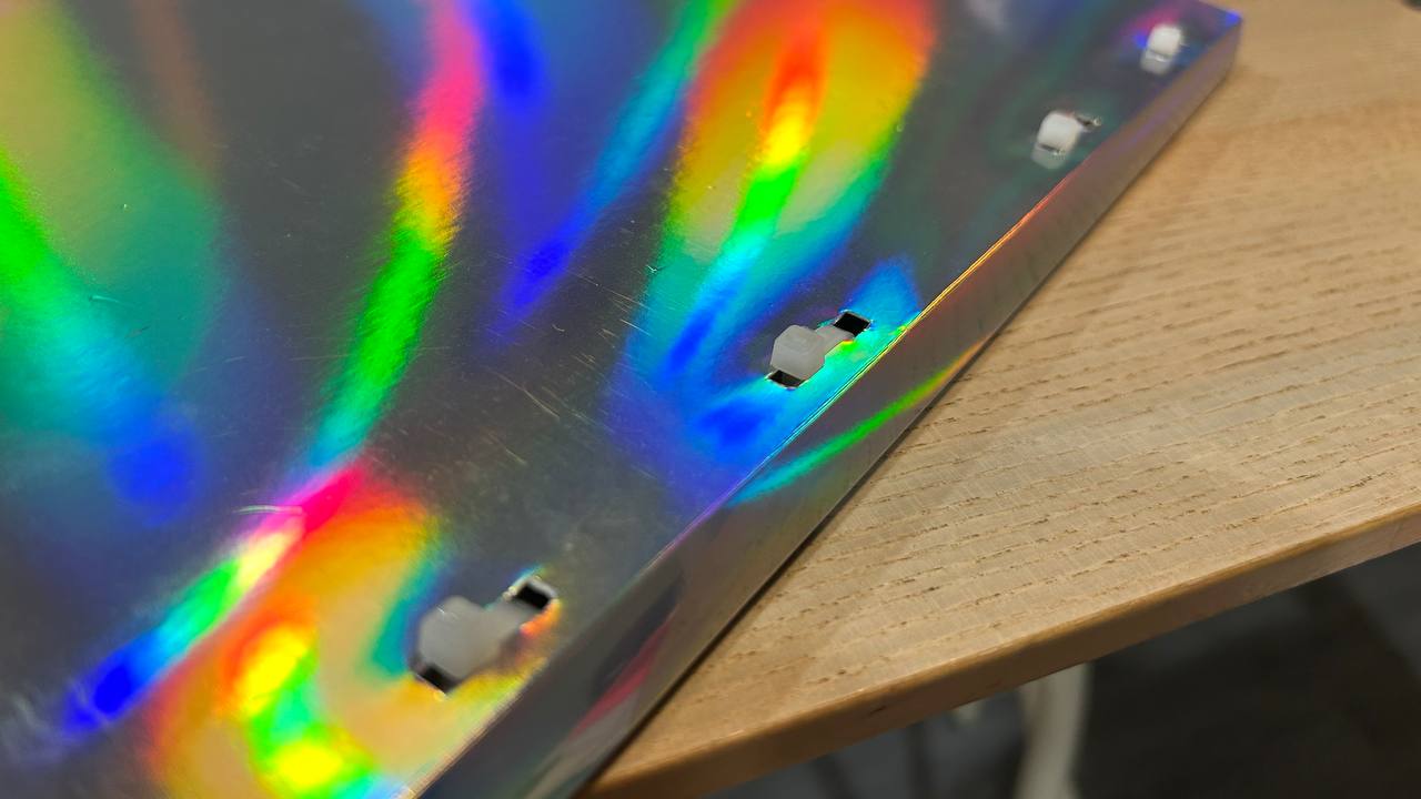
Approach 1 w/ Holographic Cover

Paper used for Approach 2
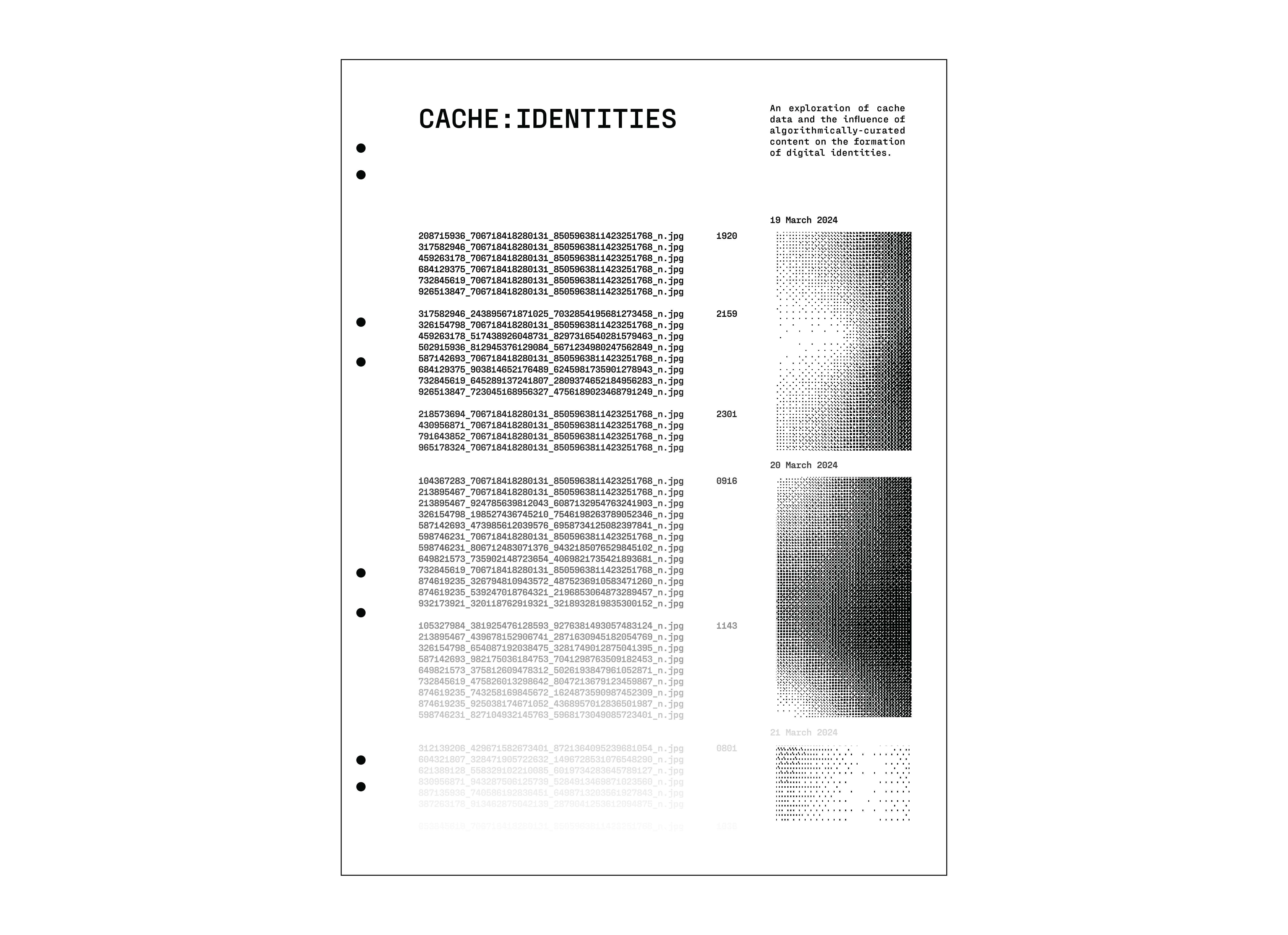
Cover Design for Approach 2
Printing & Assembly
I've always found the print process enjoyable and make sure to conduct multiple rounds of test prints to avoid overspending. Setting aside a full day at the printers allows me to make corrections on the spot. Although the printing process for this publication was mostly smooth, I encountered an issue where the cover paper was too thick for the printer. In such situations, compromises are inevitable; opting for a thicker cover meant sacrificing some consistency in the darkness of the black ink as a different printer had to be used.
Despite the potential tedium, I found the trimming process rather therapeutic. After extensive phases of thinking, designing, and refining, the hands-on trimming allowed me to switch off and focus solely on execution. However, the complexity of the book format meant that trimming took an entire day and left me with blisters on my fingers.
During the trimming process, I pondered over various presentation formats. My primary concern was presenting each artefact individually while still conveying a cohesive collective whole. Balancing visual coherence without over-designing posed a challenge. Considering this, I contemplated building a set that could enhance the visual unity across the artefacts.
Upon completing the trimming and binding, I was delighted with the outcome. Opting for black zip-ties instead of white ones was a conscious decision to avoid a "sustainable design" aesthetic, an attempt to dial it back on the misleading direction the cover's color scheme was pointing towards. Overall, what truly satisfies me about this book is its tactile quality and how the visuals encapsulate my aesthetic vision. One artefact down, 2 more to go!
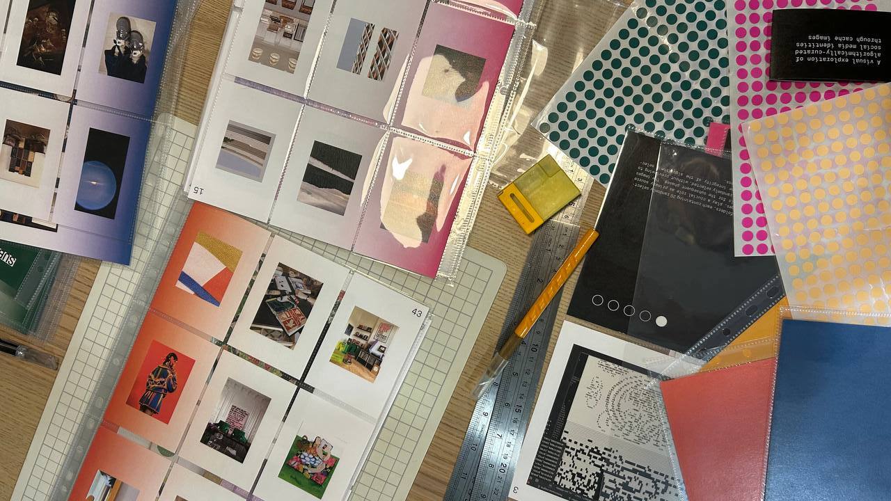
Trimming and Binding Process
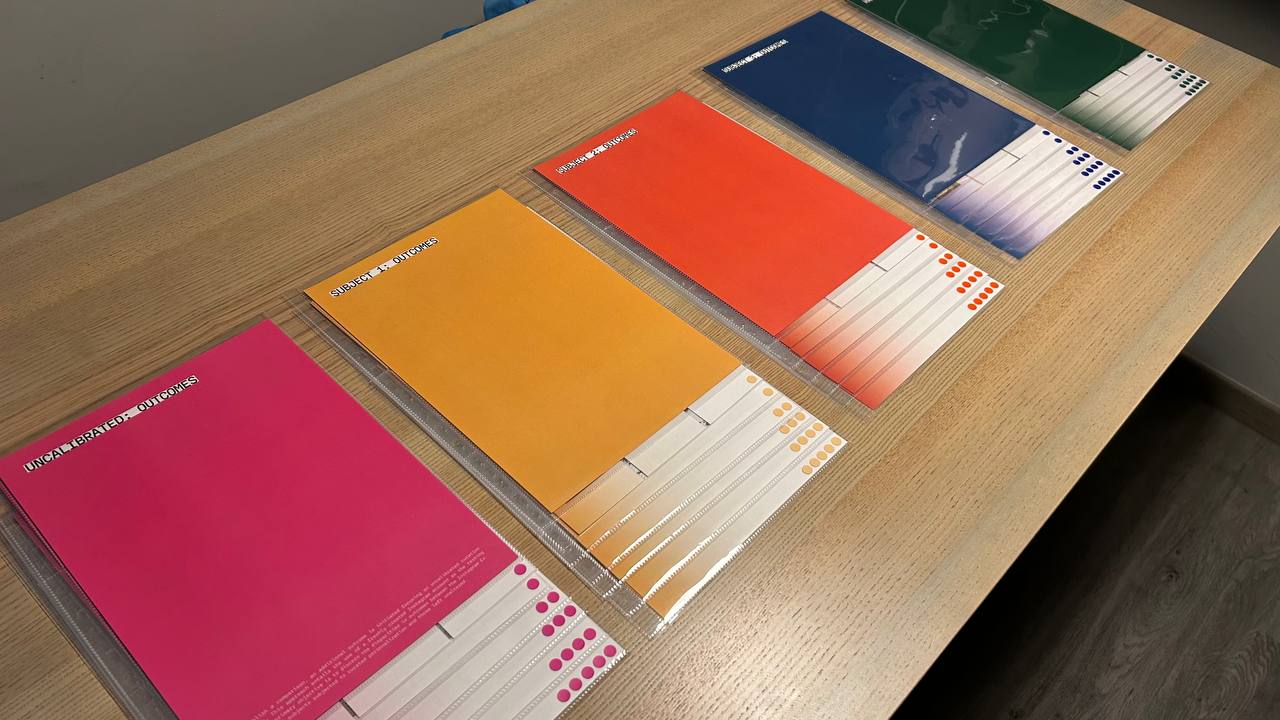
Publication Sections (Unbound)