░░░░░░░ WEEK 8 ░░░░░░░
Timeline Planning
With only about four weeks remaining until Open Studios, Artefact B is my primary concern. Earlier, I
struggled to generate ideas and gauge the duration of the creative process. Fortunately, I've now settled
on an idea and aim to complete Artefact B by Week 8, allowing me to transition to Artefact C by Week 9.
Looking ahead, I doubt Artefact C will be ready for Open Studios. Therefore, I must consider alternative
formats to showcase my work for the event's initial phase. Additionally, I intend to reserve Week 10 for
documentation tasks related to Artefact A. My envisioned format involves compiling loose sheets containing
data and results from thought experiments.
Moreover, Week 11 will be dedicated to refining the presentation of my work. This entails setting up
feedback stations, a critical stage for testing viewers' understanding of my project. By this stage, most
of my work should be completed, barring Artefact C. I plan to be physically present in the studio during
Open Studios to identify any gaps in conveying my project effectively.
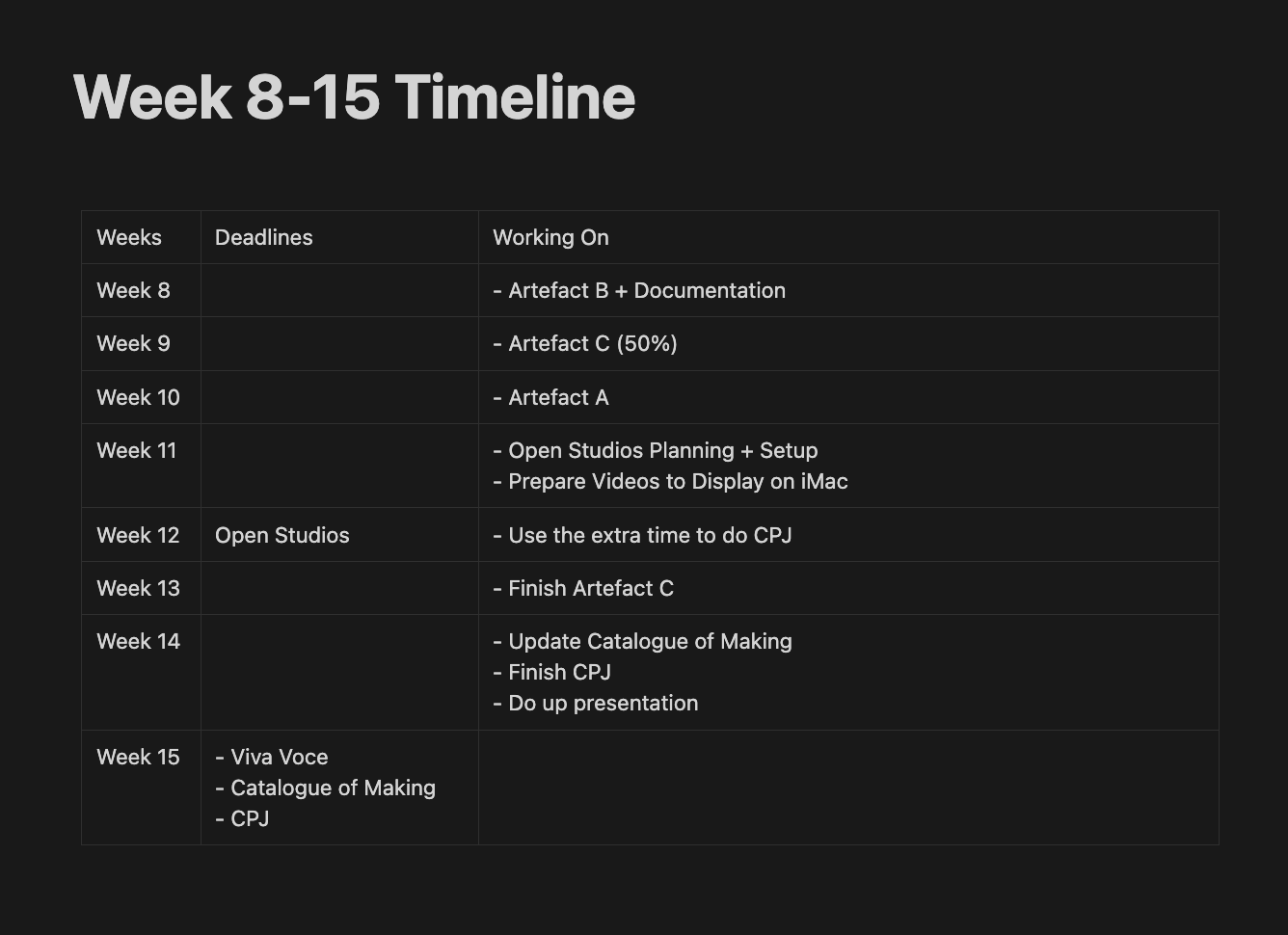
Timeline for remaining weeks
Visuals for Phase 2: Uploading Cache to the Cloud
The effect I'm aiming to achieve involves images appearing one by one while the previous image disappears,
creating the illusion of them being uploaded sequentially. Using simple TScript expressions, I easily
accomplished this task. In TouchDesigner, the cache images folder is presented as a table, enabling me to
set a timer that prompts the input to retrieve the next image from the subsequent row after a specified
duration.
To enhance the effect, I decided to introduce motion. Remembering the blobtracking effect I implemented
for individual images, I felt it was fitting to apply it here, providing the impression that the algorithm
is analyzing each image as they're uploaded. The blobtracking movements also influenced the transition,
resulting in a glitch morph effect that I found visually captivating.
TouchDesigner's folder upload tool proves incredibly functional. Beyond displaying file names and
extensions, it offers data such as date, file size, and dimensions. After arranging the names, I
introduced movement to the text to simulate a typewriter effect, letter by letter, then row by row.
Adjusting the typing speed was crucial to synchronize each row with the image transition speed.
Additionally, I included another set of text for creation dates in the top right to balance the screen
space. Ensuring the typing speed of names and dates differed was necessary; otherwise, dates would
transition to the next row faster due to shorter text length. While it required some mathematical
adjustments, my familiarity with expression logic streamlined the process.
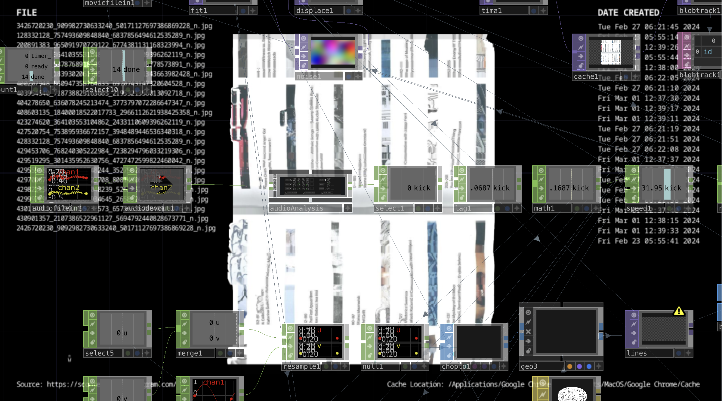
Phase 2 Process
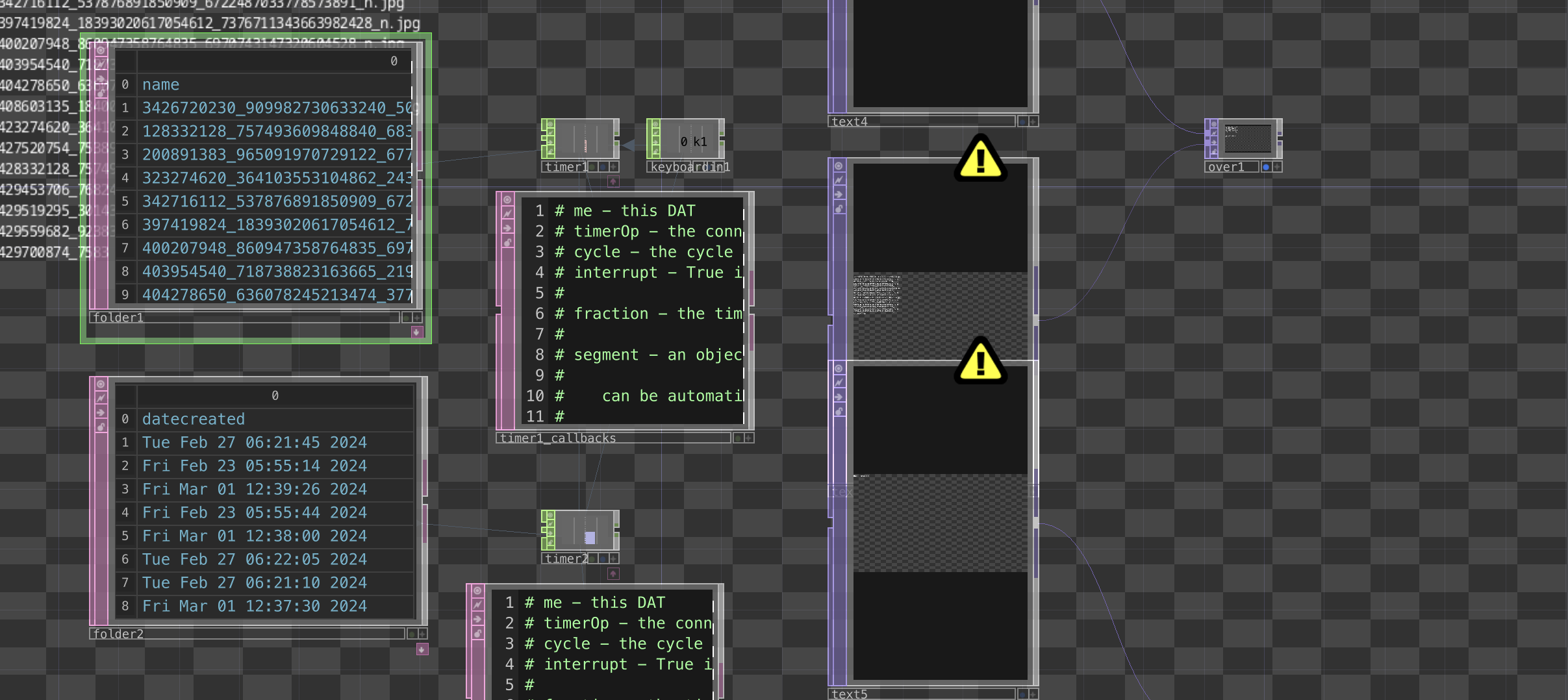
Metadata Text Setup
Visuals for Phase 3: Cache Database
Although this visual may seem the least complicated, I actually invested the most time figuring out how to achieve it. Surprisingly, there's no straightforward method for laying out images in TouchDesigner, especially when dealing with an undefined amount. Despite searching extensively, I couldn't find any tutorials on creating a grid layout, and the grid tools in TouchDesigner proved rather confusing. While I could grasp the basics of what the grid SOP does, integrating it with the geo COMP was where things got a bit murky.
After several failed attempts, I decided to change my approach and revisit the ASCII filter experiment file from the first semester. In that experiment, I successfully created 50 by 50 pixel grids and placed text in each of them. After some tinkering, I managed to identify what needed to be replaced in the geo comp to instance images instead. It also became clearer to me how the grid SOP functioned in this context, allowing me to adjust it to accommodate the number of images I had.
I have two ways to add movement in TouchDesigner: using the timer CHOP or the noise CHOP for a more random, abstract movement. For this project, I preferred using the timer CHOP as it offered easier control over the movement path. I mapped the timer CHOP to the z-axis of the camera and looped it to simulate the camera moving through layers of images.
However, I wasn't satisfied with the repetitiveness of the loop and wanted to achieve a different visual for each iteration. I found a relatively simple solution using the sort DAT. This component randomly sorts the rows or columns in a table. By connecting my folder DAT containing the images to the sort DAT, I could have my images randomly sorted. Then, using the same timer, I connected it to a count CHOP to tally the number of loops, which I input into the sort DAT's random seed. This setup ensured that each loop displayed a unique image layout, introducing variation after every loop.
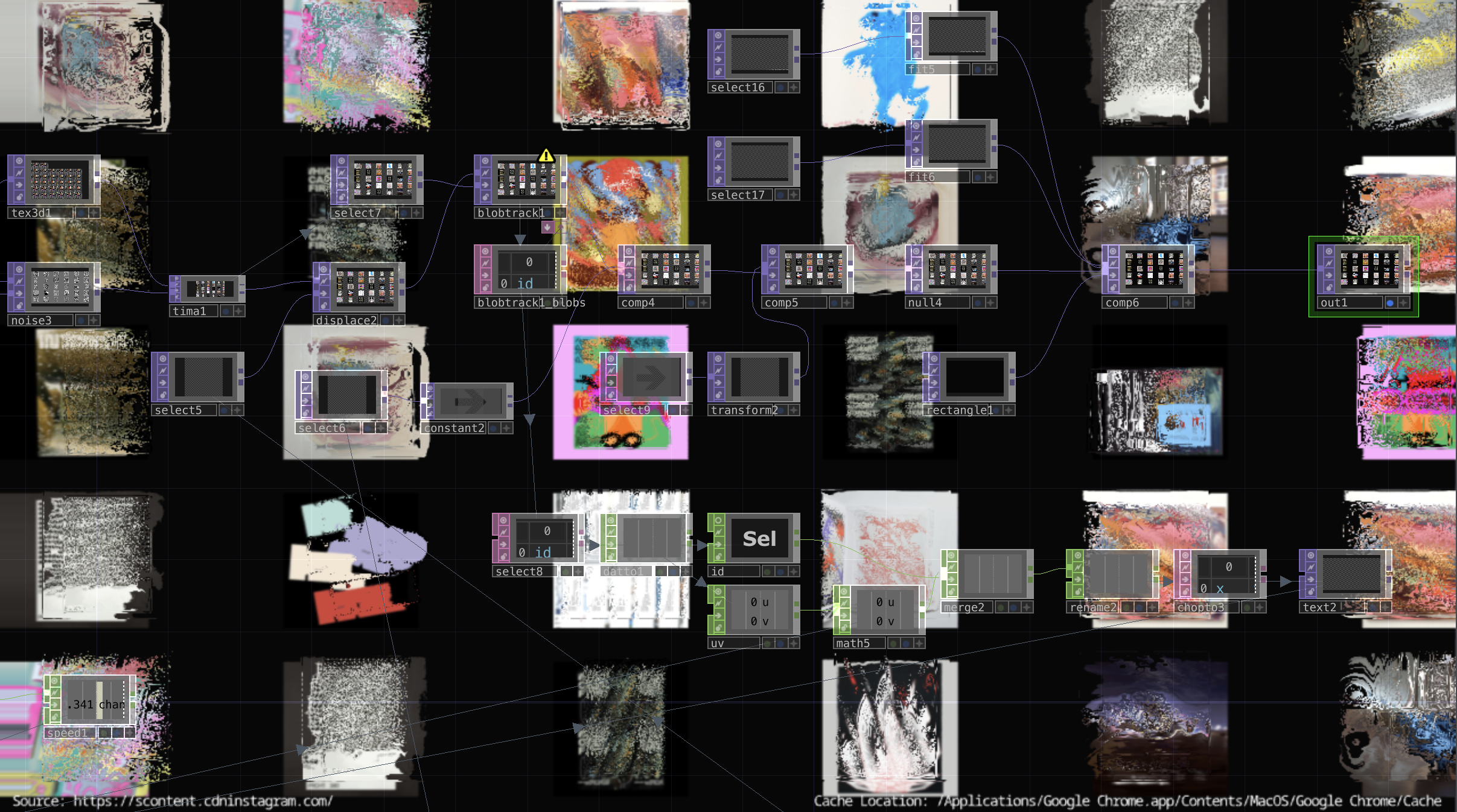
Phase 3 Process
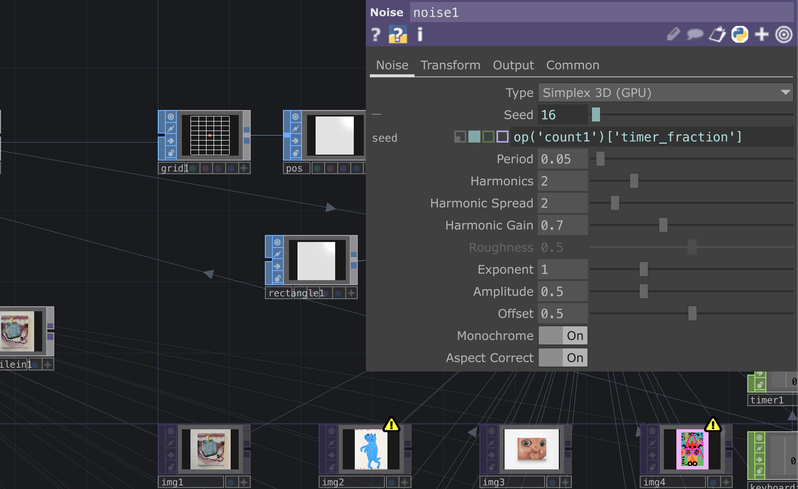
Randomising Seed After Loop
Visuals for Phase 4: Cache Data Analysis
Here is where I implement the multi-image blobtracking. Upon throwing the folder in, I encountered a significant issue with the aspect ratio. The replicator tool's children aspect mirrors the first input's aspect, meaning that if my initial image is portrait-oriented, every subsequent image will follow the same portrait aspect ratio. I attempted to convince myself that it wasn't too problematic, but some landscape photos ended up severely compressed to the point of being unrecognizable.
To address this issue, I followed a tutorial that suggested nesting the master operator in a Base COMP. This allowed me to resize my input to its original aspect ratio within the Base COMP before throwing the entire Base COMP into the replicator. However, this method brought forth another major issue: the replicated children didn't retain their alpha, causing transparent backgrounds to turn black and resulting in strange overlaps when laid out. Despite troubleshooting with blending modes and exploring adjustments within the Base COMP, none of the solutions yielded better results than what I had.
To assess the visual discrepancies, I showed some of my friends the visuals and asked for their feedback. Interestingly, they couldn't pinpoint the issue with the black rectangles and instead interpreted them as intentional glitches. Since these errors could be interpreted as intentional glitches, I applied more noise and displacement to enhance the "glitchy" effect, working around the problem in the process.
I sensed that the camera required movement to complement the previous phase's visuals. To achieve this effect, I incorporated camera rotation around the x-z axis, simulating the camera spinning around the images and imparting a 3D dimension to the scene. To elevate the visual aesthetics further, I introduced a timer CHOP, looped it, and connected it to a noise CHOP to generate random layouts after each timer loop. Following these adjustments, I performed some final cleanups with the lines, which were somewhat messy. Overall, I'm quite content with how the visuals turned out.
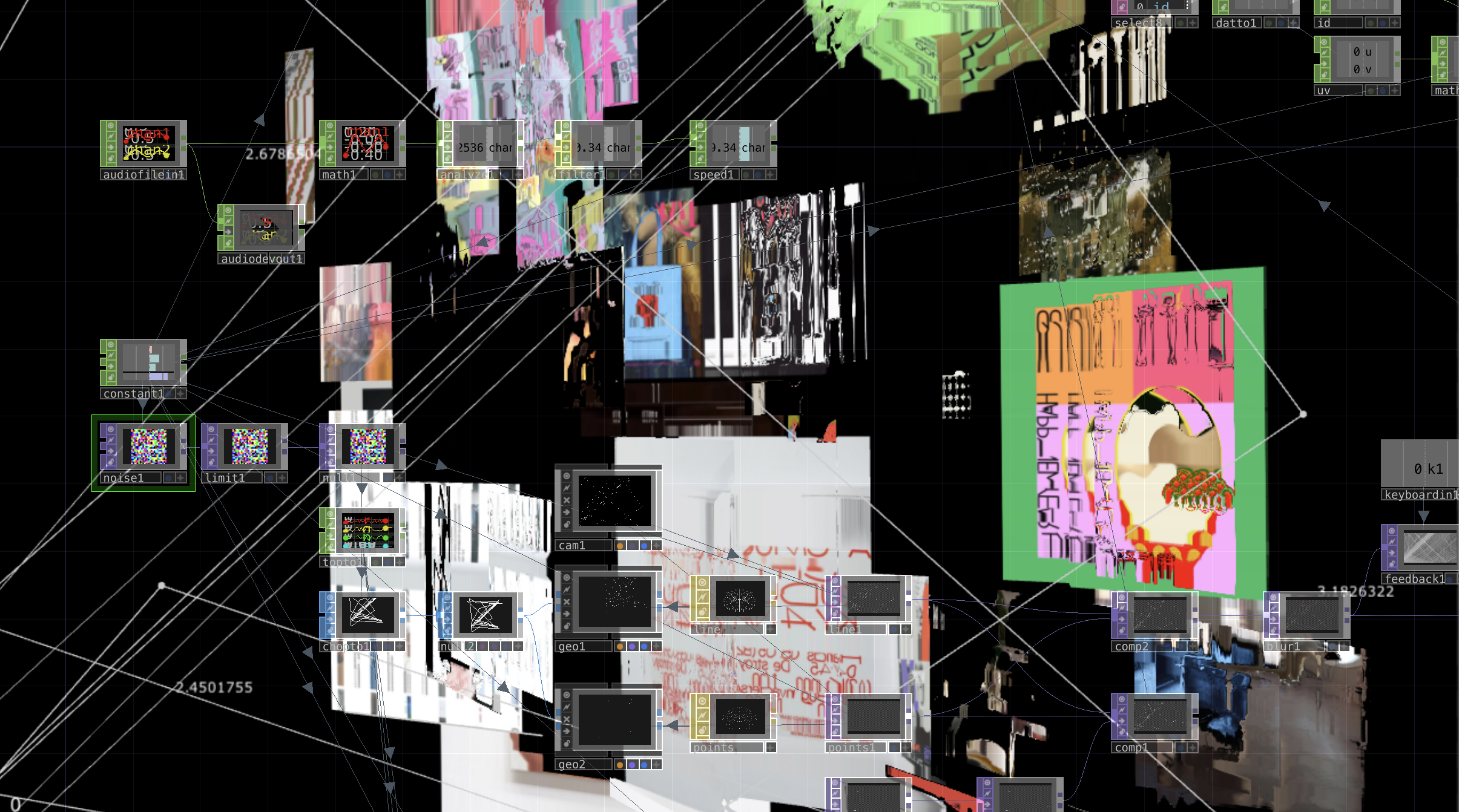
Phase 4 Process
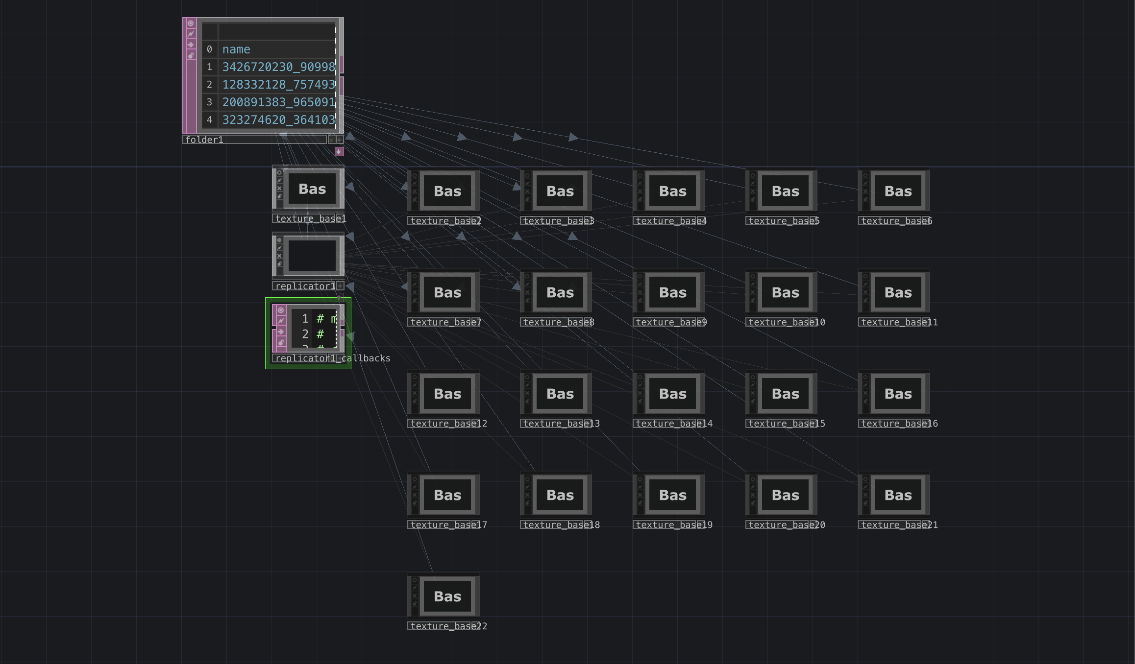
Replicating Base COMPS
Visuals for Phase 5: Identity Consumed by Cache Data
In Phase 3, I had already grasped how to convert text in grids from the ASCII experiment file to images, so understanding the technical aspects of this phase wasn't overly time-consuming.
However, one issue stood out: these visuals looked best with a gradient descending down each row of images. I wanted the rows to progress from darker images at the top to brighter ones at the bottom, creating a sense of depth. I scoured online resources for methods to extract alpha values from the images and sort them accordingly but found no viable solutions. Instead, I attempted another approach: individually uploading each image into TouchDesigner, extracting their average RGB values, and renaming them accordingly to sort them automatically based on their color channel values. Unfortunately, TouchDesigner didn't support renaming images as it lacked the capability to modify local files on my laptop.
I needed to find a different workaround. Upon analyzing my images, I realized that none of them were sufficiently dark. To compensate, I resorted to a workaround by adding an additional full black image to each file and naming it '0.jpg', ensuring it remained at the top. This improved the visual separation between the foreground and background. Additionally, I wanted to experiment with shuffling the image rows. To accomplish this, I created another sort DAT and instructed it to randomly sort rows 2-21, intentionally excluding rows 0-1, where 0 represented the label and 1 the full black image. I bound the random seed number to a key and experimented until achieving a pleasing outcome, adding an interactive element to my installation.

Phase 5 Process
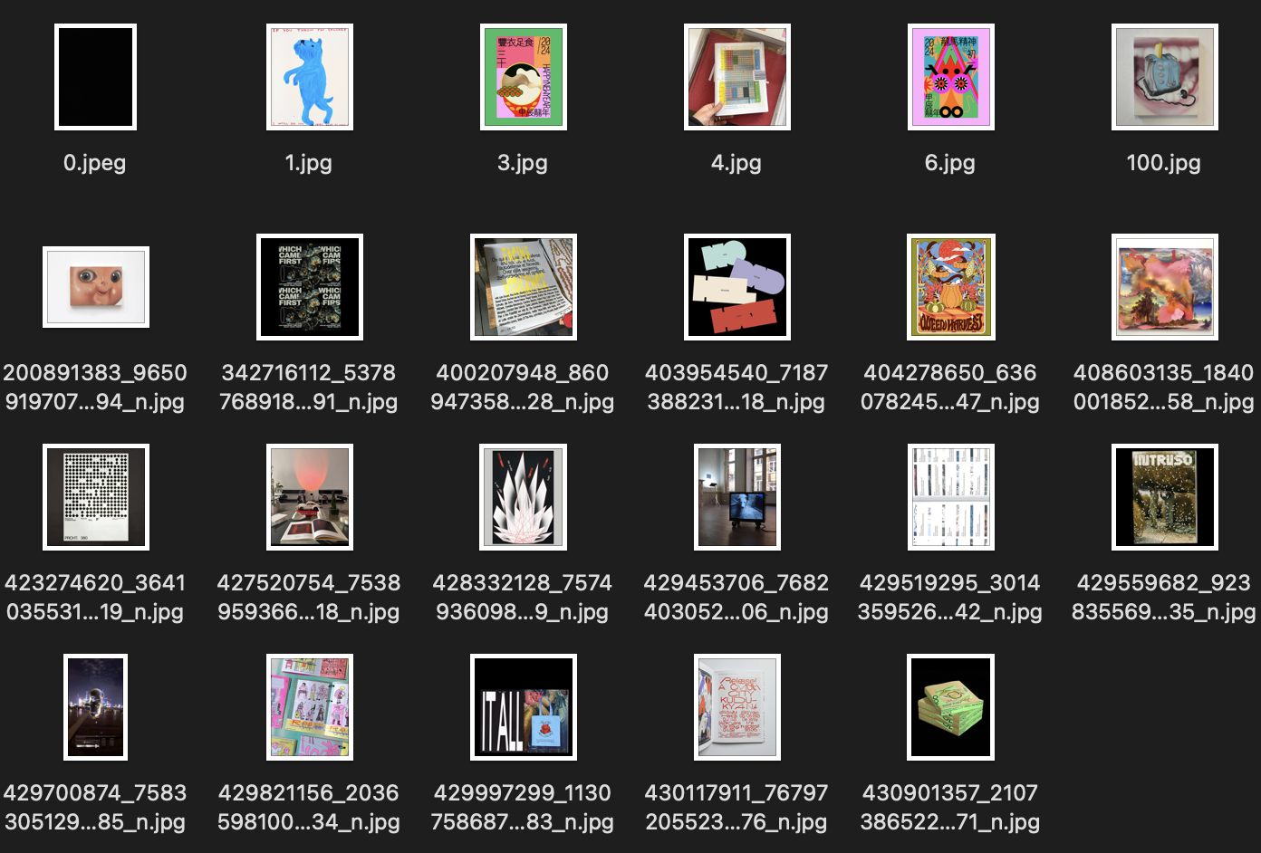
Adding in a blank image
Artefact B Documentation Planning
I opted for a physical format primarily because setting up my installation at the Grad Show wasn't feasible, though Open Studios might be a possibility. Considering how Artefact A will vie for attention with Artefact B on the iMac, I needed to explore alternative formats.
Having compiled a Pinterest Board of potential book formats, I found one particularly suited to the concept of curation: card sleeves, reminiscent of those used to store Pokémon cards in my childhood. The nostalgia appealed to me, prompting me to bind these sleeves together using a loose-leaf binding ring.
Next, I pondered how to fit the documentation of outcomes into these sleeves. Browsing through Shopee, I found A4 sleeves with the thin, matte material I desired, reminiscent of grainy paper texture. One shop offered 11 varieties with varying slot numbers, resembling the grids I typically use in InDesign.
However, a major concern arose with these sleeves being double-sided. If the content at the front utilized a 3 by 3 column grid, the back must also follow suit. Despite this challenge, I was keen to explore the concept, so went on to create wireframes in InDesign to visualize how to organize the content. I only have 2 main sections excluding the about and acknowledgments - 1 for the Narrative Outline to explain the phases, and the other for displaying the Outcomes.
The Narrative Outline followed a straightforward format since the contents adhered to the same structure. However, crafting the Outcomes section posed a different challenge. I needed to present five distinct types of outcomes, each reflecting a different phase of the project. Additionally, I aimed to group the outcomes of different subjects separately, requiring a more systematic approach.
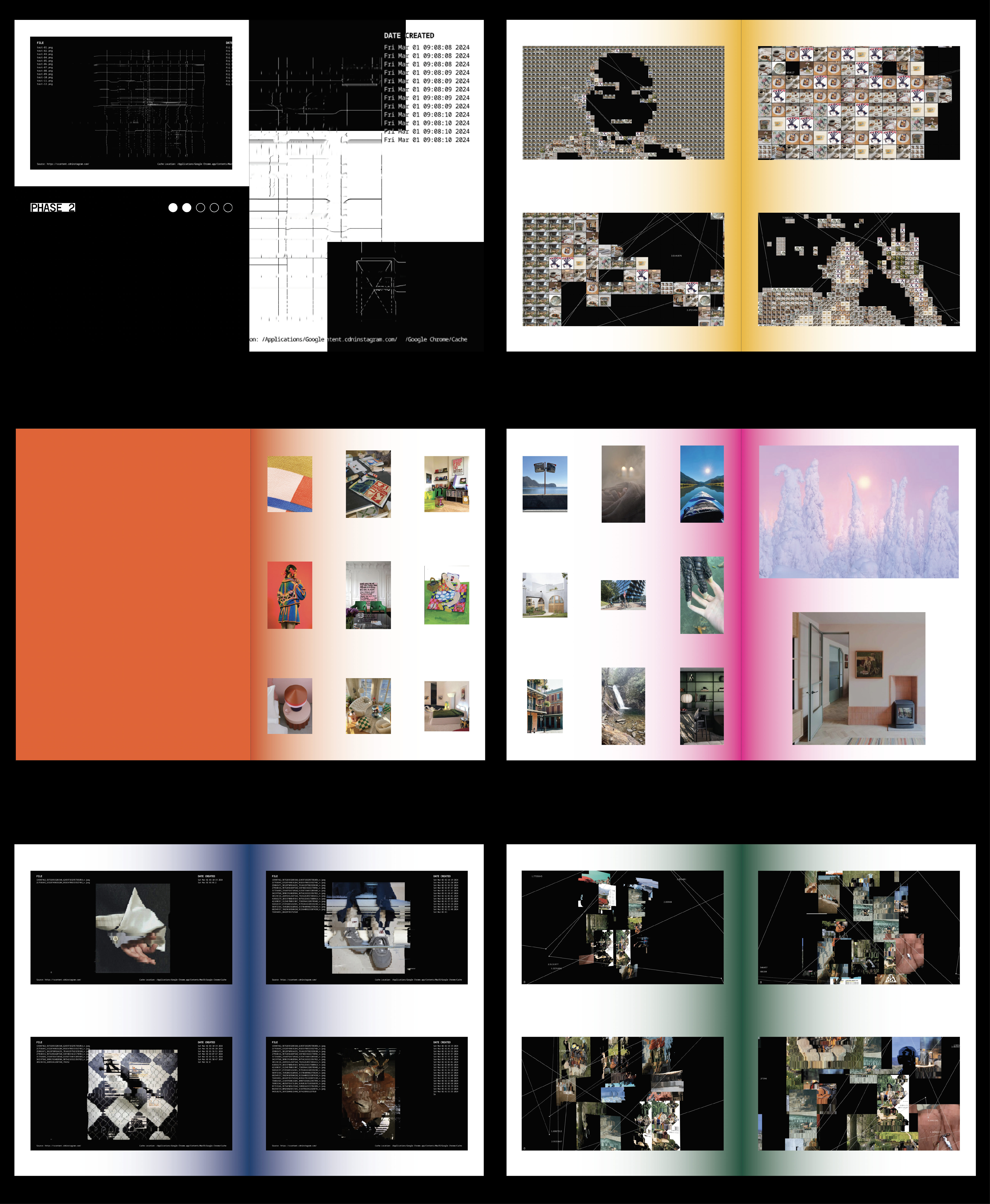
Upon reviewing my content, I noted that for Phase 1, I would need to display 20 images. For Phases 2 through 5, the number of images could vary, potentially spanning a full spread bleed. After deliberation, I opted for four images per spread for Phases 2 through 5. This decision was based on the optimal aspect ratio of the installation visuals, which aligned well with a 2 by 1 grid sleeve configuration. I also wanted the Outcomes section to be like a gallery, so there’ll be no text, just images.
Employing a straightforward yet effective layout, I devised a method to organize my content, ensuring that both the front and back of the sleeves adhered to a consistent grid. This involved incorporating additional pertinent details from each subject's outcome, such as the file name and the date and time the cache was downloaded. I’m pretty sure I’ll need to make a lot of changes along the way, but I want to start generating the content first since the visual style of my book will depend on it.
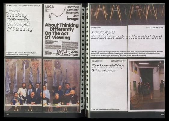
Book Concept Reference
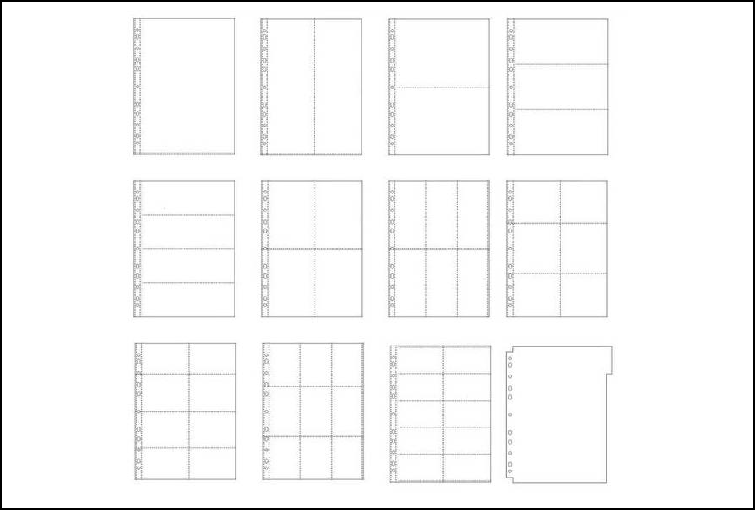
Sleeve Variations

Some wireframes I came up with
Content Generation
About Section
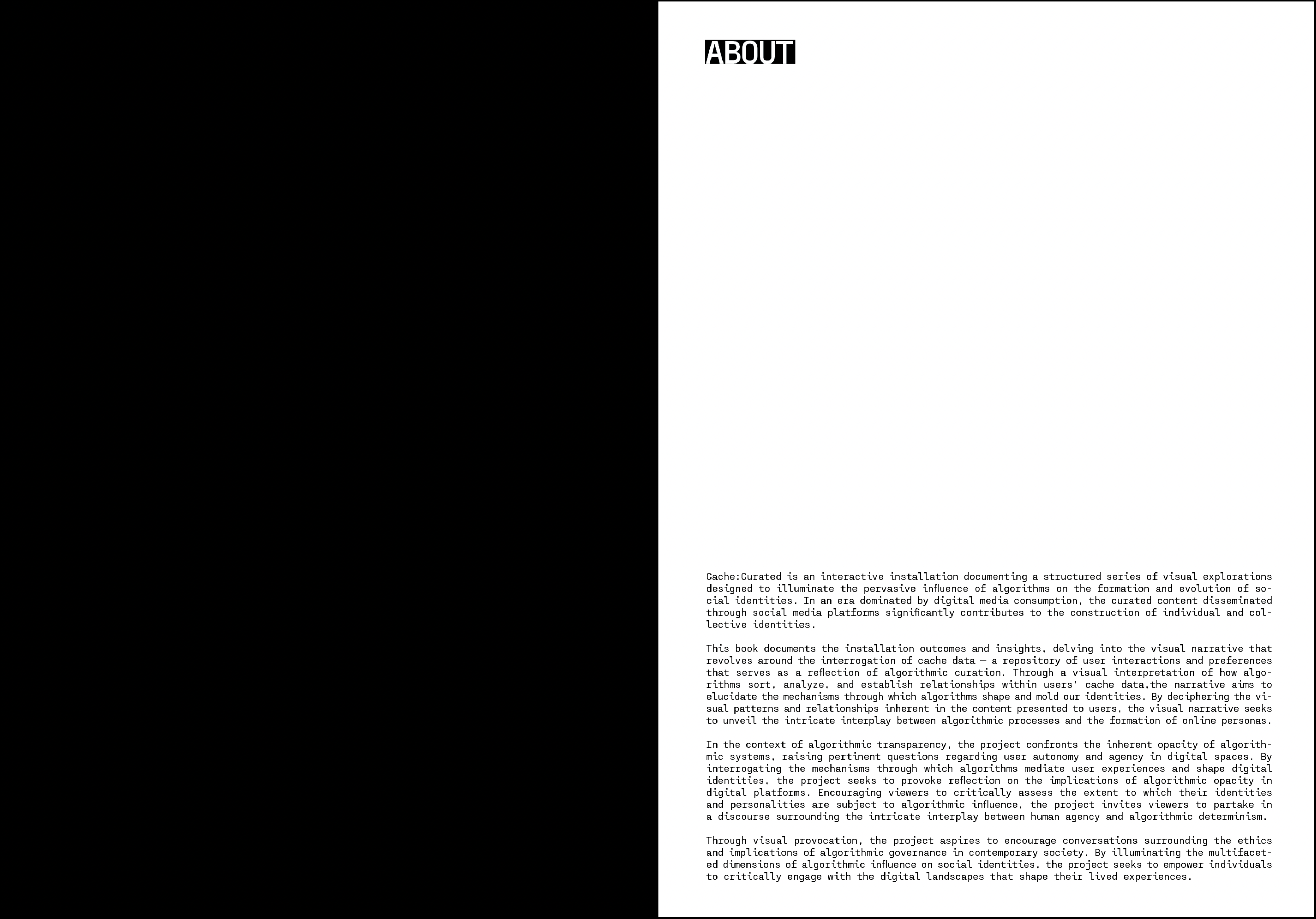
I decided on the name Cache:Identities and wrote a design statement for the artefact. In the statement, I highlighted the main objective of provoking reflection on algorithm transparency, a summary of the visual narrative, and also some context to my main graduation project. I think this should make clear what my installation is about and its purpose as Artefact B.
Narrative Outline Section
In this section, I crafted write-ups detailing the objectives of each phase, focusing on two primary aspects. Firstly, I described the visuals and their interpretive significance. Secondly, I aimed to articulate the response or impression I intended to evoke in viewers through the visuals.
Outcomes Section
In the Outcomes section, I enlisted all four of my friends as subjects, utilizing the photos documenting their experiences with my artifacts as the primary outcomes. Additionally, I recognized the importance of providing viewers with a baseline for comparison. To achieve this, I created a new Instagram account and utilized the cache images from the explore page to illustrate the distinction between calibrated and uncalibrated curation. Admittedly, I had hoped for more discernible differences. Through this exploration, however, I came to realize that Instagram's uncalibrated curation algorithms merely recommend random, generic landscape-oriented posts. As a result, the collective images lacked personality when viewed together.
Summary of Insights Section
In the context of my Artefact, I found it necessary to include some insights to assess whether I achieved my goals and to gather comments or thoughts about my work. Therefore, I included a write-up summarizing the discussions my friends and I had, which were prompted by the visual narrative.
Acknowledgments Section
My biggest worry about this Artefact is the permission to use the images. I did a lot of research about the cases in which using these images would be legal. It was also very difficult to credit these sources as I didn’t even know who they belonged to as I picked them out blindly. Therefore, this acknowledgments section serves to justify the use of the images and clarify that this is a student project with no monetary gains or credit taken.
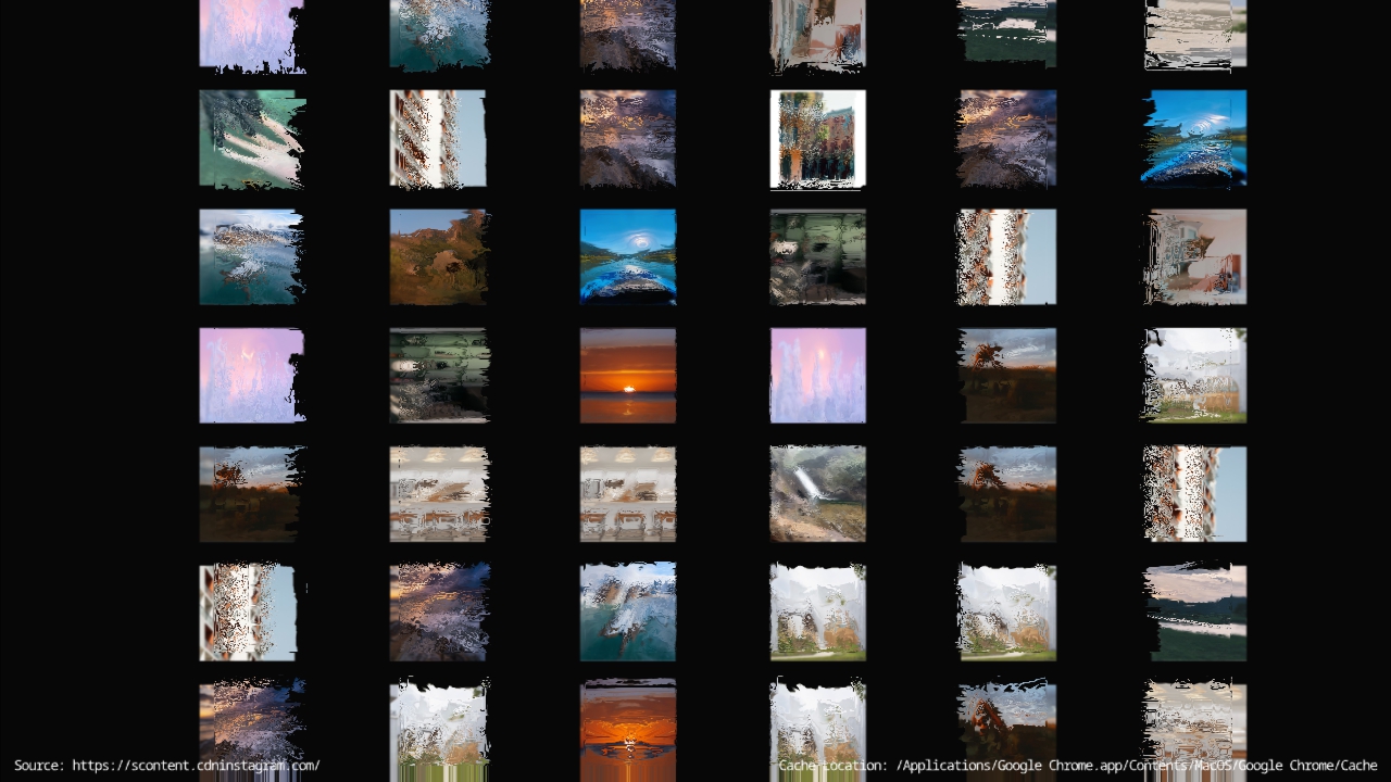
Uncalibrated Phase 3
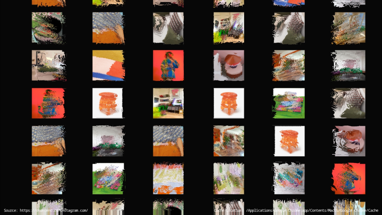
Subject B's Phase 3
Visual Style
Colours
As I examined my outcomes across empty spreads, I noticed distinct color themes emerging for each subject. When scrolling from one spread to another, the color palettes seemed to transition subtly. Upon closer analysis, I realized that there were no overlapping colors between subjects. This observation led me to incorporate these unique color schemes into the visual identity of my book.
I selected the primary colors from each subject's outcomes and applied them to the cover page. While I aimed to integrate these colors into the spreads, I didn't want them to overwhelm the entire background. After some experimentation, I decided to use gradients of each subject's color, creating an effect that appears to emanate from the inner spine of the book.
Stickers (Indicator of Phase)
Given that my Outcomes section lacks text, I contemplated whether to include indicators for each phase on the spreads. This led me to conceive an additional layer for the curatorial book concept. I thought about affixing colored stickers corresponding to each subject on the sleeves to serve as indicators. It struck me that I could likely find stickers with colors similar to those used in my book. I recalled Andreas distributing circular stickers for us to affix to each other's ideas during the first semester, which inspired this approach.
Text-styling
After experimenting with various text justifications, I found that full justification worked best for my content. To complement this choice, I opted for a monospaced typeface from the Pangram Pangram foundry. As I approach graduation, I realize the importance of using professionally designed fonts rather than relying on those from less reputable sources like dafont or other non-legitimate font websites. The selection of a monospaced font not only enhances the overall aesthetic but also helps resolve issues such as rivers and orphans within paragraphs.
In addition to text justification, I customized each header with a unique style. I incorporated a colored background for each header text box to distinguish them from the surrounding content. This approach ensures that the headers stand out, particularly when placed against a colored background, thereby improving the overall hierarchy and visual appeal.
Front and Back Cover
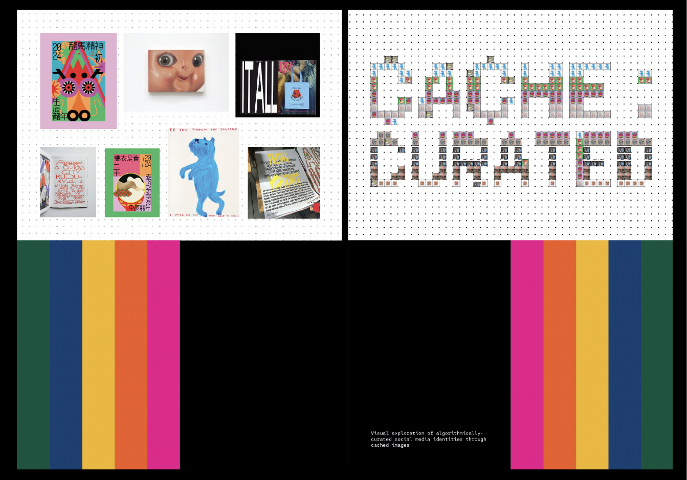
I dedicated a significant amount of time to conceptualizing the front and back cover designs. Traditionally, I tend to keep the front covers of my designed books minimal, usually with just a single color block and a focus on typography. However, for this project, I wanted to challenge myself to explore something different. Given that this Artefact was more vibrant and playful, I aimed to reflect its essence in the covers.
An additional factor influencing my decisions was my uncertainty about the cover material. I debated whether to use the same sleeves as the book's contents or opt for a different material, perhaps a 300gsm art card. With both options on the table, I needed to consider the implications, particularly for the sleeve option. Departing from the abstract blank cover approach, I sought to ensure that the cover would provide a glimpse into the book's contents.
To achieve this, I divided the cover into top and bottom halves and experimented with color blocks using the hues featured in my book. Initially, I attempted to include only the name of my installation on the top half. However, upon enlarging the typeface, I found that it didn't visually align well, even after adjusting the tracking. This prompted me to integrate the visual style of my installation into the cover design.
I rendered the Phase 5 file over a transparent image featuring the name of my installation, a choice I found aesthetically pleasing. For this visual element, I utilized images from my personal Instagram explore page to maintain coherence with the overarching theme.
To maintain continuity and coherence, I replicated the graphics from the front cover on the bottom half of the back cover, creating the impression that the color block was encircling the spine. While I intended to leave the top half blank to avoid over-designing, I realized the importance of providing context for the small images composing the title on the front cover.
To achieve this, I decided to arrange the images used on the back cover in a layout mirroring their arrangement on the front cover. By doing so, I established a visual connection between the top halves of both covers, enhancing the overall cohesion and narrative flow of the design. I’m pretty satisfied with what I have now, but if it feels too overwhelming when I put the book together, I don’t mind reverting to something less busy.
Sample Spreads
Text Styling
Cover Design