░░░░░░░ WEEK 7 ░░░░░░░
Graduation Project Physical Presentation
I got some feedback and suggestions from Lasalle Alumnis who have been through Open Studios and Grad Show
about the presentation of my work. The points that they brought up from their experience were all things
that I was currently not putting much of a focus on.
One point that they brought up was branding, even though my project wasn’t about branding/identity
related, it was still important for me to tie everything together visually. They also brought up that
during their Grad Show, visitors tended to ignore works that were overly complex and too difficult to make
sense of. There are rare cases where some visitors will actually be curious about the work, but that’s
mostly driven by visual aesthetics.
Another point they brought up was the presentation of work. Since I had 3 artefacts that were related
conceptually but not visually, they emphasised the importance of making it clear that these are 3 tools
that possesses the same function. They showed me examples of how their batches did it, as well as directed
me to the Lasalle SODC FYP archive.
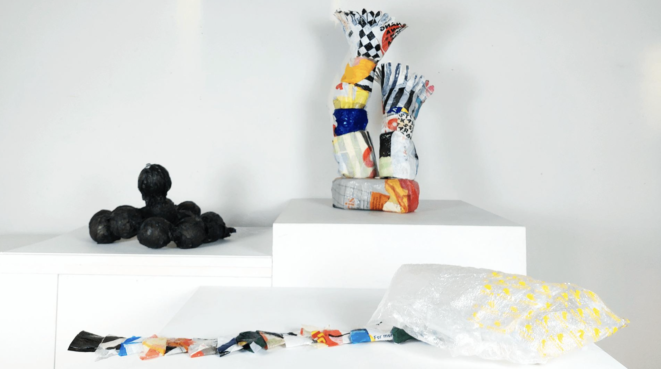
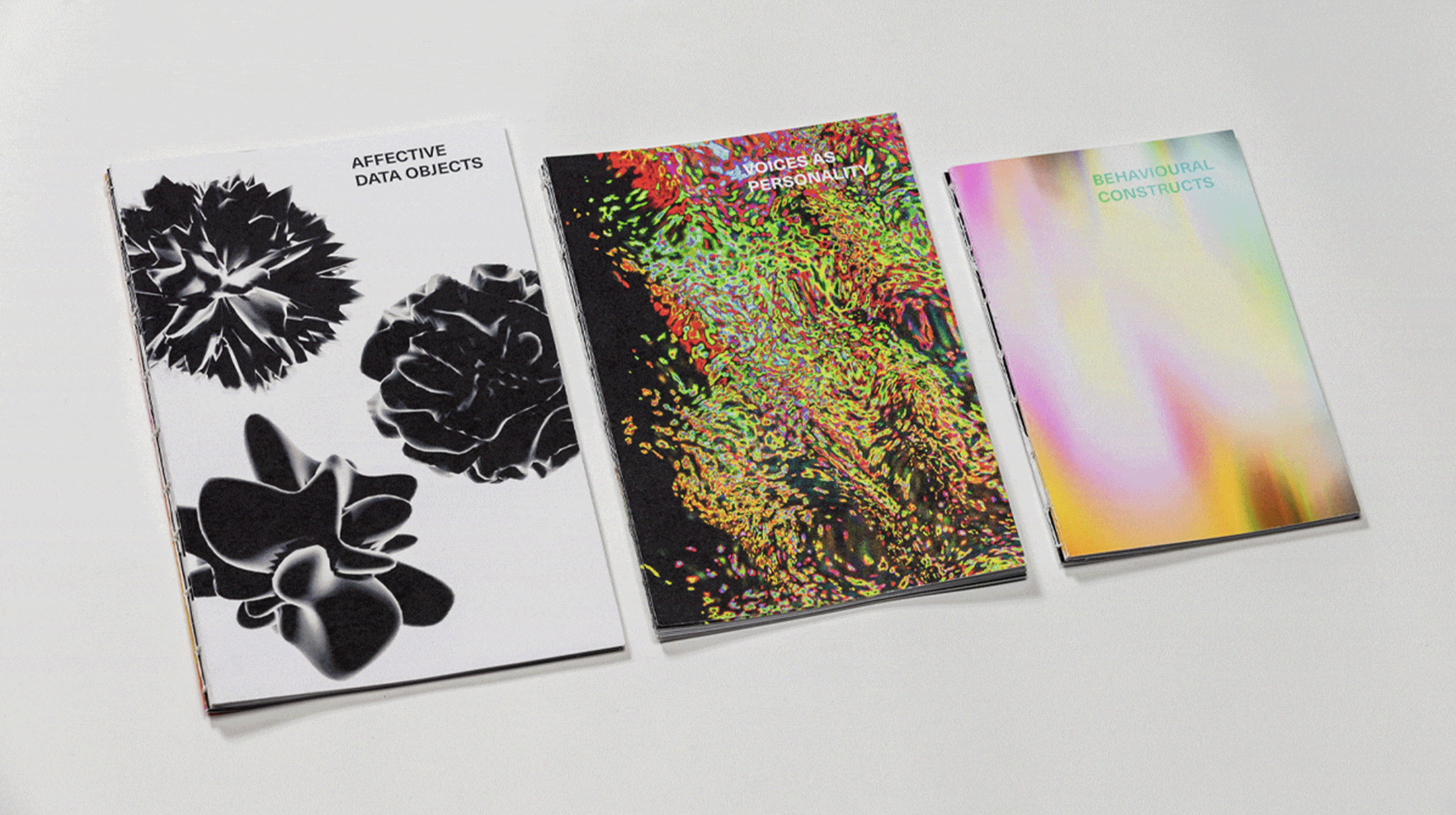
I found 2 examples on the archive website that I thought were relevant to my project - Urban Plastisphere
(Aimee Junoes) and Selfscapes (Rachel Lee). In Aimee’s project, she displayed 3 physical artefacts. Even
though they were all made up of plastic, she created a separation by simply placing them on different
heights. This consideration allowed me to regard the artefacts as 3 different entities, each communicating
a different message but part of the same context/concept. Similarly, Rachel’s project consists of 3
artefacts but it was a mix of physical and digital works. The way she packaged her project together was
through 3 books in varying sizes, yet aligning in the same visual style. Each of her artefacts had a name
tag along with it so it was easy to refer as well.
Now for my project, I’ll likely have physical outcomes to go with my digital ones. The physical formats
are to document the success of the artefacts in provoking reflection, as well as the process of the
experiments. Even though everything falls under the same context, I wanted each individual artefact to
have their own unique visual style since each of them adopted a different approach (Definitely also to
showcase my flexibility).
Since I’ve decided on individual stylings, I would then need to find a way to package them together under
1 concept. When I was discussing with my friends, I proposed that I should come up with 1 small brochure
for each artefact, with the same styling. This idea was quickly shut down due as I would have too many
printed collaterals and it would just be an overload of information. It would be much better to design
sections, or just 1 printed pamphlet to tie everything together. I drew up some quick wireframes of what
I’m referring to based on last year’s individual table layouts. These are my options for now, but when we
get closer to the open studios date, I will lock everything down.
Urban Plastisphere - Aimee Junoes
Selfscapes - Rachel Lee

Setup Wireframe A (Sections)

Setup Wireframe B (Pamphlets)
Artefact B Conceptualisation Process
The primary objective of this artifact is to prompt individuals to contemplate the dilemmas of algorithm
transparency, which entails ensuring that algorithmic processes and associated data remain accessible to
the public. Moreover, I aim to achieve this goal computationally by employing a sequence of visuals
crafted in TouchDesigner. A persistent challenge I encounter in computational design pertains to the
utilization of imagery. Upon examining computational outcomes, I observed predominantly three types of
visual elements employed: images, typography, or renders. Despite experimenting with renders during the
initial semester, I found it challenging to integrate them cohesively within the context of my project.
Similarly, typography posed difficulties in being effectively contextualized to my advantage.
Consequently, I made the decision to prioritize images as the primary element in this artefact.
While developing my initial artifact, I stumbled upon the concept of live folders. These folders enable
the visuals in my TouchDesigner file to adapt to live content updates, a feature I found particularly
intriguing and wished to incorporate in some capacity. Given my focus on algorithmic curation, I
recognized that social media images would be the most relevant context. Interestingly, I often find myself
prioritizing technical considerations over ideation. This time, however, it proved advantageous. While
exploring methods to download images from my Instagram explore page, I delved into experimenting with the
Chrome inspect tool and encountered a galore of cached images.
The alignment between using cached images and the concept of live folders proved to be quite fitting.
Cached folders retain every image encountered following a specific action (such as scrolling, clicking, or
refreshing), making them an excellent fit for an interactive component in my project. However, I
encountered a significant obstacle. Legally, accessing Google Chrome's cache folders is not permissible.
They are stored on a cloud network, making them inaccessible for download. Nonetheless, the browser does
permit the individual downloading of images, which is the approach I opted for.
Up to this point, I haven't finalized my decision on what I'm going to do. I've simply collected all the
resources and tools necessary to construct a narrative. Since the narrative will heavily rely on my
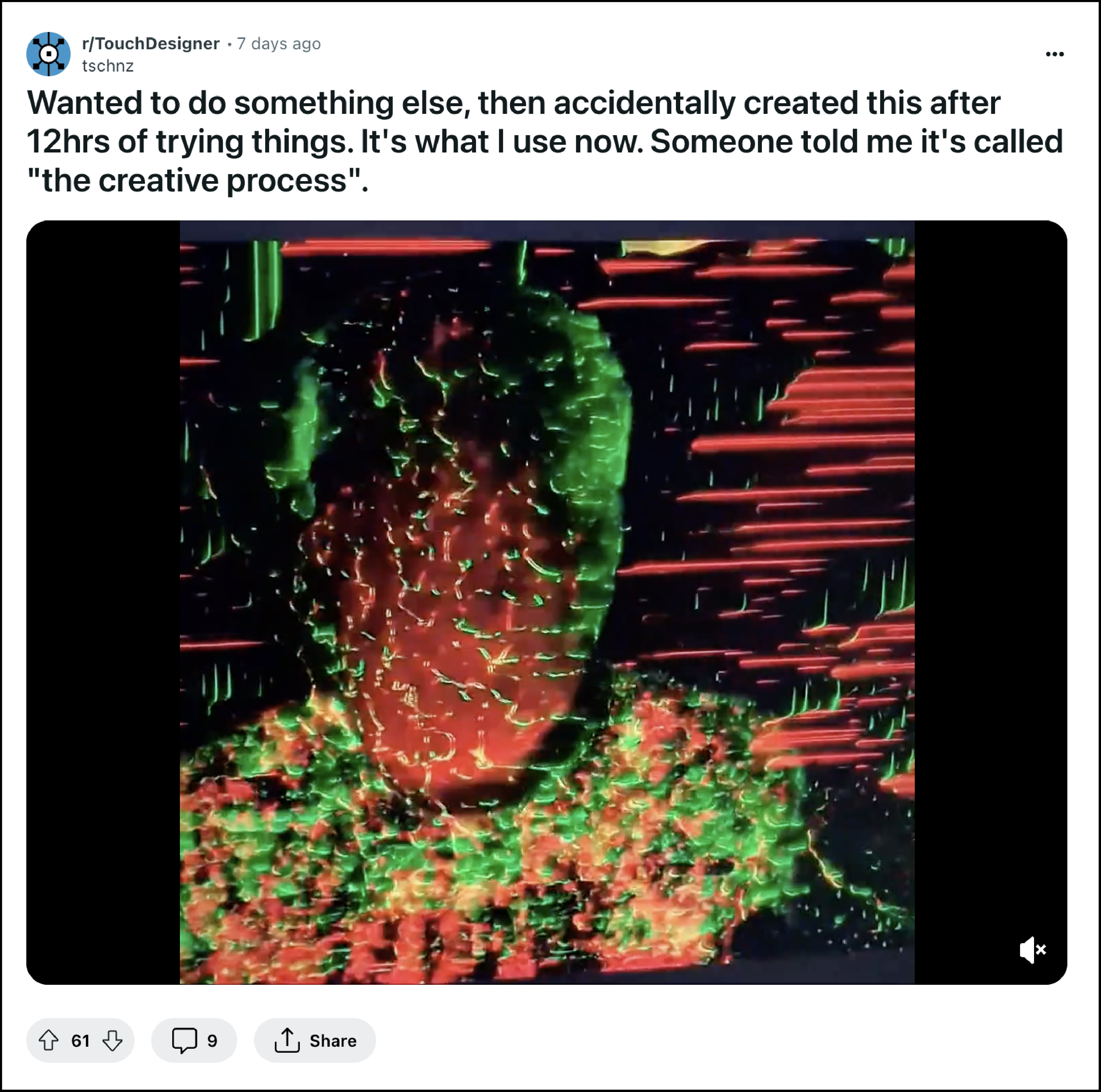
visuals, I'm comfortable with exploring until I gather enough resources to formulate one. While browsing
Reddit, I stumbled upon a post where an individual unintentionally produced a visual outcome while aiming
for something entirely different, and his friends dubbed it 'the creative process.' This resonates deeply
with my experiences in computational design, I guess it’s really a universal experience.
I do have one experiment I want to revisit. In the first semester, I conducted a visual exploration of the
'algorithm black box,' where the inner workings of algorithms are concealed. This encompasses the
decisions they make and the data they utilize, among other factors. If I can find a way to make it
provocative and encourage people to reflect on algorithm transparency, it will undoubtedly be for the
best.

Cache Folder Inspect Tool
'The Creative Process'
Noise Displacement & BlobTracking
As I was looking for TouchDesigner tutorials regarding image manipulation, I came across the concept of
BlobTracking. Basically it’s similar to the Inclusivision software’s face detection, but instead of
detecting faces, it detects movement and gives you the x and y values. With these variable x and y values,
we can draw materials/text over them to mimic the movement.
In the tutorial, they used a noise map to displace the input video and then tracked the displacement. This
made me understand 2 things. Firstly, I can use a noise map to create random algorithmic distortions.
Second, any sort of movement can be tracked, so I don’t exactly have to follow the same approach.
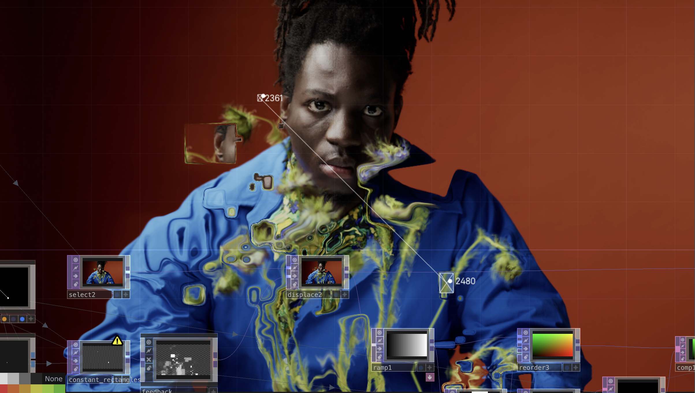
After trying the blobtracking tool out myself, I realised that there was a limitation with the basic
subscription of TouchDesigner. In the tutorial video, there were a lot of points being tracked and the
creator was able to connect all the lines to form this web. However, for my version the maximum number of
blobs I can track is 2, meaning that I’ll only have 1 line connecting the 2 tracked points every frame.
This might seem minor but it resulted in a huge difference in the impact of the visuals. The one in the
video seemed overwhelming (but controllable), but mine was plain boring. However, in my version, you could
see the tracking of the movement clearer as there was less to look at.
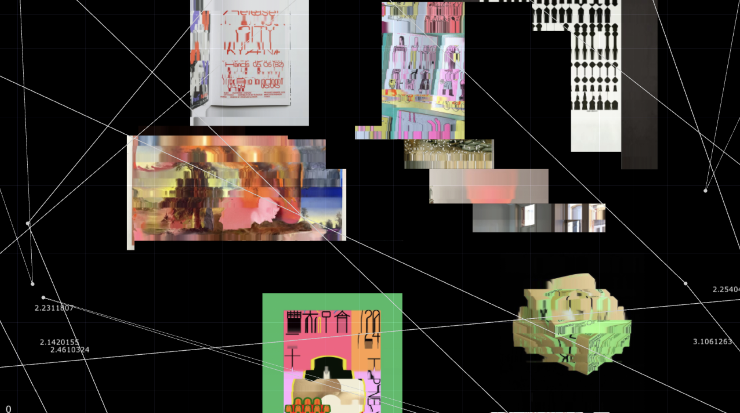
Thinking of how I can apply this to my project, instead of using 1 image, I could displace and track
multiple images so the lines could be drawing some sort of connection between the images. Using cache
images from my own Instagram explore page, I replicated them floating in random x y z positions and tested
it out. The result wasn’t what I had expected, it was boring, in fact more boring than when it was just 1
image.
Having not achieved my desired outcome initially, I attempted another method. This time, I created a noise
map and had the blobtrack TOP track its values. Instead of directly applying the noise map on my images, I
utilized its channels, allowing for more lines to be drawn without being limited to just one. I didn't
quite appreciate the fluid effect demonstrated in the tutorial. Given our focus on algorithms and data,
the fluid motion didn't quite reflect the movement one would anticipate from algorithms. To synchronize
the images with the movement of the lines, I applied a glitch effect I had previously learned on top of
the images, creating the illusion of motion. This also gave the impression that the images were being
scanned, which ultimately worked to my advantage.
Despite using the same tools, the version of the blobtracking with multiple images and the version with a
single image both has its own unique expression. The lines in the one with multiple images look like it
was trying to draw connections between images, and the lines in the single image looks like it’s analysing
the pixels within the image. I think this was the point I was starting to realize my visuals were veering
toward interpretations of the algorithmic curation process. I wouldn’t mind that as long as this creative
churn continues, but I was also quite worried about the provocative portion of my project, since it is
still absent right now.
Limited to 2 Blobs
Multi-Image Tracking w/ Lines

Glitch Effect
Designing Provocation
As I continued my search through TouchDesigner outcomes on Pinterest and Instagram, I sought inspiration
that could infuse a sense of provocation into my project. Despite stumbling upon some intriguing image
manipulation visuals, none seemed to align with the current concept of 'Interpretations of the Algorithmic
Curation Process.'
With my concept already in place, I shifted from the 'accidental discovery' creative approach to delving
deeper into the relationship between cache data and algorithmic curation. Initially, I assumed my
understanding of cache was comprehensive, only to realize its limitations upon further research. While
investigating, I discovered that there was no direct link between how Google Chrome stores Instagram
Explore Page images and the cache utilized by Instagram for curation algorithms, which resides on its
independent cloud server. Nevertheless, I realized I could frame my narrative of Chrome's cache data as
Instagram's cache data.
As I pieced together the puzzle, I began to question whether my identity was a subject of curation. While
social media algorithms learn from our digital patterns and behaviors, there comes a point where
individuals encounter new and different discoveries recommended by these algorithms. At this juncture, do
our identities become subjects of algorithmic curation, or do our identities continue to inform these
curation algorithms? This revelation prompted me to contemplate further how these algorithms function and
what kind of data they extract from us to recommend these fresh discoveries. Consequently, I intend to
frame my interpretations of the algorithmic curation process as a narrative that prompts viewers to ponder
this question.
Visual Narrative
I’ve always liked to include an interactive element in my computational work, so for Artefact B, I would
like to do the same. Preferably, I would like to create a visual installation and get some friends to be
my subjects, offering me their Instagram Explore page cache images. I don’t think anyone I’m not close to
will be willing to let me invade their privacy like that. Using their cache images, I would then create a
visual interpretation of the how these images will be analysed, sorted in the algorithm black box, and
then becoming a part of their identity. To do this, I broke down the installation into 5 phases:
Phase 1: Collecting Cache Data (No Visuals)
Despite my desire to streamline this process, legal constraints prevent me from downloading the images as
a folder, so I’ll have to download them one-by-one. I truly wish I could access the live folders to create
a more immersive interaction between the visuals and my subjects. Just imagine if they could scroll their
Instagram explore page and witness how these visuals change and update in real-time. Unfortunately, I must
work within my current limitations. In order to avoid introducing human bias into the data manipulation
process, I will select these images at random without previewing them. Additionally, I'll be mindful to
exclude cache folders containing profile icons to only use posts.
Phase 2: Uploading Cache to the Cloud (Visuals)
I want to create a visual interpretation of the process behind uploading the images to the curation
database. With my improved proficiency in TouchDesigner, I anticipate being able to plan ahead before
creating, rather than relying solely on accidental discoveries. However, I must note that accidental
discoveries can yield excellent results, and if they surpass my initial vision, I fully embrace them.
During this phase, I also intend to incorporate the cache image names. I've observed that the cache images
I downloaded possess unique and systematic names. Leveraging this data can assist viewers in comprehending
the process unfolding before them.
Phase 3: Cache Database (Visuals)
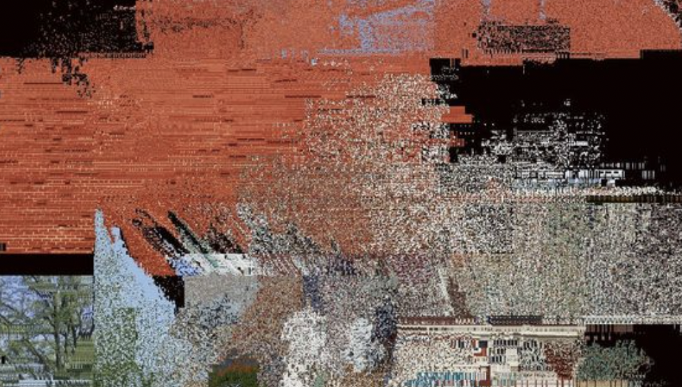
The objective of this phase is to illustrate the vastness of the data stored in the cloud. I plan to
arrange all the images and manipulate the z-axis to craft an endless landscape. Through this phase, I aim
to evoke a sense of the overwhelming scale of the database. Despite only utilizing a selected number of
images, I hope to convey to my subjects the magnitude of their data—from the inception of their Instagram
account until the present—coexisting within the same database.
Phase 4: Cache Data Analysis (Visuals)
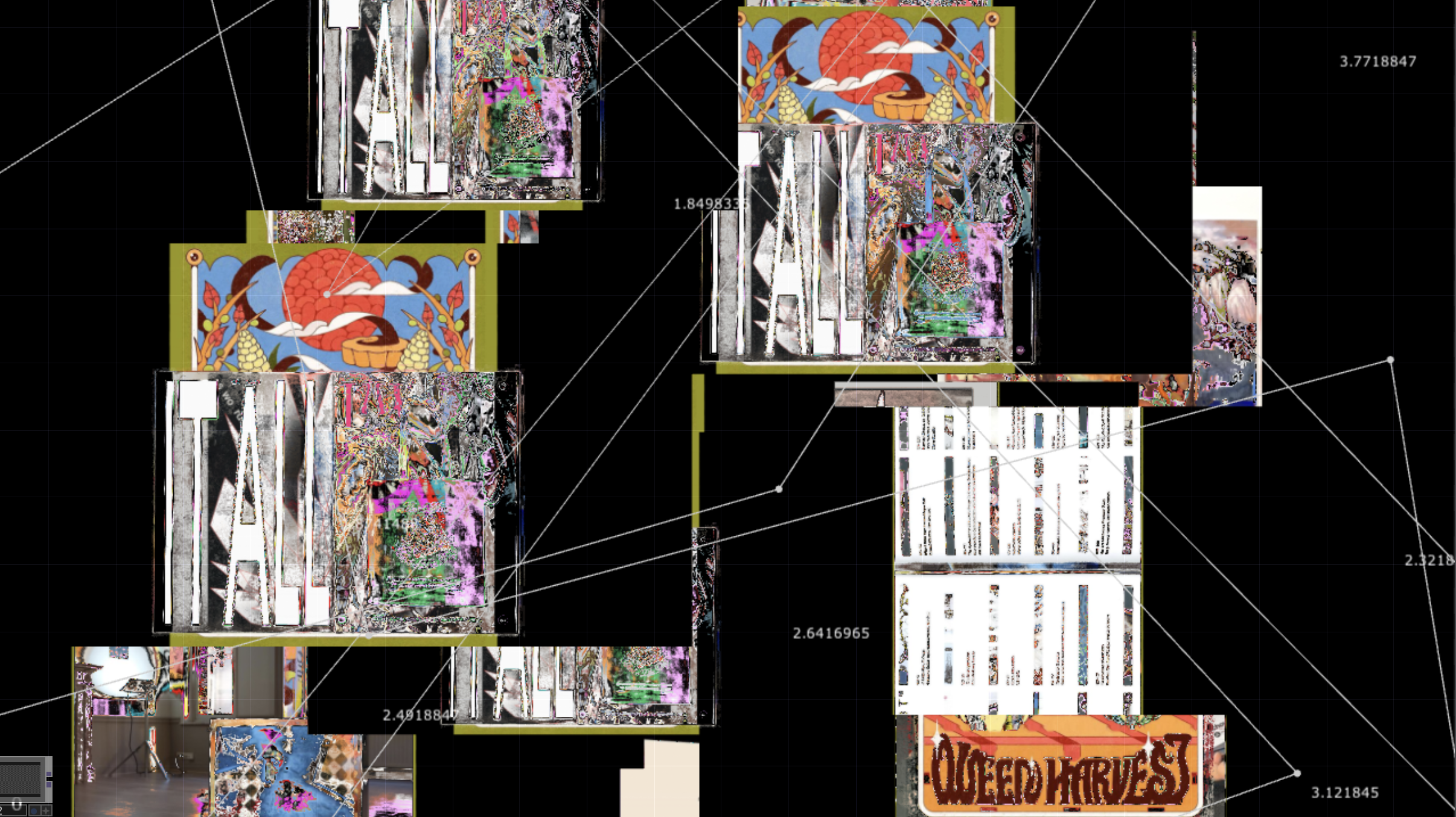
In this phase, I aim to leverage the line visuals from the multi-image blobtracking, where the lines
appear to be forging connections between images. These visuals are open to interpretation and serve as a
transition to the next phase. Rather than flatly presenting the images as in phase 3, I intend to
introduce a different type of movement to imply a sense of depth and dimensionality within a 3D space.
Phase 5: Identity Consumed by Cache Data (Webcam + Visuals)
In this final phase, the narrative comes full circle as I aim to illustrate how cache data is gradually
assimilating our identities. The primary objective is to pose the provocative question mentioned earlier,
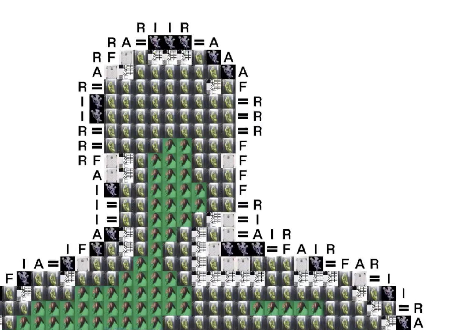
prompting viewers to reflect on its implications. To enhance immersion, I plan to integrate the webcam
into this phase, deepening the viewer's engagement with the experience. Drawing from my previous
experiments with the ASCII filter, I intend to explore the feasibility of replacing symbols with images
instead. The visual I aspire to achieve involves substituting all the pixels in the webcam's input feed
with the cache images, creating a compelling visual representation of the narrative's climax.
Phase 3 Reference
Phase 4 Drafts
Phase 5 Reference