░░░░░░░ WEEK 3 ░░░░░░░
Front-End UI
Since the front-end serves as the prototype's initial point of interaction with participants, it plays a
crucial role in enhancing the suspension of disbelief. Despite the prototype's primary focus not being
functionality, I still needed to incorporate certain common functions essential to the software to make it
feel more believable. Preview of Front End and Back End UI
Input Mode
Initially, I implemented two modes of input for users to upload media: screen and single image. To
facilitate this, I created a key switch for users to toggle between these modes. Initially, I had
considered giving each mode a distinct UI appearance. However, upon closer examination, I realized that
the differences in data between the two modes were negligible, so I opted against it.
Image Folder
For the image folder option, I found the process for uploading images to be unfriendly. While I wanted
users to have the flexibility of uploading their own media, guiding them through the use of TouchDesigner
could raise suspicions, especially among participants with some level of programming literacy.
Recalling a video I had seen about file uploads, I remembered the possibility of linking a folder on my
computer to TouchDesigner. This approach allowed users to upload multiple images simply by dropping them
into the designated folder. To facilitate this, I created additional key switches to help users navigate
through the folder.
Screen Mode
In the screen mode, I encountered resolution issues while testing on displays of varying sizes. Despite
spending a significant amount of time on the software, I struggled with the resolution settings. The
autofit functions seemed overly rigid, leaving me with no option but to manually input the desired
resolution size. Eventually, I found an aspect that accommodated displays of different sizes, but the lack
of flexibility in computation, which I had previously overlooked, became a point of concern.
Screen recording mode
Custom resolution settings
Face Crop Lines Data
In my narrative planning, I intended to highlight that the back-end of the software would only be
accessible to large corporation partners, excluding the public. While I already had data that was
inaccessible in the front-end, I felt it wasn't sufficient. After careful consideration, I decided to
relocate the face-crop lines from the front-end to the info panels on the right, introducing ambiguity
regarding their accessibility.
Separating the crop lines from the input image was a straightforward process. Working with nodes, I could
easily create a separate connection and overlay it on top of a rectangle with the same aspect as the
image.
However, I encountered an issue with the stroke width. While the thickness appeared visually balanced on
the display, scaling it down to fit into my side panels caused the thickness to decrease with the
resolution. Increasing the stroke thickness wasn't feasible as the line SOP was a shared element across
the front and back-end. After experimenting with various solutions, the most effective one, albeit
unprofessional, was to duplicate the entire section and increase the line stroke thickness.
Ambiguous crop rectangles
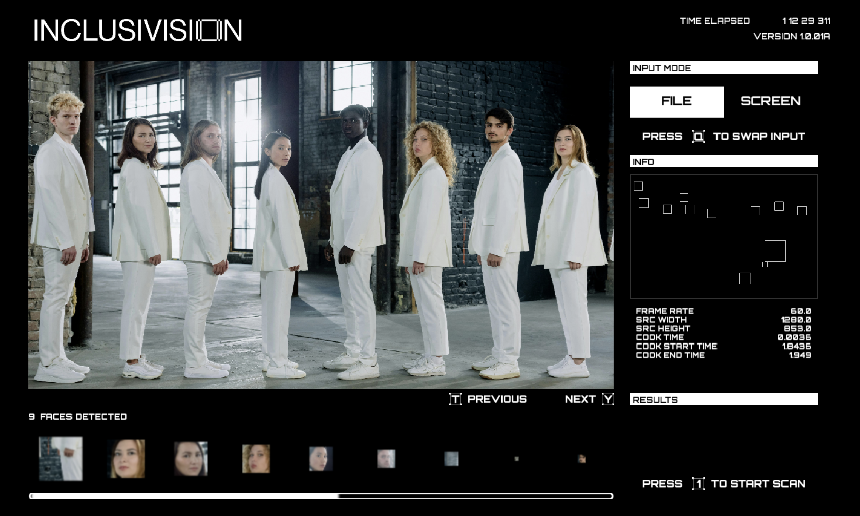
Info Panel
The info section plays a crucial role in the software's functionality. While my main input view is set to a horizontal fit, cropping away the top and bottom portions of portrait images, the scanner still picks up on the cropped sections. Hence, displaying the input resolution serves as a reference if any detected faces extend beyond the main view.
Although frame rate isn't significant for images, it becomes essential for screen recording and video inputs, offering insight into the software's processing power.
Similarly, the cook info contributes to the narrative by explaining the prioritization of speed and efficiency over accuracy in opting for Haar Cascade for face detection.
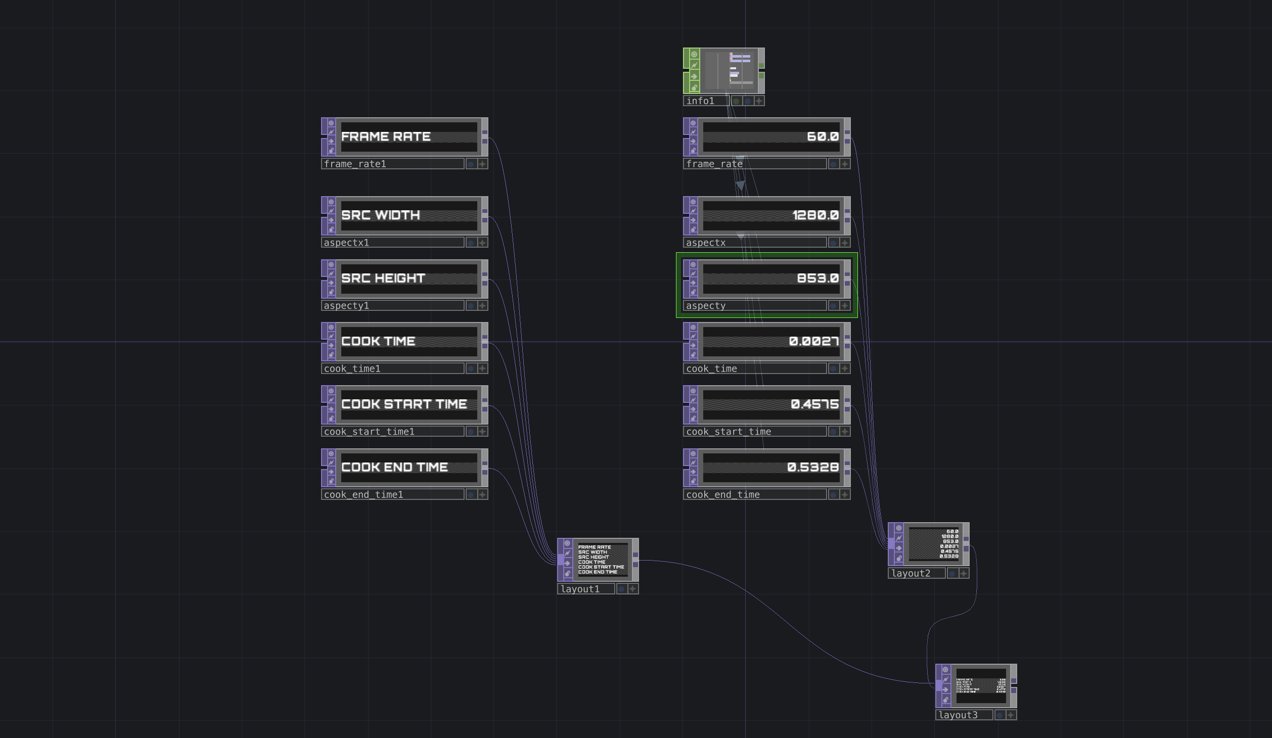
Info panel nodes
Detecting Animation
Within the replicator COMP, there's an option to generate children gradually to prevent all faces from appearing at once. However, the lack of controls for the speed at which they appear results in the impression that all faces appear simultaneously.
To address this limitation, I leveraged this function to animate the gradual appearance of faces. By incorporating a compounding delay for each face and synchronizing the scale with time, I achieved a sequential detection effect, where the software identifies each face one by one.
Furthermore, I introduced a loading bar activated by pressing the scan button. This loading bar plays a crucial role as it signals the completion of the scanning process, indicating that all faces have been detected.
Despite the seemingly minor nature of these updates, they significantly enhanced the UI's dynamism. The newly integrated animations harmonized with other moving elements in the UI, resulting in a more cohesive and balanced layout overall.
Animation frame
Attention to Detail
I firmly believe that the level of attention devoted to design directly correlates with how much consumers, clients, or viewers value the product. This principle guides my meticulous focus on spacing, margins, and type size in UI design, ensuring consistency between the front and back-end of my software. My primary goal is to enhance legibility, aiming to immerse participants in the thought experiment's realism and prompt the question, "Who would invest so much effort in creating something that isn't real?"
Adjusting the overall size to ensure consistency across the front and back end consumed two full days of work. I carefully adjusted each element and its containers to manually set the resolution size. When an element's size exceeds its container, it's either cropped or scaled automatically, often resulting in disproportionate layouts. While I disdain working with manual numerical adjustments due to the need for individual value readjustments, I recognize the limitations of TouchDesigner in creating responsive layouts.
For the instructional buttons, I maintained a consistent style reflective of Inclusivision's branding. However, crafting these buttons in TouchDesigner posed challenges distinct from Adobe Illustrator, as TouchDesigner lacks vector capabilities. Consequently, the button creation process required manual font size adjustments and resolution matching. Unfortunately, autofit functions proved unreliable, often downsizing or cropping elements within containers.
Overall margin and spacing settings
Consistently styled buttons