░░░░░░░ WEEK 14 ░░░░░░░
Documentation Video Planning
The main purpose of the documentation video is to provide viewers some context to the project as well as each artefact’s structure. I felt like this was what’s missing in my display during Open Studios, viewers were mostly looking at the final outcomes, which is pretty vague especially due to my topic’s complex nature.
Upon reflection, I've opted against including sound or music in the video due to logistical constraints during the graduation showcase. Consequently, the explanation will be presented in text format. This presented a challenge as I needed to summarize my project in a reader-friendly manner. However, I plan to infuse a more informal tone in the video, asking questions that engage the audience and facilitate clearer communication of my message.
I began by breaking down the sections of the video and the content that goes in each of them. The video will begin with an introduction to the project before introducing each of the artefacts. In this introduction, I managed to summarise my project down into 4 sentences. Each of the sentences addresses the context, rationale, method, and purpose respectively. I can have some interesting computational visuals in the background while the text runs in the foreground. I believe I can find a way to make it interesting with animation.
Initially, I intended the video documentation to delve deeply into each artefact's process. However, without sound, this approach seemed impractical. Therefore, I've decided to break down the narrative flow into sections accompanied by video clips. This way, viewers can grasp how each section transitions into the next, gaining a comprehensive understanding of the artefact's full experience and its process in prompting critical reflection.
Artefact A
Front-End & Back-End: This section demonstrates how the artefact works and what its purpose is.
Thought-Experiment: Gives the viewer an idea of the environment the artefact interaction happens, as well as how the user-test is conducted.
Biased Outcomes: Shows example of the software bias, as well as its implication on society the subjects in the thought experiment discussed about.
Artefact B
Phase 1: To provide some context as to how I got the visuals, I compiled a short video demonstrating how the images used were extracted. The video establishes the images from Instagram’s explore page, showing the folder storing these images as cache data, and then how each of these images are sorted into a folder with their assigned cache IDs.
Phase 2-5: I used the same video I had put together for Open Studio. I had written quite a bit of copy for this section, but decided to take it out as my viewers would have to read too much. I’m planning to transfer all these information into my catalogue of making later on so it’s not really a waste of time.
Artefact C
Ad Topics: Just like phase 1 of artefact B, I actually prepared a write-up to explain this portion. I think for now, ad topics would suffice to give a little bit of context as to what data is used to create the bubble.
Filter Bubble: Coming right after the ad topics visual, the filter bubble is a combination of all the ad topics. The layered bubble lines should be obvious enough to indicate that.
Content Exposure: I felt that there was a need to attach a label to what these visuals represented due to the nature of how abstract it was.
Incubator: Similarly to the previous section, I felt like it’s much needed to include this incubator section to suggest what that term was referring to in my work.
Wireframes
Creating wireframes unexpectedly took up a significant chunk of my time, around half a day. Surprisingly, this process, although time-consuming, proved valuable for visualizing animation and transitions, streamlining my workflow. Additionally, as I crafted these wireframes, I concurrently worked on certain video components such as text and decorative elements. These elements were pathed and exported through Illustrator, ready for integration into After Effects, saving me time in the long run.
In designing the video, I opted for simplicity, aligning with my belief that straightforward designs are often the most effective for documentation style videos. This approach mirrors my presentation style at Open Studios, ensuring that the video's visual elements do not overshadow the primary content. Despite its simplicity, I dedicated considerable effort to planning the animation, ensuring that the video retains substance and engages the audience effectively.

Introduction Wireframes

Artefact A Section Wireframes

Artefact B Section Wireframes

Artefact C Section Wireframes
Putting It All Together
It took me a day or two to piece the video together, leveraging the wireframes I had created earlier. While the design work was mostly done, adjusting the pacing consumed a considerable amount of time. The varying lengths of each documentation clip led to inconsistent pacing throughout the video. I sought feedback from friends by exporting segments for their input, adjusting the speed based on their feedback to ensure a cohesive flow.
Keyframing the animation was relatively straightforward, given my background in film at Poly. However, I encountered challenges with pre-composing. Forgetting how pre-comps functioned led to issues where edits in one area affected the entire composition, causing misalignments and necessitating extensive redoing. This taught me the importance of proper organization and avoiding shortcuts that can lead to more time-consuming fixes.
Simultaneously, I worked on my catalogue of making, which proved beneficial in identifying gaps in the video that could be addressed in the catalogue. This dual approach also helped in planning how the video sections would complement and guide the flow of the catalogue, adding depth to both presentations.
Upon completing the video, I didn't experience the usual sense of relief. Instead, I felt anxious about my catalogue of making. Underestimating the time needed for the video despite having most of the content ready contributed to this feeling. Concerns about potential repetition between the video and catalogue content, coupled with procrastination on documenting my publications, added to my apprehension. Now, I'm focused on compensating for the missed interaction aspect in my documentation and ensuring a cohesive presentation across all materials.
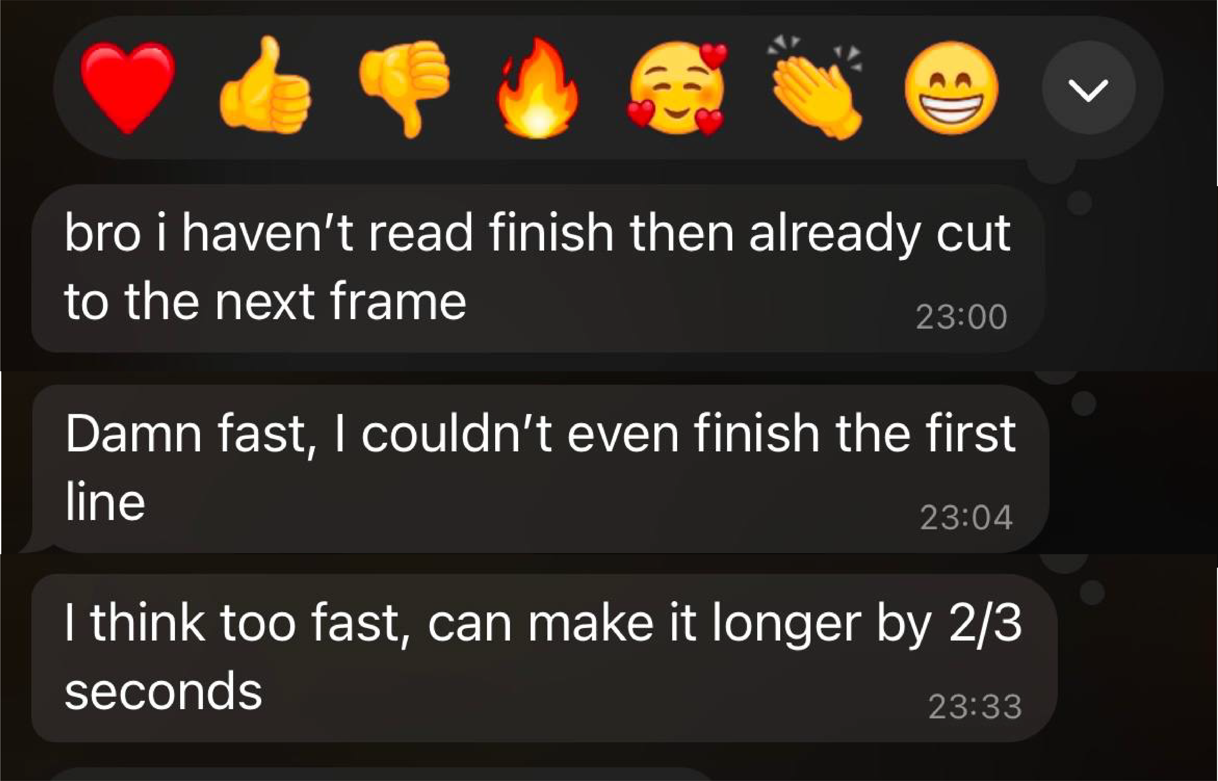
Feedbacks about Video Pacing
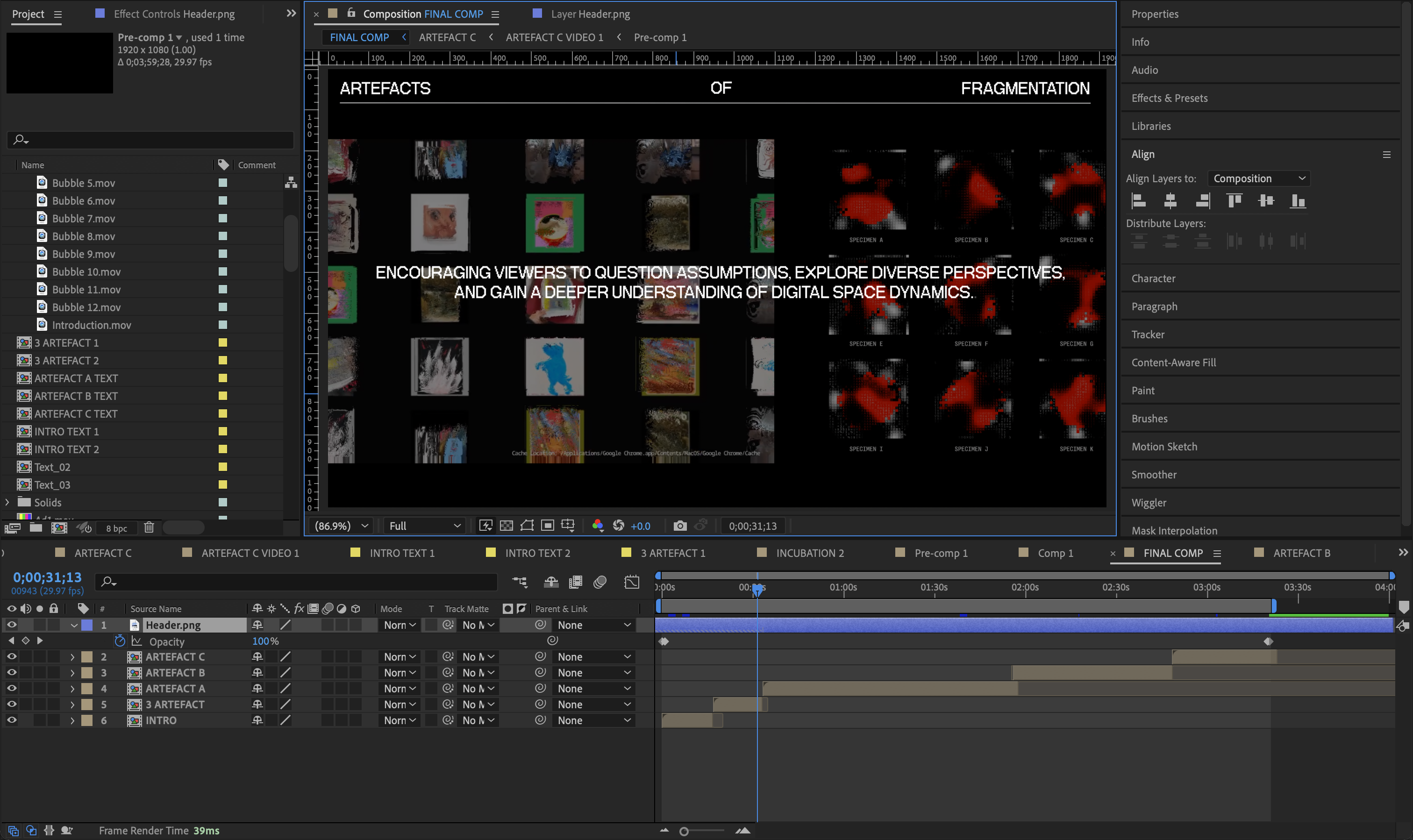
Working File Timeline
Catalogue of Making
Having not revisited my code since the end of the first semester, I struggled to recall the details of each class and their applications. It took some time to review the file interactions by modifying div styles and classes to understand their functions. While someone had previously commented on this approach, I personally find it more manageable than navigating through stylesheets.
Reflecting on my catalogue from last semester, I noticed significant changes, all for the better. Although the structure remained somewhat similar, I realized that the setup didn't quite suit my current project's needs. Consequently, I revamped the entire layout while retaining the basic elements. I also decided to remove the website part of Inclusivision as it no longer aligned with my project's direction, helping to balance the emphasis on each artefact without overemphasizing Artefact A.
My catalogue now comprises two pages: one for experiments and another for artefacts. I felt the need for a clearer demarcation between them, so I opted for inverted colors on the artefact page. I took a shortcut by in-line styling the colors of each element, a decision I deemed acceptable given that it was my personal project, allowing me to see everything on one page for easier testing before applying the style universally. While the approach may not have been ideal, it was much quicker than duplicating classes and styles and changing colors.
In terms of content structure, the first part includes an introduction to the project, incorporating the design statement. I divided the statement into "About" and "Context" sections for better comprehension. The artefact sections follow a similar structure as in the video, with descriptions addressing key points. Additionally, I plan to include documentation photos of each artefact's publication along with sample spreads to provide a comprehensive overview of the project.
While retrieving content from my After Effects file, I accidentally messed up the file containing my completed video when moving stuff around for export (which I hadn't exported yet to prevent my laptop from overheating during continuous work). It was incredibly frustrating trying to restore everything, but I've become accustomed to this workflow – finished works are never truly finished, are they?
I encountered significant challenges while working on the column classes in the HTML file. In the first semester, I had created classes for different columns (2, 3, 4), but they didn't function as intended. I vaguely recall it being more complex, involving nested divs, and the class naming was quite ambiguous, partly my own fault. For instance, there were classes like 2__columns and 2__columns__in – what does the 'in' even signify? Unfortunately, I had already deleted the original code structure for this page, so I'll have to start from scratch and create new classes as I couldn’t figure it out.
After setting up the basic structure of my website, I added all the intended content. However, I forgot about documenting the publication, which I realized at 5:30 pm, just as golden hour was starting. I quickly grabbed some plain A3 papers, taped them together to create a simple backdrop, and set up a makeshift photo shoot on my balcony. Despite the humidity making it uncomfortable and me unable to turn on the fan to avoid papers flying around, I had a lot of fun capturing photos of my work.
During the shoot, I also had to address a practical issue with Artefact A's publications – they wouldn't stay closed due to the fold-over flap. To remedy this for the photos, I secured them using bluetack. The photos turned out great even though they were shot using an iPhone, the quality wasn’t the best but it was okay as they’re going to be placed in a single row in my catalogue and you can click on them to enlarge.
The last task for the website is uploading the documentation video, which will be featured at the very top of the introduction section. The final export size came to around 250 MB, which was acceptable given its length. However, directly uploading it to my website would significantly increase the loading time. To address this, I opted to embed it via Vimeo instead.
I noticed that this is a common practice among filmmakers on their portfolio websites, so I saw it as an industry norm and thought it wouldn't be out of place. However, one aspect that bothered me was the inability to remove the Vimeo frame. It looked unattractive, especially against the black background of my website, as it created a noticeable white border. Despite trying adjustments like padding, margins, and using CSS to remove the border, I discovered through research that it's unavoidable without upgrading to a Pro account on Vimeo. Figuring that it’s not sustainable in the long run, I decided to bat an eye and consider my catalogue of making complete.
I'm really really happy with how my catalogue of making turned out. Initially, I was concerned that the aesthetics might not complement my artefacts well. However, after inverting the colours of the page, the vibe shifted from a scientific worksheet to a techno-futuristic look. There were also some problems with mobile responsiveness, but given the amount of time left, I could only try to make it work for 1 page. For consistency’s sake, I decided to leave it like that. I have plenty of reflections to write down, but I'll save it for when I complete my last deliverable: the presentation slides, which I plan to work on at the beginning of week 15.
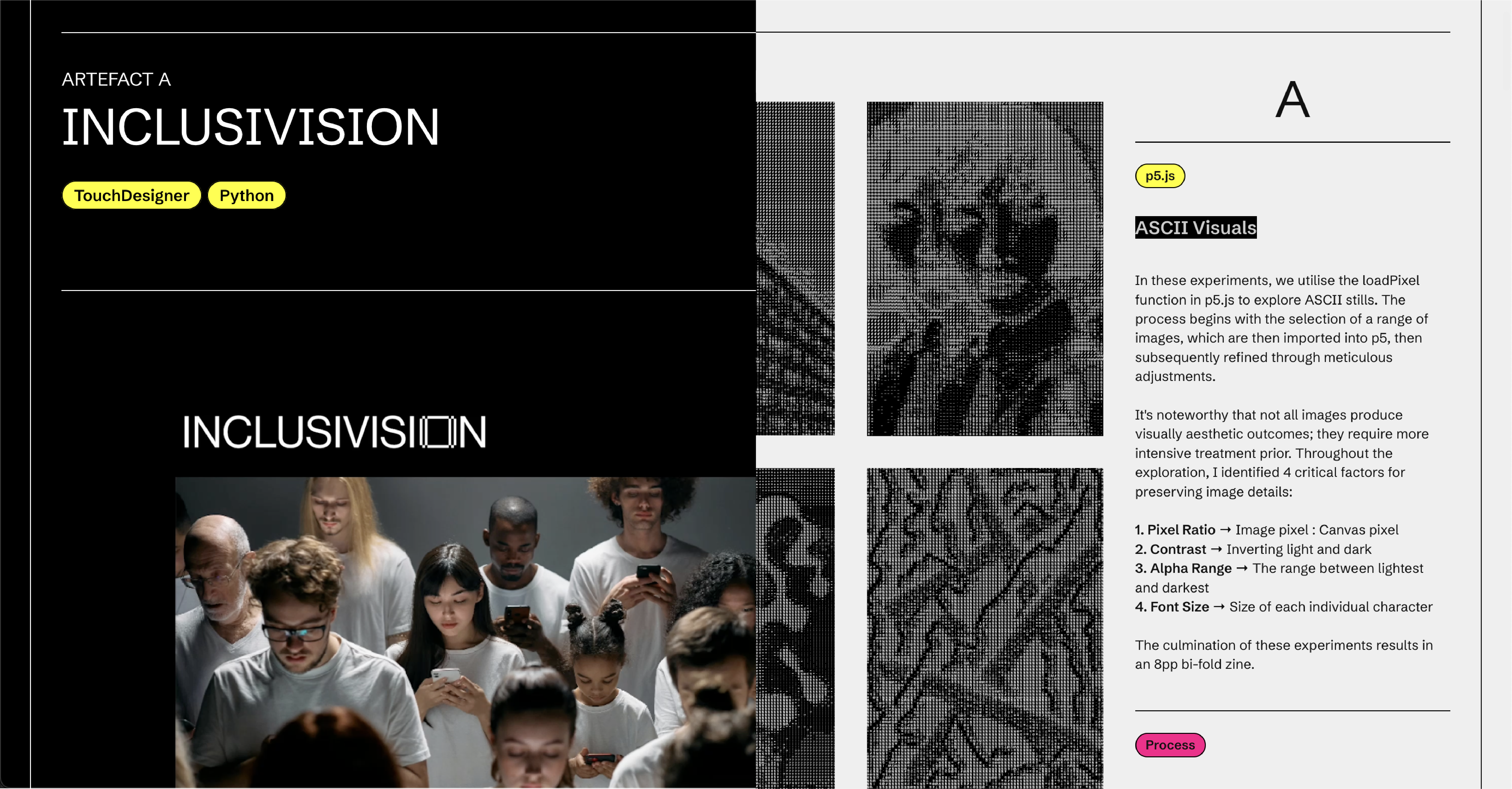
Left: Artefact / Right: Experiments
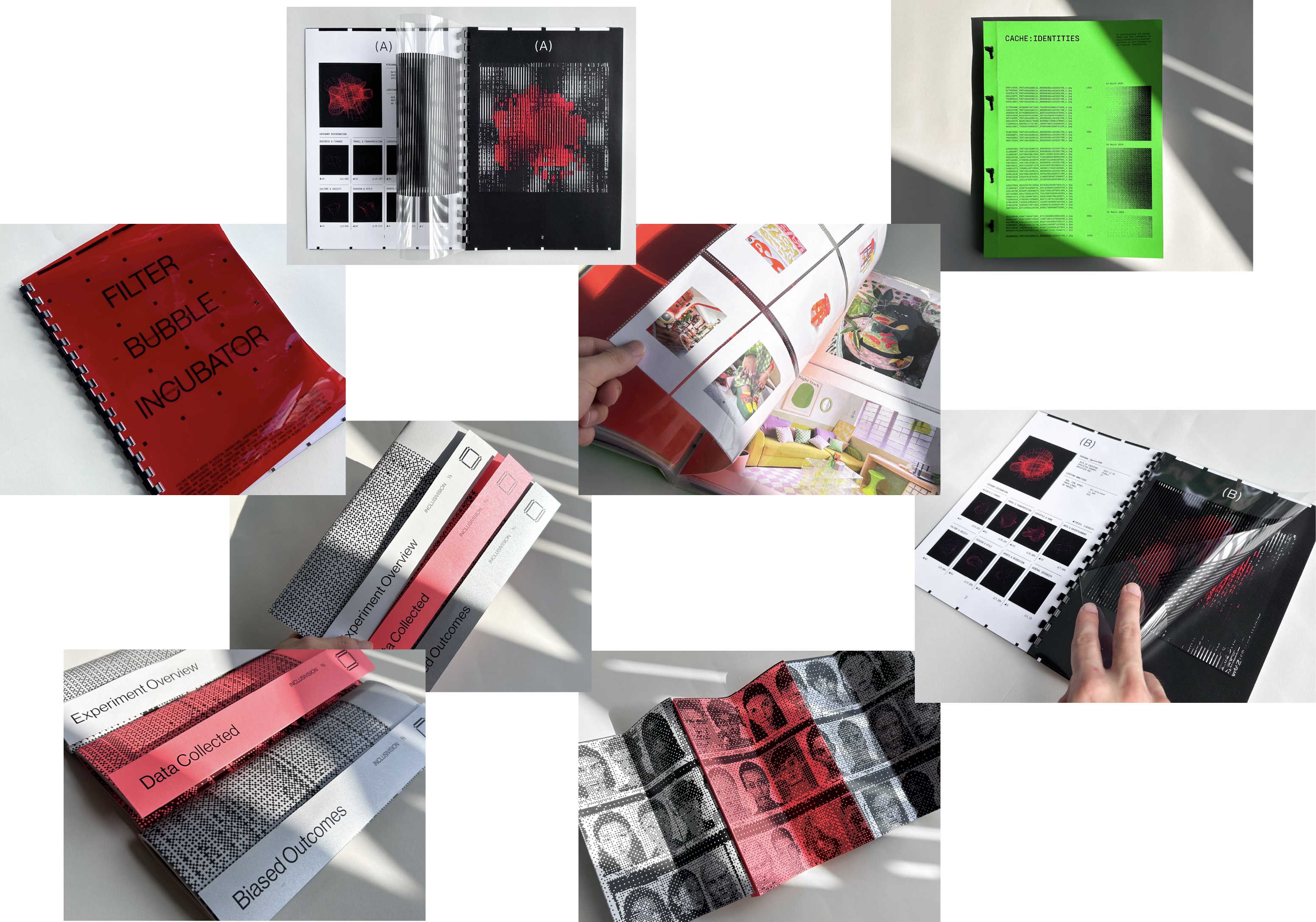
Some images from the shoot

Embedding through Vimeo
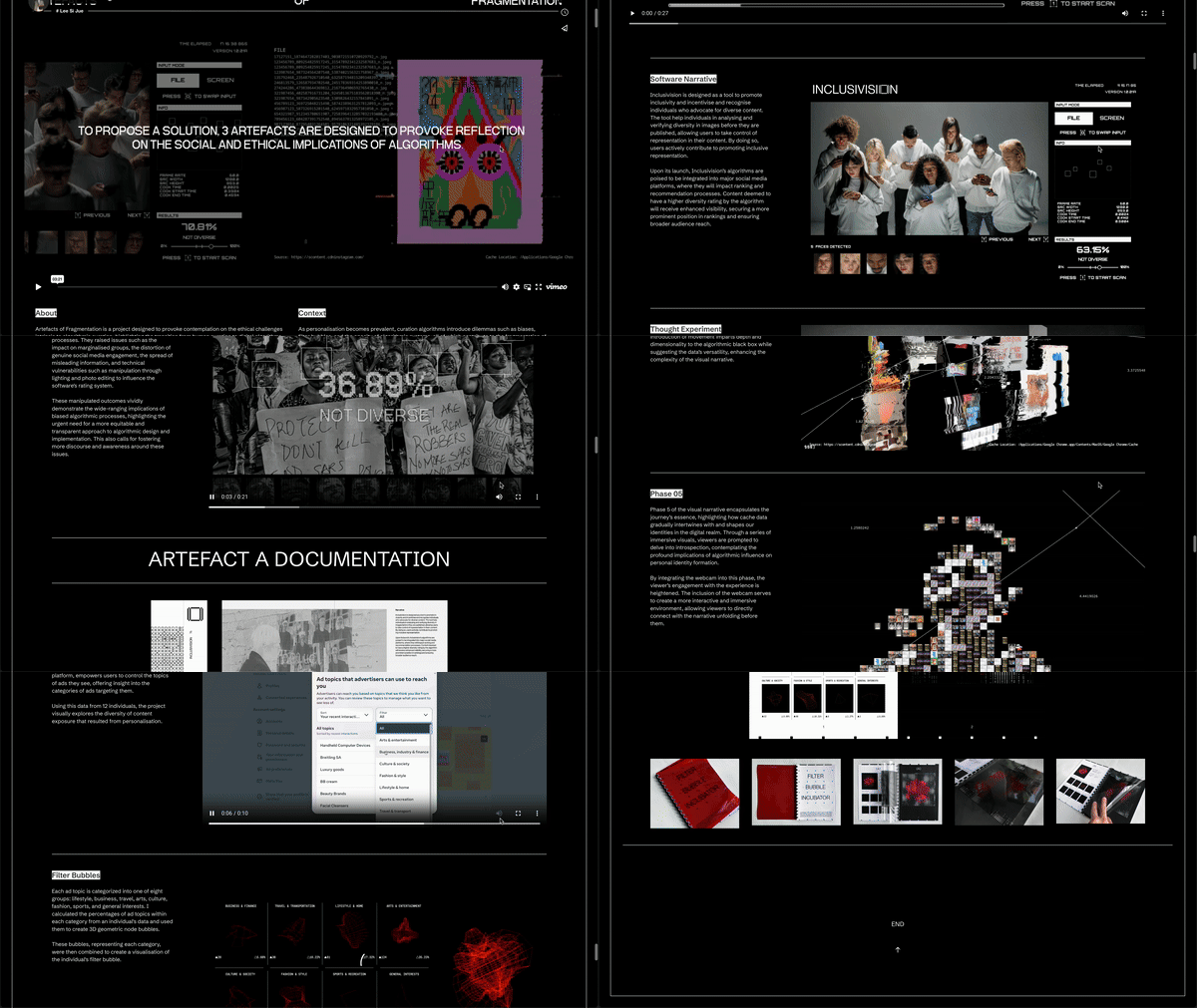
Completed Catalogue Scroll-through