░░░░░░░ WEEK 13 ░░░░░░░
Artefact C
One challenge I'm facing with Artefact C is ensuring its consistency with the other artefacts. Both
Artefact A and B rely on data-driven elements. While Andreas made a valid point that noise can be
considered synthetic data, I believe using real data would enhance the overall quality of the project.
I started researching available data that I could use, focusing on finding relevant information related to
filter bubbles to build a coherent narrative. Despite being my project and Artefact, I struggled to
connect filter bubbles with design, taking considerable time to grasp the concept. Fundamentally, filter
bubbles are a result of personalization, meaning any personalization data could serve as input for my
bubbles.
My initial Google searches yielded limited useful information, likely due to vague search terms. To refine
my approach, I shifted to searching for methods to assess my level of personalization and understand what
personal information contributes to personalization algorithms. One useful key term I came across was
‘activity history’, this reminded me of Instagram’s ‘My Activity’ page, which might contain something
useful.
This is where I came across Meta Ad Topics, a feature within the Meta platform, which empowers users to
control the topics of ads they see, offering insight into the categories of ads targeting them. Ads play a
crucial role in shaping the personalized content experience that defines a user's filter bubble,
influencing their perceptions and behaviors within their online environment.
However, there were no numerical values I could use to input into TouchDesigner. To bypass this, I devised
a method to generate values. By categorizing ad topics and tallying the number of ads in each category, I
obtained initial values. These values allowed me to calculate percentages between my ad topic categories
and those of my brothers, which unsurprisingly, accurately reflected our identities. Hence, I've opted to
use this data to illustrate personal filter bubbles.
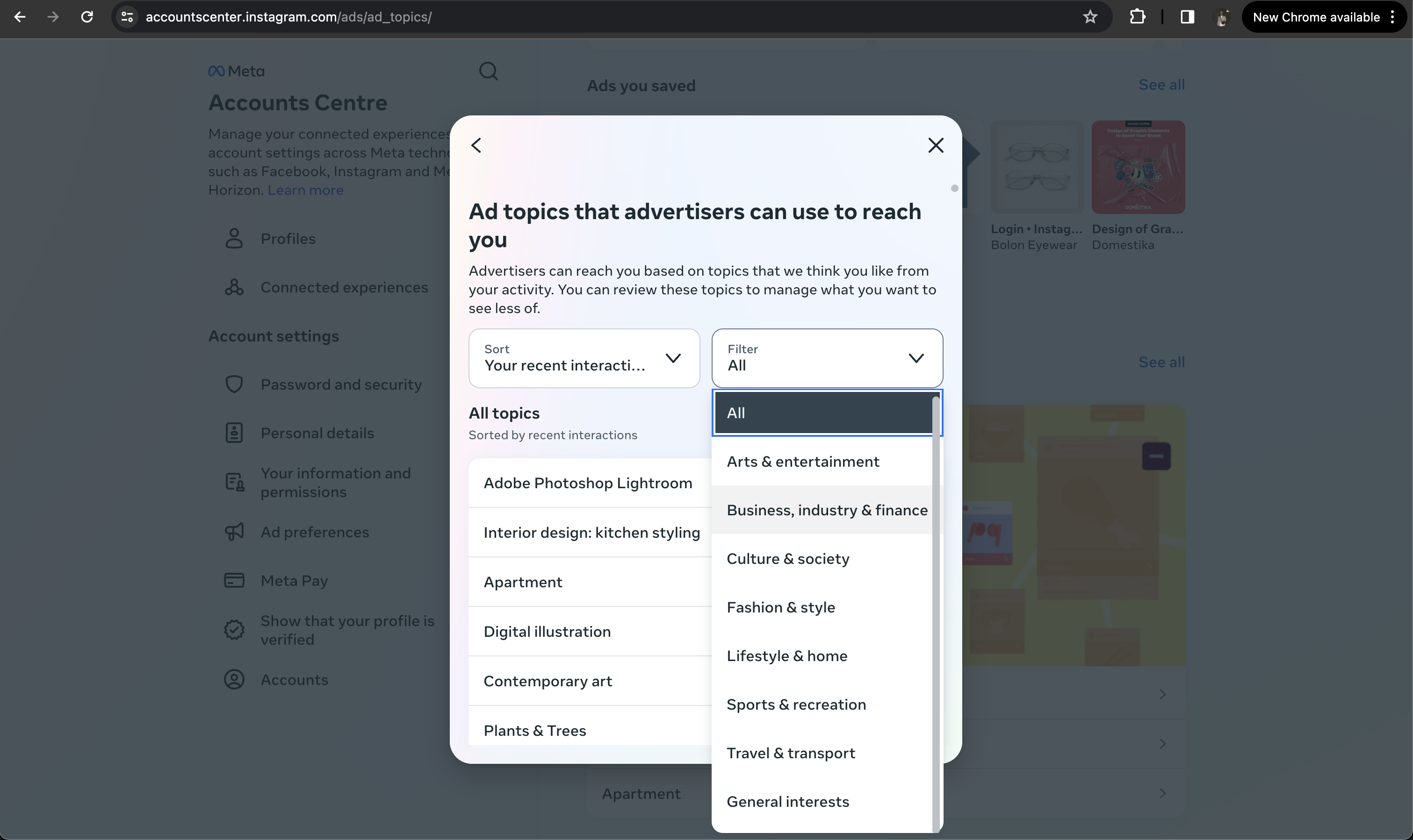
Meta Ad Topics
Importing Data
I explored several options to import data into TouchDesigner, seeking a visually engaging approach to
highlight value differences effectively. While initially considering scale, I found it too simplistic for
my needs. I aimed for complexity to maintain visual consistency across my artefacts, so I linked each
category's percentage to the number of nodes shaping the bubble. This approach also influenced the
bubble's size, adding a desirable layer of complexity to the visuals.
However, a challenge arose as the minimum node count was 3, capping percentages below this threshold.
Despite this limitation, I decided not to dwell on it, believing it wouldn't significantly impact the
final visual outcome. Each category now corresponds to a unique noise seed, ensuring consistent bubble
shapes with varying node numbers.
To enhance the incubator visual, I layered these data-driven bubbles over generative type with random
noise seeds. While the visuals remained similar, the project gained depth with real data integration,
altering my perception of its impact.
With the substantial data involved, my main concern shifted to frame rate drops. Despite optimizing the
patch file using replicators to reduce noise seed instances, performance remained a challenge. To mitigate
this, I disabled node previews and nested each bubble's category into containers, albeit foreseeing
potential complications during compilation. Nonetheless, these adjustments were preferable to investing in
an expensive software upgrade.

Single Ad Category Bubble
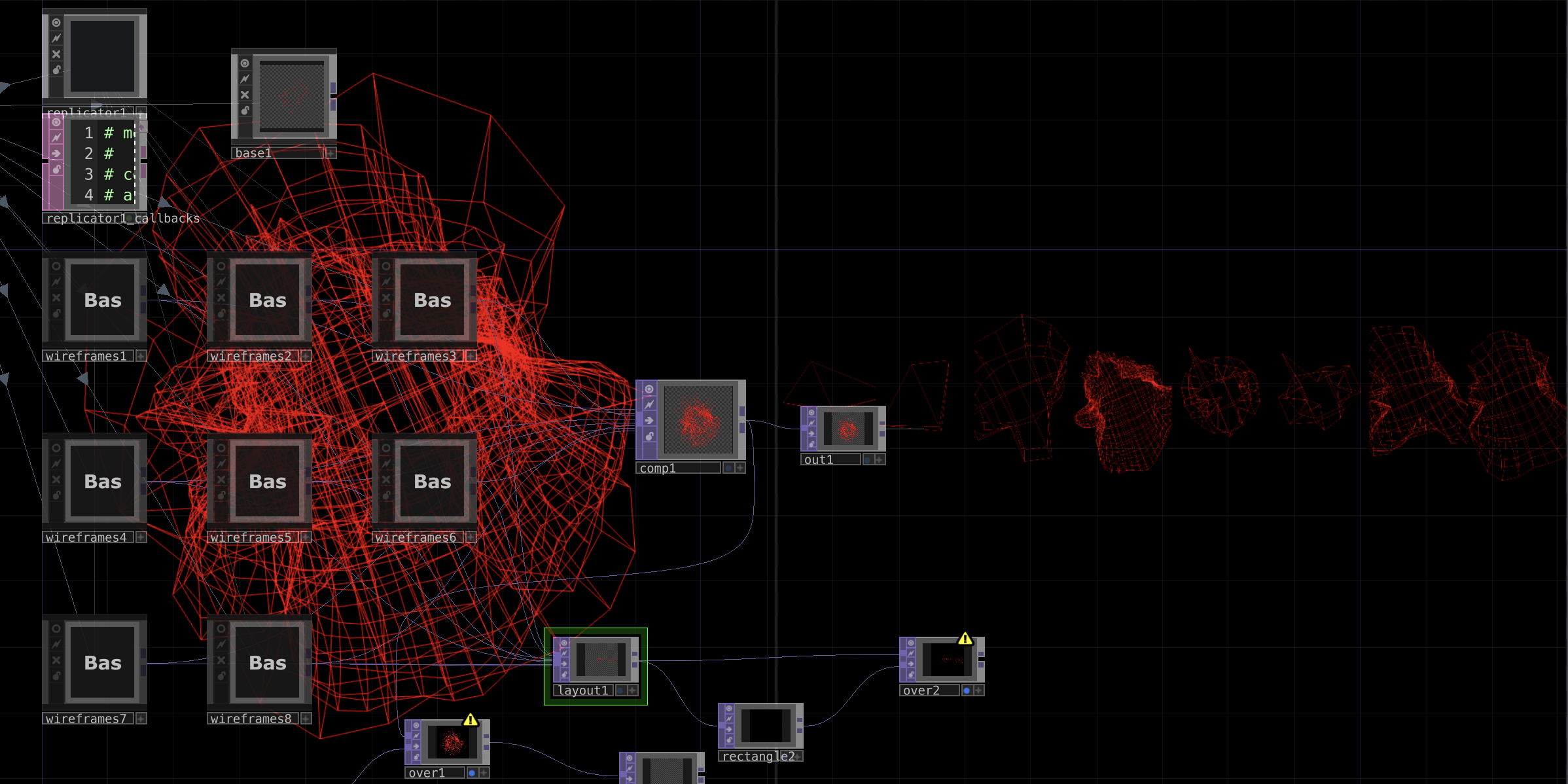
Combined Ad Topic Bubble & Base COMPs
Data Collection
I found gathering the data for my project quite challenging due to its sensitive nature, prompting me to
rely on asking friends for assistance. Navigating to the data display page was also cumbersome, involving
more than 10 clicks and some scrolling, despite having a search function that wasn't very effective.
Determining the number of responses needed for my grid layout was tricky, aiming for a visually pleasing
arrangement like 8, 9, or 12 sets if feasible. I dedicated an entire day to visiting friends' offices to
collect this data, which turned out to be quite a journey. Fortunately, my first stop yielded 3 sets of
data, with a total of 12 sets gathered after 10 hours and half a tank of petrol.
Although it felt like another Open Studios day, explaining my data collection purpose to each friend group
helped me become more confident in articulating my project's concept and its relation to the gathered
data.
The process took some time too because I couldn’t really find an efficient way to get through this
tiresome process. Each individual’s had at least 300 ad topics that are sorted into 8 categories. I had to
count how many ad topics there were in each category to get the data that I needed. There wasn’t really
any way to directly export this data so I had to sit beside each of my subject to slowly go through their
ad topics and count them on their phone. It’s not like I could ask them to provide me their login details
and do it at home.
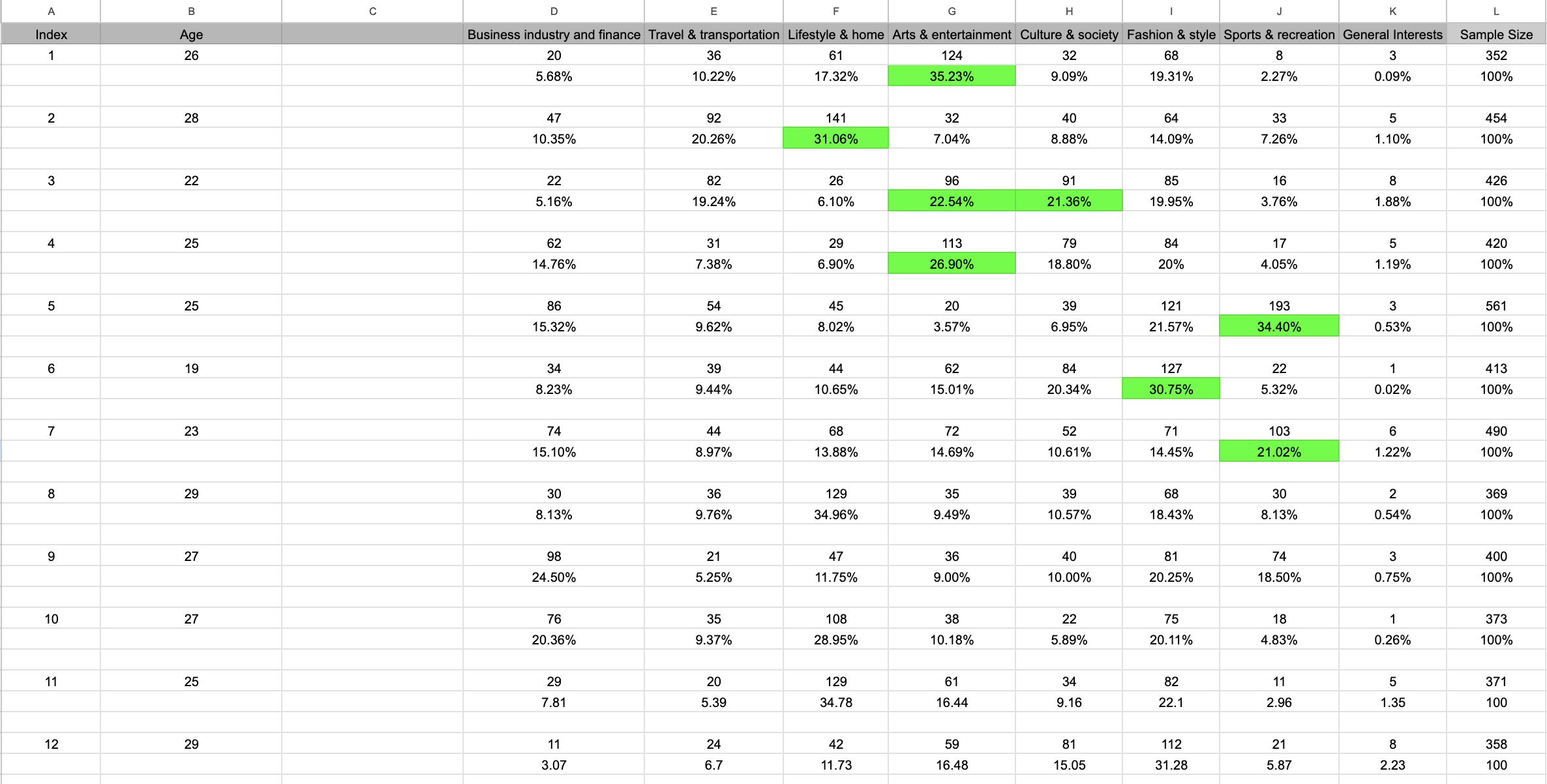
Sorted Data Sheet
Generating Bubbles
I organised the collected data in an Excel sheet for easy import into TouchDesigner as a table,
streamlining my workflow. Since my file was already set up beforehand, generating the bubbles was a quick
task. Prior to data collection, I had optimized my file using techniques from my previous work, such as
nesting each pre-setup in a base COMP to replicate multiple instances of category bubbles. All I needed to
do was duplicate and adjust the input row and column numbers.
However, I faced an issue while trying to arrange the bubbles in a grid, not with the layout but with a
significant frame drop. Enabling all 12 bubble previews caused my frame rate to plummet from 50+ to just
4, making workspace navigation frustrating. Anticipating this, I opted to work with one bubble at a time
since I didn't need to display them live. I could record each bubble separately and later arrange them in
After Effects or Premiere.
Exporting from TouchDesigner was a bit confusing due to technical aspects. I noticed that exporting in a
tool called the perform mode preserved better quality compared to regular exports. However, the perform
mode was a little tedious to use as I had to manually write expressions for each bubble. For some reason,
the perform mode is also a little weird sometimes, exporting outputs with lower quality than if I had just
screen recorded on my Mac. Nevertheless, I still had to use the perform mode because I’ve been
encountering occasional glitches like frame skipping or color differences when screen recording on my Mac.
Exporting the bubbles in both .png and .mp4 formats for 8*12 Ad Categories and 12 Combined Bubbles was a
time-consuming task. I made sure to maintain consistent timecodes across the videos to ensure visual
consistency. However, after compiling the bubbles, I realized that the effort was somewhat wasted because
the differences were hardly discernible.
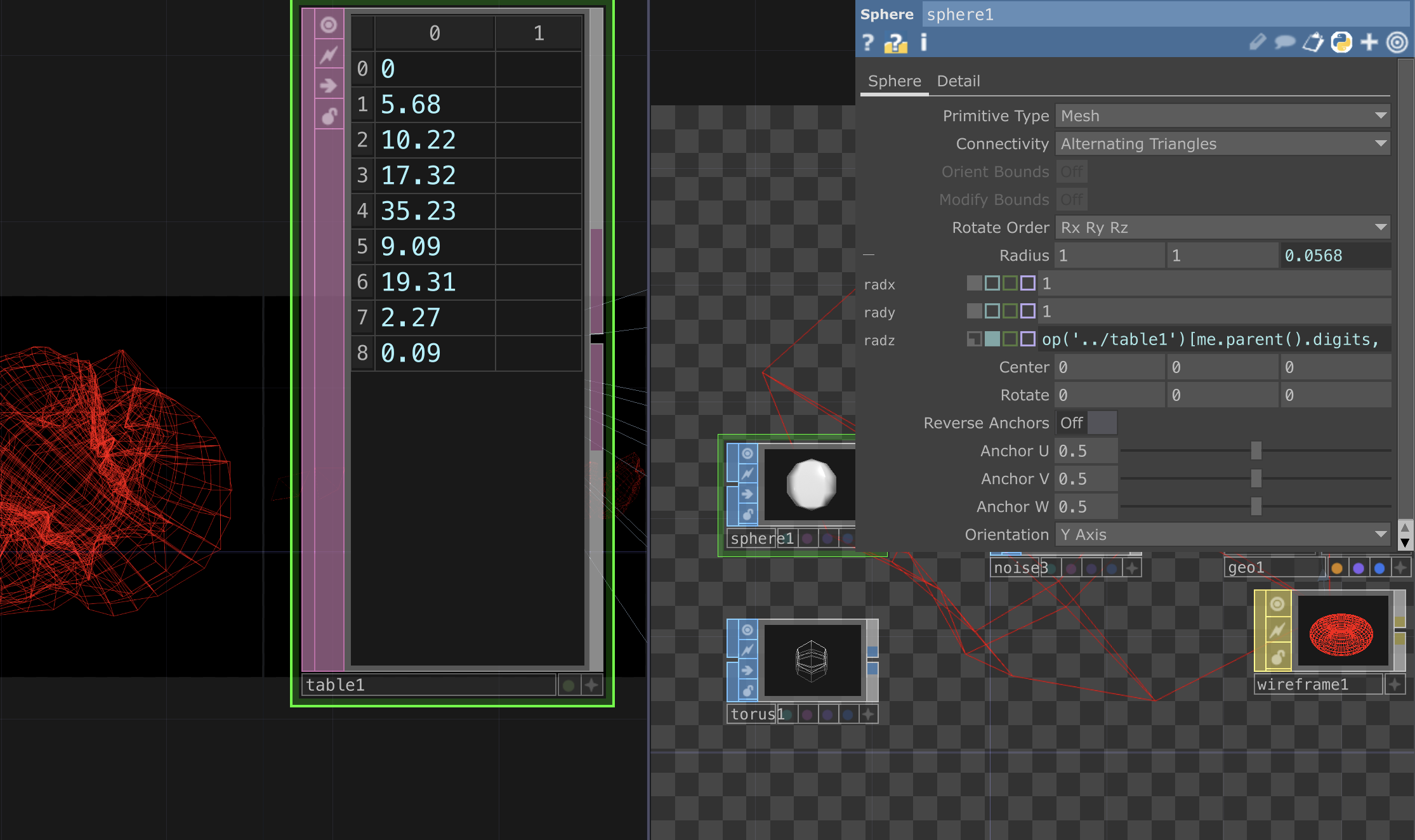
Custom Expressions Optimising Data Import
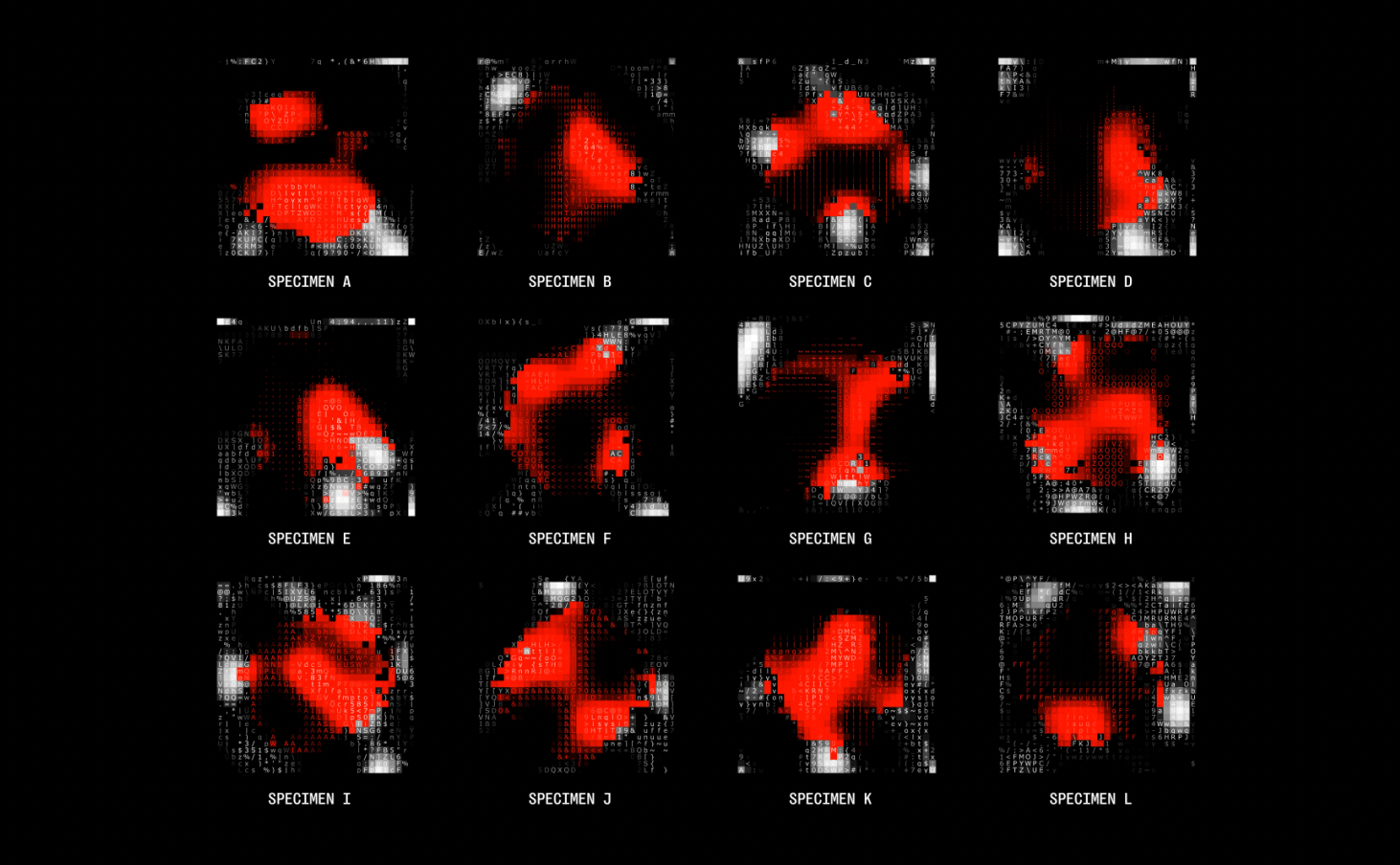
All 12 Bubbles in Incubation
Artefact C Publication Design
Content guides design, and as I reviewed my materials, I found useful references for my documentation.
Having experience with two previous books, cost-saving strategies were a priority. Opting for a B5-sized
book allowed printing on A4 and trimming, reducing expenses.
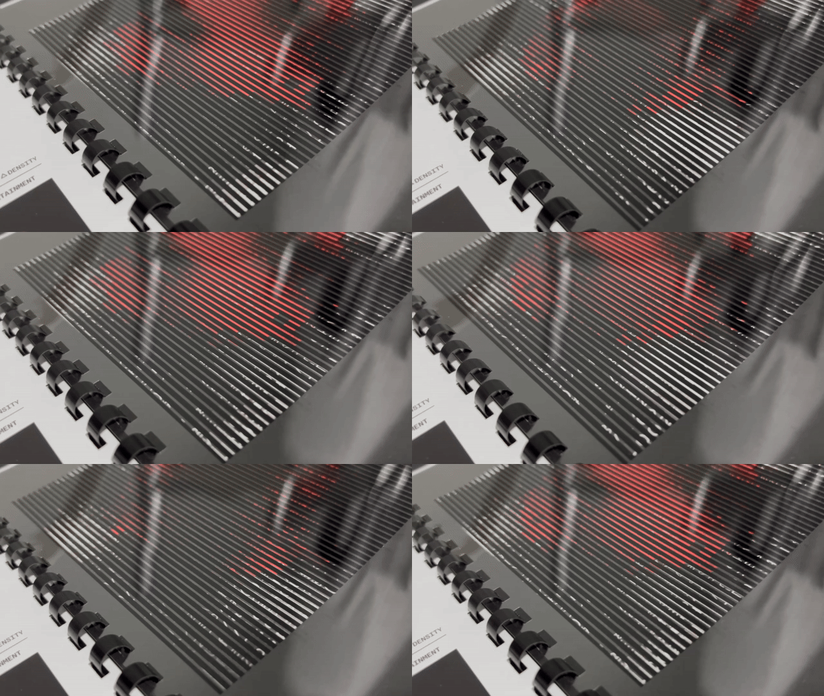
The scanimation concept I used from Open Studios greatly influenced my design approach. I explored
integrating it into the publication, which led to two main options. In option one, layer B remains
separate with instructions for bubble animation, requiring a complex cover design. Option two involves
printing 12 copies of layer A, overlaying them on bubbles, and binding them together. Despite the
complexity of annotating each sheet, I chose this option for its cohesive form and budget considerations.
With less content than previous artefacts, I planned to avoid excessive text. A brief write-up at the
start would provide context, and glossary pages inspired by references would explain technical terms. This
streamlined approach complemented the artefact's content.
Designing the layout was straightforward, focusing on the content as the central theme. I incorporated
decorative elements that not only adhered to the grid system but also subtly suggested a technology theme,
which enhanced the visual appeal of the project. Considering the content's nature, I opted for a
monospaced font, especially suitable for texts heavy on numbers and runs across pages. Despite the diverse
content types, the grid system facilitated consistent alignment across all pages.
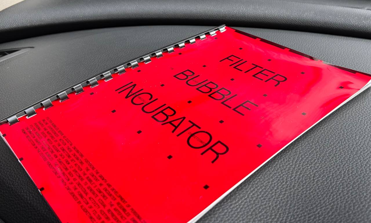
I had to really brainstorm for the cover design because I wanted it to be distinct from the content inside
the book. Using more bubble visuals didn't make sense as they wouldn't convey anything meaningful.
Earlier, I mentioned my idea of using red acetate film, but as an alternative, I obtained red gel filters
used in film lighting from a friend. Unfortunately, the print shop informed me that printing directly on
these filters could damage their machines, so I needed to rethink my approach.
I planned ahead for this situation and devised two designs that could adapt to it. For the cover, I
created a design that highlights the grid system used, with the red film layer adding a vibrant,
unprintable red hue. Given the book's ambiguous content, the cover needed to provoke thought, so I
included a hidden one-liner, 'the perceived truth is algorithmically conditioned,' beneath a transparent
title page. On the back cover, I incorporated an image resembling an incubator to add relevance and depth
to the topic.
Overall, I find the design to be simple yet effective, incorporating elements that enhance clarity and
convey the artefact's message. I'm satisfied with how the visuals turned out. However, my current concern
revolves around the binding method. I'm considering using a comb bind, although I'm unsure if it's the
optimal choice. Part of this decision stems from having binding clips that I purchased from Shopee a while
back and haven't had the opportunity to use yet.
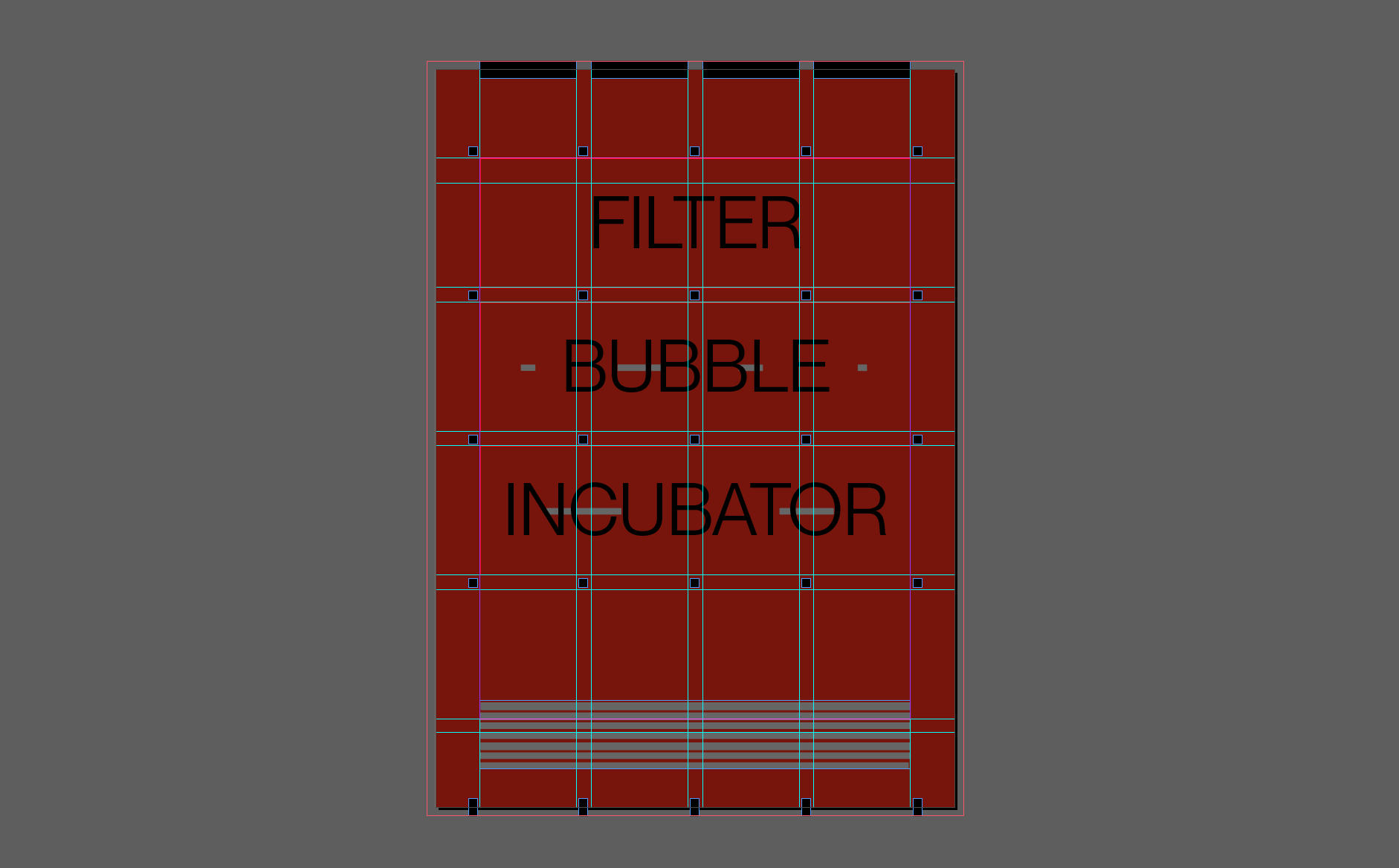
Cover and Grid System
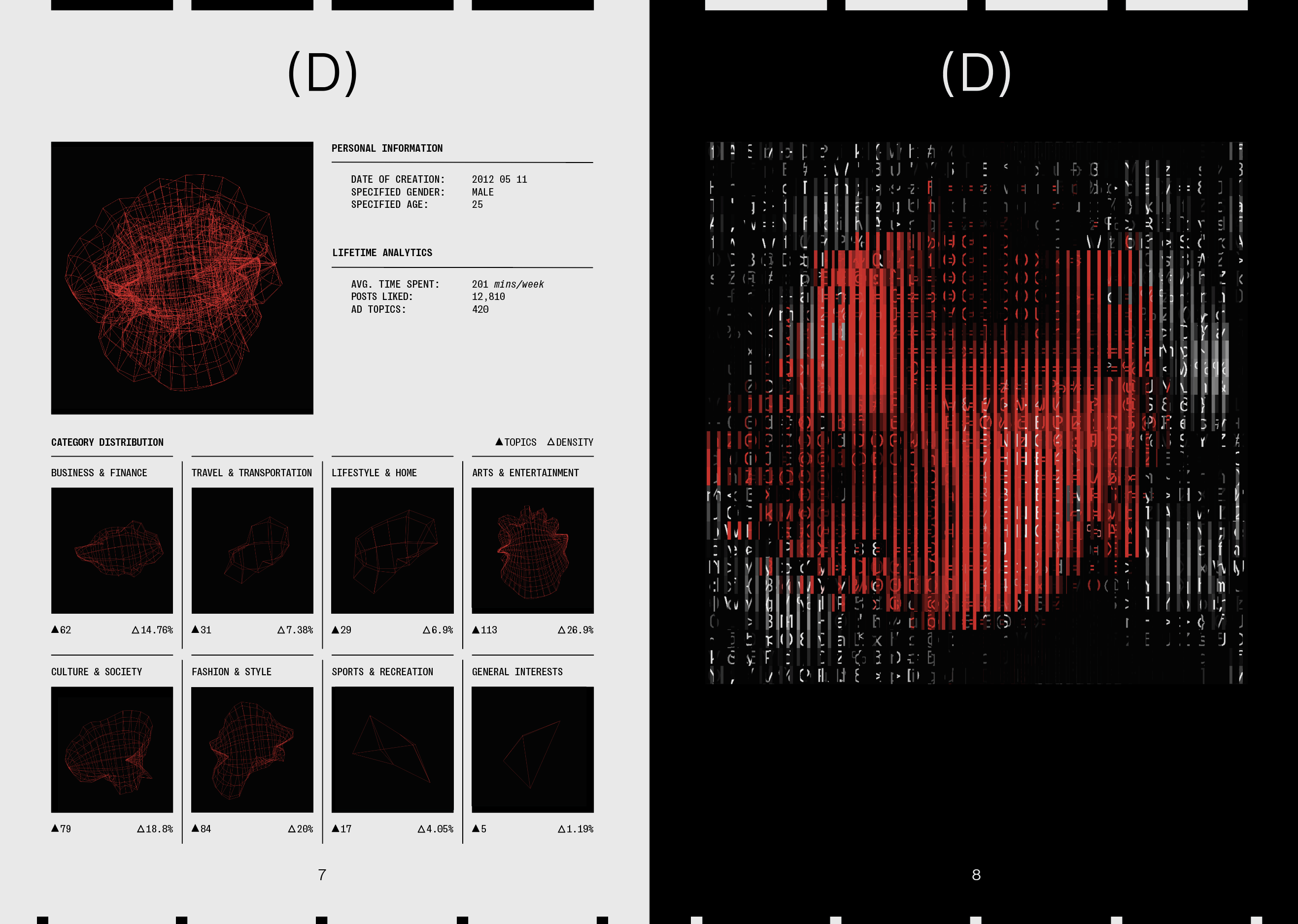
Integration of Scanimation
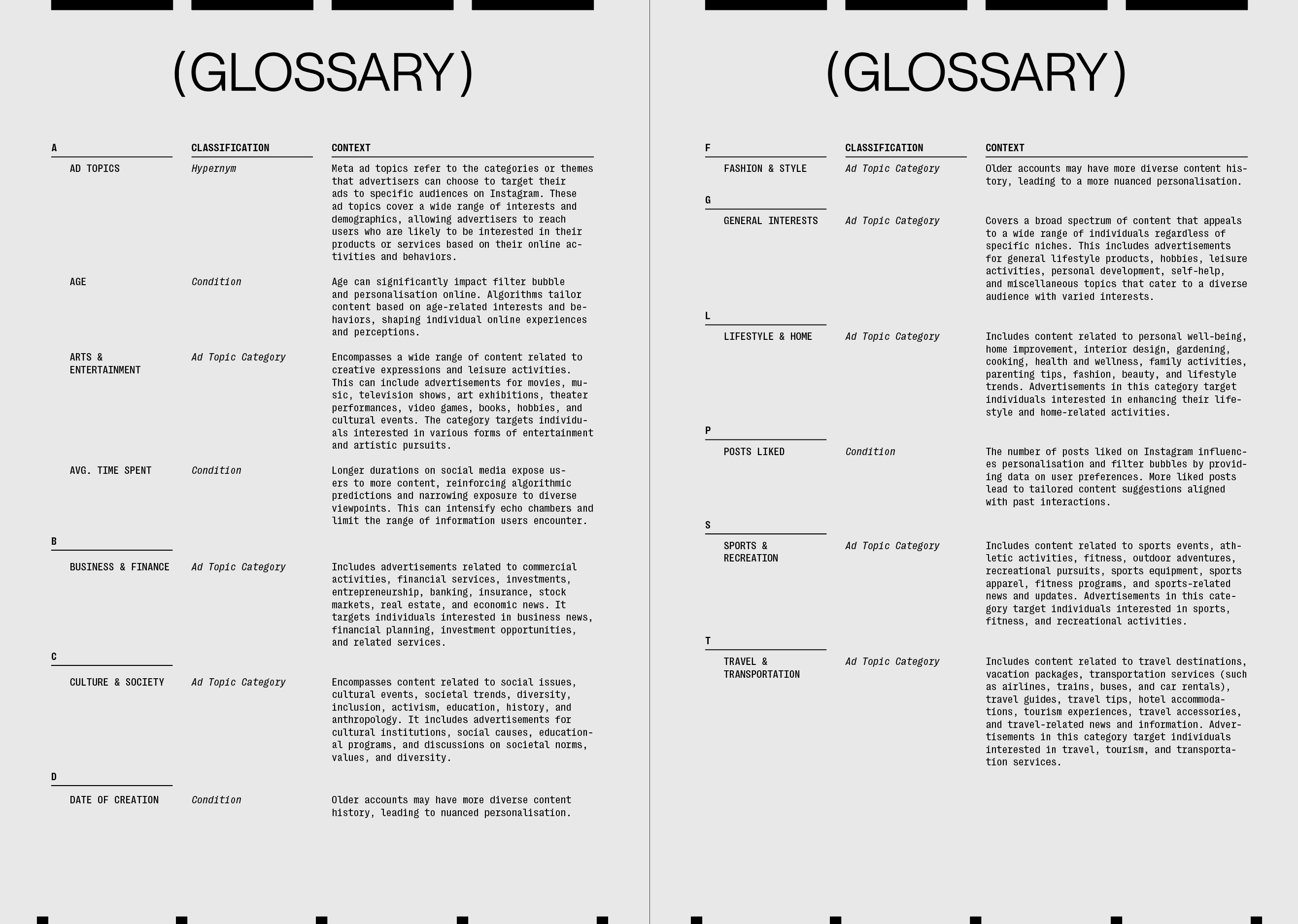
My Favorite Spread: The Glossary
Artefact C Print & Binding
Printing Artefact C turned out to be more challenging than anticipated. The first unexpected hurdle was
the inability to print on red filters, a factor I hadn't fully considered earlier. Although I had thought
about other challenges in advance, this particular issue significantly impacted the process.
Initially, I encountered problems with the ink for the black scan lines being easily scraped off. Despite
allowing ample drying time, the roughness of the paper made this difficult to avoid. Fortunately, the
scraping isn't too noticeable, so I decided to proceed.
Another challenge was achieving the vibrant RGB red I envisioned. Despite printing in RGB, the red didn't
appear as bright as desired without spot colors. However, I accepted the outcome since the colors were
reasonably close to those on the filters.
In search of a print shop with a hole puncher suitable for my bind clip needs, I visited Sunshine Plaza
and Burlington Square. Unfortunately, most printers didn't have the specific hole puncher I required for
book binding. Considering the risk of manually punching holes and potentially causing reprinting issues, I
opted for a plastic comb bind instead. While not my ideal choice, the comb bind allows some movement of
the sheets, which can prompt interaction with the scanimation effect, which works for me.
With Artefact C completed, I now turn my attention to the documentation video. Originally planning to
delay this until after submission, I reconsidered to avoid the complexity of multiple monitors during the
Viva. Taking a brief break before starting on the video, I feel confident in my progress and timelines.
Achieved Ideal Cover Look
Scanimation Effect