░░░░░░░ WEEK 11 ░░░░░░░
Artefact C Idea Bin
As early as week 6, I formulated a plan for my filter bubble artefact. My idea was to create an anaglyph publication that would simulate the experience of being trapped in a filter bubble. The content, comprising images and text, would be rendered in just two colors: red and cyan. Depending on the color of the transparent filter placed over the publication, readers would only see either the red or cyan content. Stefan Sagmeister has a really popular book that uses the effect in a way which I find rather creative.
Initially, this concept seemed robust, but upon further reflection, I realized that bridging the gap for readers to understand the concept of filter bubbles might be challenging. Moreover, even if I incorporated stories about filter bubbles as the central content, the design element would still lack depth and the computational aspect I envisioned.
While I didn’t want to abandon the idea, I continued my research on filter bubbles, leading me to a fascinating discovery. Did you know that Netflix personalizes the thumbnails of movies and shows based on your viewing behavior? For instance, if you watch a lot of romance genres, Netflix will use thumbnails depicting romance scenes to entice you to click.
Initially, I was desperate to find a way to connect this idea to provoking reflections about filter bubbles and misunderstood the purpose of Netflix’s thumbnail personalization. I was skeptical, focusing on the potential negative impacts such as boosting their own films' rankings. However, I realized that Netflix's thumbnail personalization serves a dual purpose: not only does it personalize content but also helps viewers discover shows outside their usual preferences, expanding their bubbles.
Feeling stuck for ideas, I contemplated whether to abandon the third artefact altogether. I believed that the two artefacts I already had were sufficient to craft a compelling design statement. Recognizing that my project's core relies on deep critical analysis, I feared that a weak concept for artefact C might diminish the impact of my work.
However, instead of giving up, I delved deeper into the anaglyph medium and explored similar physical formats that could enhance my design approach. During my exploration of how designers applied anaglyphs in their work, I stumbled upon the scanimation technique. This technique, reminiscent of old-school methods, creates an illusion of movement using scan lines and chopped-up frames of images—a concept I remember experimenting with back in primary school. Intrigued, I began testing out these techniques to see what kind of visuals I could create and how they could contribute to developing a concept.
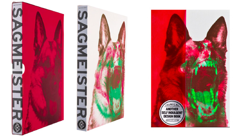
Made You Look – Stefan Sagmeister
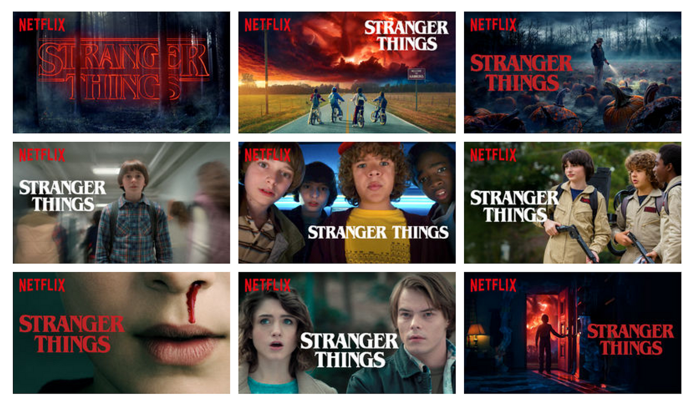
Netflix 'Stranger Things' personalised thumbnails
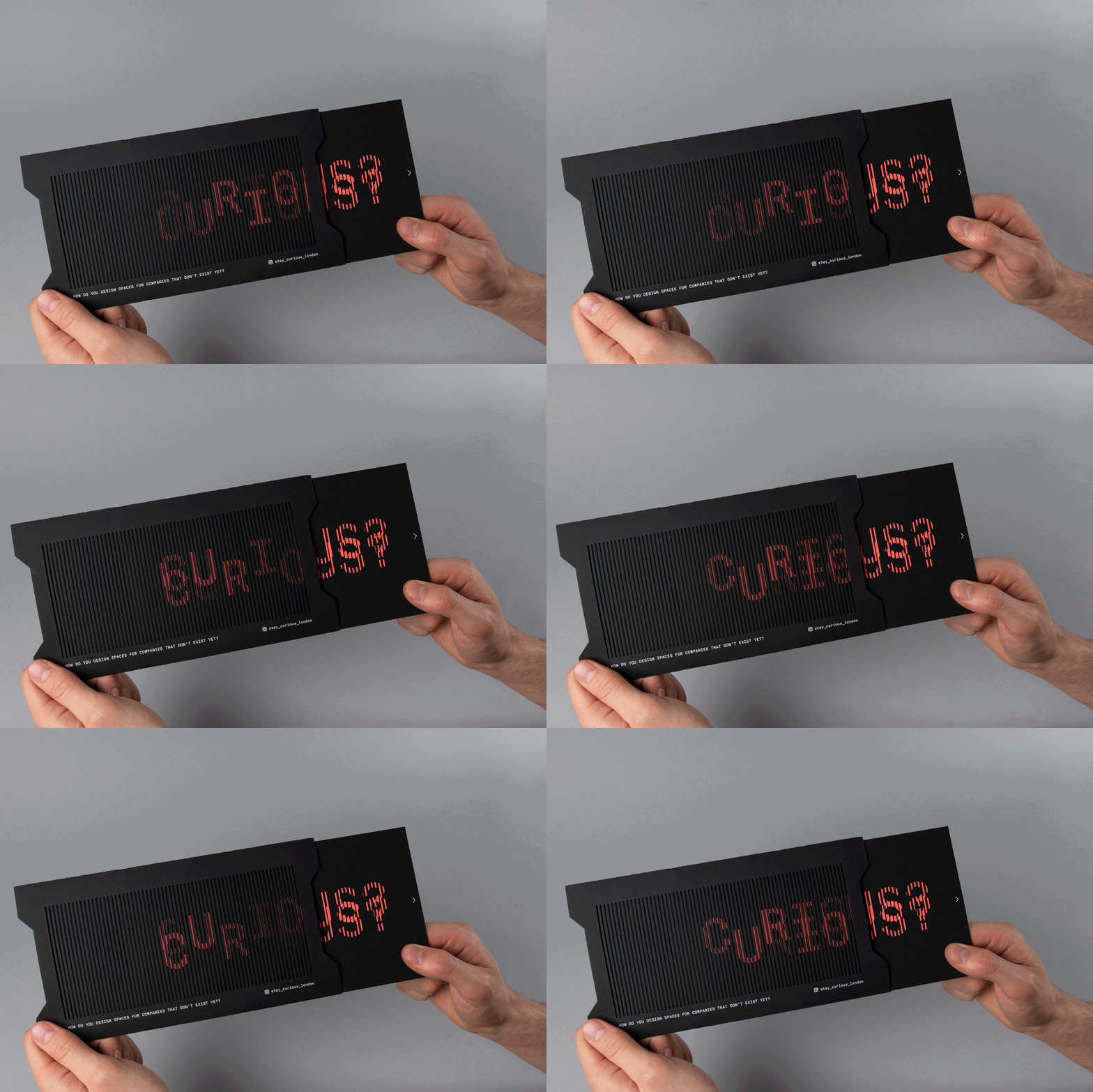
Scanimation Effect
Physical Formats Exploration
During this exploration phase, my goal was to understand how these two techniques—scanimation and anaglyphs—functioned and if they could be combined effectively. In theory, merging them seemed plausible.
I created several frames depicting an orb rotating around a figure, along with floating rectangles that changed position in each frame. The idea was to generate two distinct animations of different colours using different scan line filters: one transparent and the other tinted red. When overlaying the transparent filter and moving it, the animation became visible. However, overlaying the tinted filter obscured the reds, symbolizing the confinement akin to being inside a filter bubble.
Despite the functionality of the concept, I faced logistical concerns about physically producing it. My main worry was how to print these scan lines on red acetate film. Researching online, I found that the earliest delivery time for the film was two weeks away, and I couldn't be sure if the paper quality would absorb ink effectively. Additionally, I reached out to printers to inquire about printing on acetate, but those who responded had a minimum order quantity requirement.
Reflecting on Andreas's advice about "small mountains," I pondered how to apply it to this artefact. Simplifying complexity while maintaining a visually intricate appearance seemed key. Computational design can appear daunting to those unfamiliar with it, including myself at times, but breaking it down reveals its straightforward nature. Embarking on a new approach, experimenting with data-driven TouchDesigner sketches could help me achieve the desired quality without excessive complexity.

Anaglyph test with red film
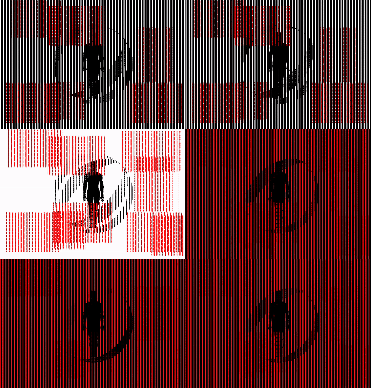
Scanimation combined with Anaglyph test
Artefact C Exploration
I came across a newly uploaded ASCII tutorial on YouTube that took a different approach. Instead of assigning symbols to specific grey value ranges, it utilized the entire Latin character set, enhancing depth and detail by narrowing the grey value range. To save time, I downloaded the sketch rather than creating it from scratch and spent time analyzing its structure. While the tutorial used a live camera input, which I had already adopted in previous artefacts, I aimed to find input more related to filter bubbles.
Next, I delved into the contextualization process, brainstorming content that could tie in with filter bubbles. While many ideas seemed viable, they lacked intentional provocation. None of the images I found were relatable enough, especially since the main issues with filter bubbles that are visually representable tend to be political, which may not resonate universally.
Reflecting on our past p5.js sketches with Andreas, who always began with basic shapes before animating them, I applied a similar approach to create literal bubbles and explore potential outcomes. Using the noise CHOP, I generated multiple bubbles that evolved into complex and visually appealing patterns. However, I became sidetracked and experimented with creating anaglyphs using these visuals.
Unfortunately, the anaglyphs didn’t align with my plans. They worked best when there was strong separation between the foreground subject and the background, which wasn’t feasible with the ASCII characters. Even if I managed to make it work, the text within the bubbles would vanish, leaving only a disjointed moving blob on the screen.
Consequently, I decided to showcase only Artefact A and B during Open Studios due to the lack of progress. Before retiring for the night, I shared an Instagram story showcasing my work in progress. Surprisingly, I received numerous replies from friends, jokingly mistaking the visuals for an ultrasound or asking about a potential pregnancy. These humorous responses sparked a new perspective. I began asking my close friends about the emotions the visuals evoked, receiving feedback describing them as eerie, scary, and ominous.
Building on the keywords and the assumption of my visuals resembling an ultrasound, I chose to develop my concept around incubators. Whether it's a baby incubator or an egg incubator, the fundamental purpose remains the same: to create a controlled environment with specific conditions for optimal growth. This narrative can be extended to algorithms, which also rely on specific user behaviors to personalize content. The abstract bubbles in my visuals can symbolize these filter bubbles, representing the personalized content within algorithmic systems.
For now, I’ll just stick with this narrative first, I think the visuals itself will do the trick for Open Studios. I plan to focus on the presentation of my work first as well as the design statement and write-ups.
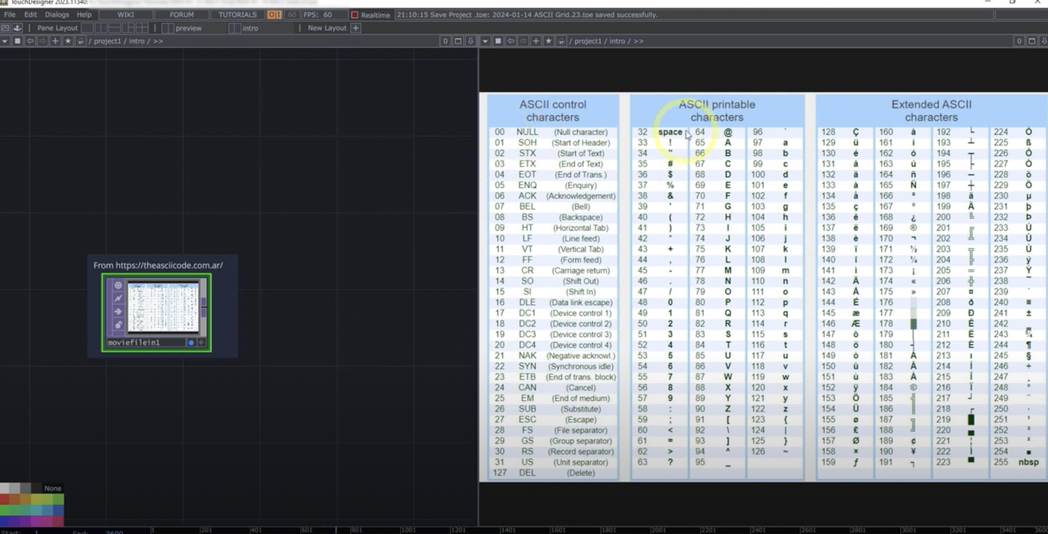
ASCII filter tutorial using extended character set
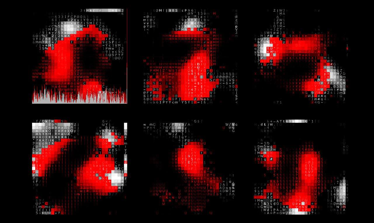
Filter Bubble Incubator
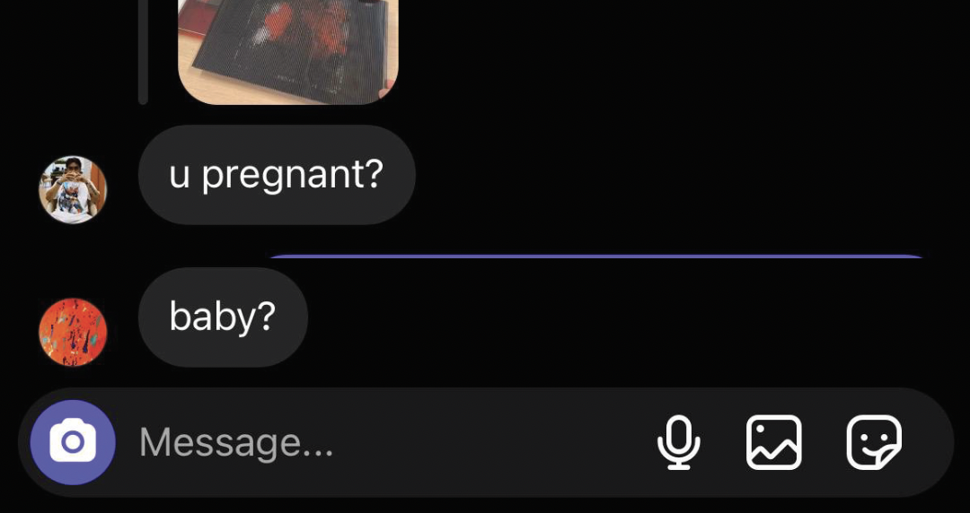
Instagram story replies
Design Statement & Write-ups
I've chosen the title "Artefacts of Fragmentation" for my project. This title reflects how these artefacts prompt critical reflection on various dilemmas that contribute to societal fragmentation. To make it clearer, I also added Algorithm Curation Dilemmas after a colon, this makes it so that people will understand what my project is about despite the abstract title.
The design statement needs to communicate clearly what my project is about, so that is my focus. I’m not going to go too in-depth to describe each artefact does, mainly just the key points like provoking reflection, each having their own narrative, and the 3 dilemmas.
For each artefact, I also came up with a short write-up along with the medium, format, and dilemma they are provoking reflection on. I want the audience to see things from my point of view, not for them to view these artefacts as a subject, as I’ll lack consistency on that part. Therefore, these write-ups are descriptions of the artefact and what they have achieved, not instructions.
For Open Studios, I’ve decided against an overall ‘identity’ for my project, my goal is just to communicate my project clearly, and present my artefacts as individual entities. To which, I designed these little cards that will be placed by the side of each artefact.
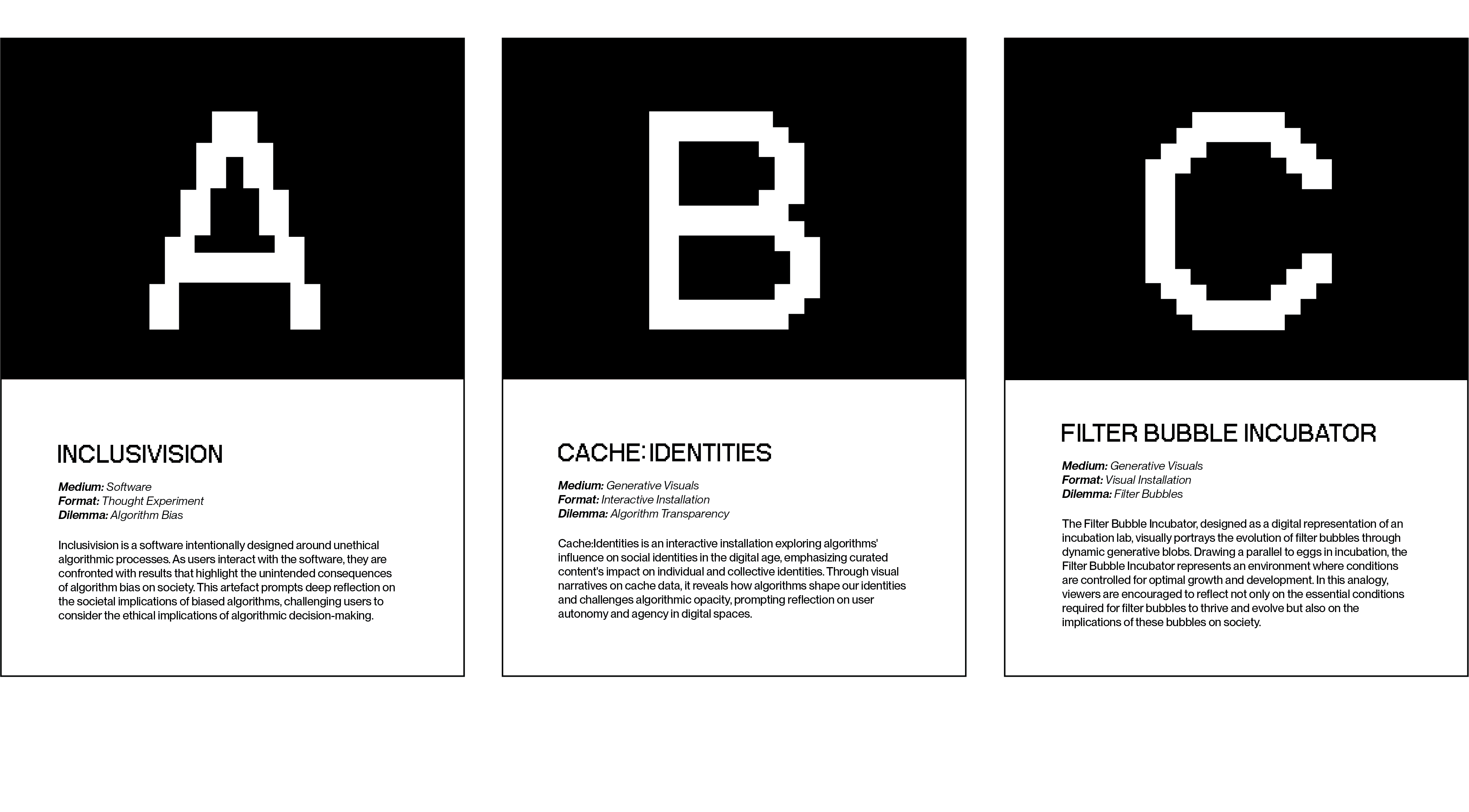
Artefact description cards
Open Studios Set-up
When I brought my work in for a dry run setup for Open Studios on Thursday, I quickly realized I hadn’t figured out how to present my digital works effectively. Initially, my plan was to use a projector projecting onto the divider between our tables, but there simply wasn’t enough space without encroaching on another student’s area. Considering alternatives, using a large monitor seemed feasible, but its practicality was uncertain.
Additionally, I hadn’t edited the videos together yet. Reflecting on my setup, I began to think it might be better not to combine them into one video clip. Each artefact could benefit from having its own separate monitor playing its visuals. Although I intended Artefact A (Inclusivision) to be interactive, allowing people to test the software, logistically, I would need a powerful PC or laptop to run it. I didn’t want to leave my Macbook there as I needed it to update my CPJ during Open Studios.
Thinking through the logistics, I realized I would need three monitors. I had two at home, and the school might provide an iMac as the third monitor. The iMac could connect to an external monitor, while the other monitor could be linked to an old Macbook I have at home. Since the old Macbook couldn't run Touchdesigner, I would have to screen record my visuals instead.
Having experience setting up for Open Studios in my first and second years, I knew Andreas would have some materials we could borrow. Before purchasing my own, I wanted to see what Andreas had available to save money for printing my last artefact. Utilizing the materials at hand, I assembled a setup that was simple yet effective.
I brought my monitors in a day before Open Studios to set everything up along with my peers. Initially, I thought I’d only need an hour or so to finish setting up everything, but I stayed longer to figure out how to set up for artefact C. It felt odd to have an empty space in front of the monitor, so I decided to test out some physical formats for Artefact C. I printed some of my explorations using the scanimation technique and placed them there.
Now, I’m all set for Open Studios. I’m eager to hear what others have to say about my work and to receive feedback for improvement. With everything displayed, I feel more receptive to feedback. In the past, when I showed Andreas only a few things I did, I often felt like many of the improvements he suggested were already in progress but not yet finished, making me less open to feedback. I'm not stubborn; I just need people to understand the full context before I can fully embrace their feedback. I understand that I haven’t been able to give anyone the opportunity to do that, so now’s the time!
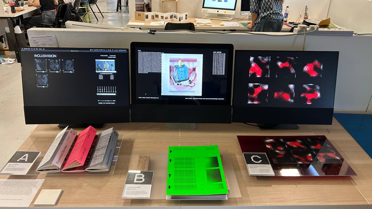
Presentation Setup
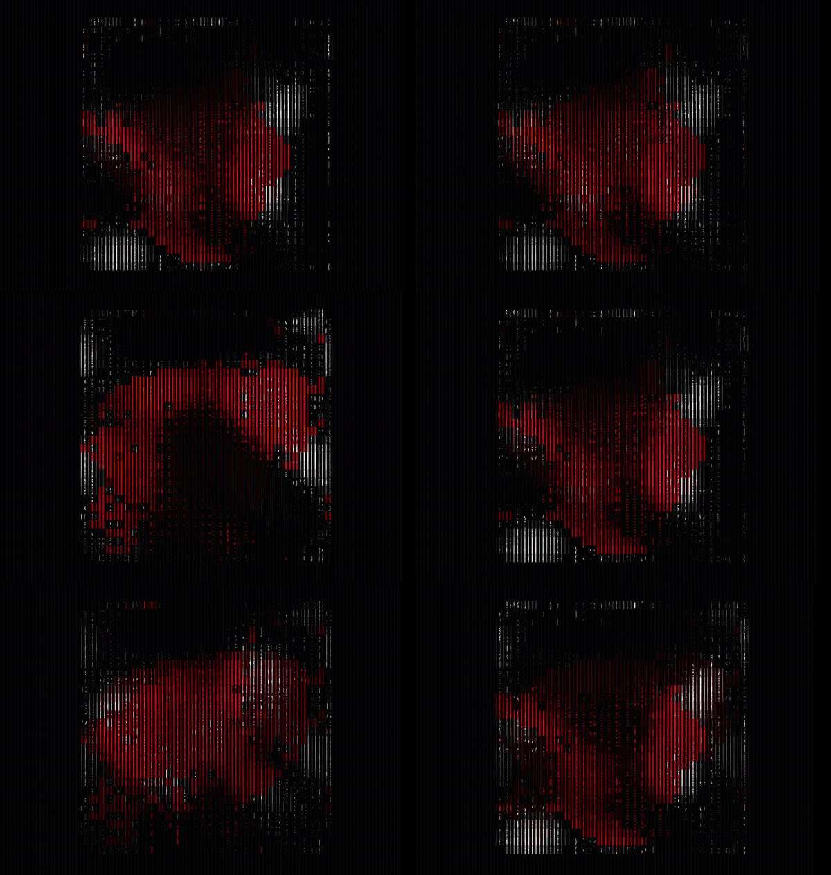
Artefact C scanimation