▩▩▩▩▩▩▩ WEEK 2 ▩▩▩▩▩▩▩
Presentation
After my presentation, Ryan posed several questions, which turned out to be excellent indicators of gaps
in my concept. They presented a challenge, as I found it tricky to provide clear answers. These
questions revolved around the broadness and lack of clarity in my research objective, how ASCII would be
applied in my design, and the apparent contradiction of not using generative graphics when personalized
algorithms inherently involve generative processes.
Andreas' feedback further emphasized the need for more in-depth research into my primary topic of
creative algorithms as a way to address these issues effectively. He also provided me with practical
tasks to kickstart my journey into coding with ASCII. These tasks would serve as stepping stones towards
a more concrete application of ASCII within my design solution.
Interestingly, after everyone had presented their projects, I came to a realization that I wasn't the
only one grappling with these challenges. It was apparent that many of my peers shared similar
uncertainties regarding their project objectives and were grappling with unidentified gaps in their
concepts. However, a small group among them seemed to possess a clearer sense of their goals but faced
difficulties in articulating them effectively. This observation led me to the idea of creating a lexicon
of keywords related to my project. This lexicon will facilitate the development of my research
repository and enhance my ability to communicate my ideas clearly.
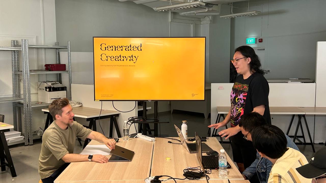
Ryan's Presentation
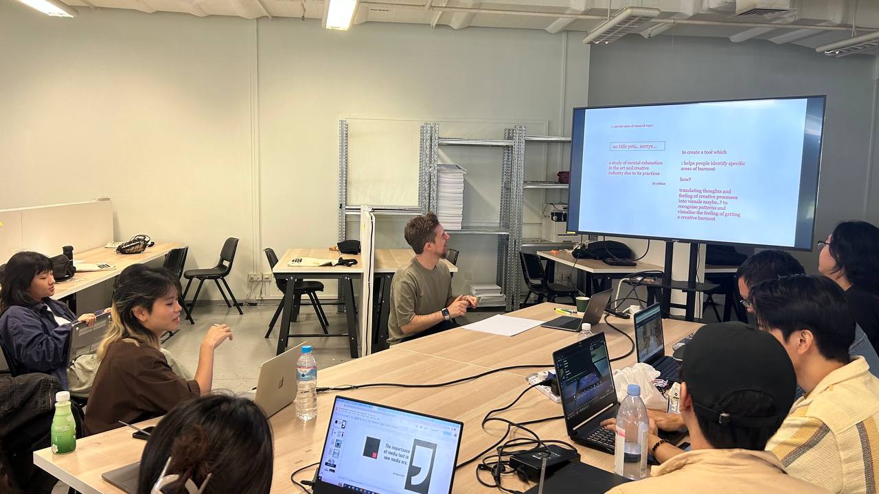
Siyoun's Presentation
Lexicon & Research Repository Categorization
Using ChatGPT, I generated a list of keywords related to my project. Additionally, I prompted the AI to
provide meanings for these keywords in the context of my topic. This approach assisted me in efficiently
filtering through the results, allowing me to exclude those that weren't directly relevant to the areas I
was focusing on.
It was much easier to find readings related to my project after building a terminology. All I did was
shuffle some keyword combinations and I would get literature of different concepts. Instead of reading
through every paper I found, I skimmed through the contents to find word associations and key concepts
that would assist me in building my argument. During this process, there were a number of instances where
I serendipitiously (attempting to get familiarized to this term) encountered foreign terms that will be
useful for my research topic.
I’ve sorted them out in are.na by channels labelled in their umbrella terms so it will be easier for me to
locate them in the future. In the following week, I plan to go through the readings I’ve curated and start
building up my reading list.
Lexicon of keywords related to my project

Annotating my sketch
First Interaction with ASCII
After watching Daniel Schiffman’s introduction to ASCII Creative Coding on Youtube, I began by creating
annotations on his code. I found this process of annotating helps me to understand each line of code
better and what each function does.
I opted to keep things relatively simple with my initial ideas. My primary goal was to gain a
fundamental understanding of how each variable and coding element influenced the resulting visual
output. At this juncture, I hadn't clearly defined my objectives or expectations. I began by
systematically converting random images into ASCII art through code, using it to explore the
relationship between code and visual aesthetics.
When I examined the initial batch of generated images, I noticed that some worked well while others did
not. In certain instances, the results were quite striking, with the original image's finer details
entirely lost. Ironically, I found myself struggling to discern the content, despite my having seen the
original source. It led me to question how others could possibly recognize or appreciate the artwork if
I myself encountered such challenges.

Initial explorations

Exploration with variables
Variables
Through this experimental learning process, I discovered several variables that influenced the
aesthetic outcomes of my ASCII images.
Contrast
ASCII art relies on the variation in character density to represent different shades and tones. In contrasty images, the differentiation between light and dark regions becomes more pronounced, offering distinct demarcations for the selection of suitable characters. Furthermore, this heightened contrast effectively separates the foreground from the background, enhancing the subject's prominence. Consequently, images featuring landscapes or scenes with subtle tonal variations may prove less effective in ASCII art, as the lack of pronounced contrast can obscure the intended visual impact.
Pixel Ratio
The term ‘pixel ratio’ in this case refers to the ratio between the pixels of the
canvas and the pixels of the image. The difference in scale affects the overall amount of the
characters in the p5 canvas. If the pixel size of the canvas is larger than the pixels of the source
image, there will be less characters in the canvas. Inversely, if the pixel size of the source image
is close to the size of the canvas, there will be more characters.
To illustrate this, I conducted an experiment using SGIFF's 2023 poster. As I increased the image
size, more characters appeared on the canvas, revealing finer details from the source image. However,
this expansion also resulted in a reduction in character legibility.
Alpha Range
In the first line of the code, I predefined a constant density,
'Ñ@#W$98765...‘ . We also extracted the RGB values of the image which ranges from 0 –
255. The lower the number, the closer to black, and the higher, the closer to white.
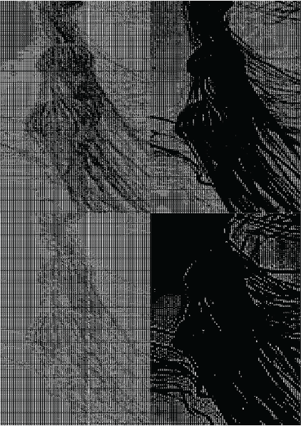
In the sketch, we have these few lines of code where we map the predefined density to the RGB alpha
range and floored it so we get whole numbers. Since the amount of characters in the predefined density
is nowhere near to the range of numbers in the RGB alpha, these few lines of code will map, for
example, ‘Ñ’ to the alpha values 0 - 20, and @ to 21-40 and so on so forth.
Knowing this, we can manipulate the alpha range to adjust the contrast in the sketch itself (or add
more characters to the predefined range) to redefine the density range. We can also reverse the map
range from 0-255 to 255-0, which will invert the colours completely. Through experimentation, I found
that some images are more effective with a white-on-black approach, while others benefit from the
inverse.
Font Size
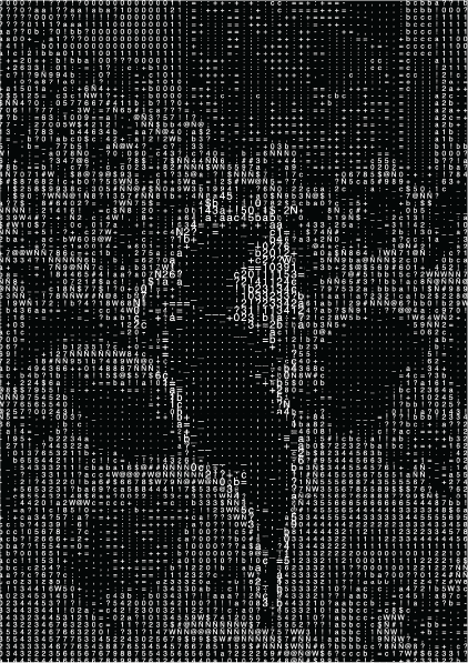
I believe it's best not to alter the font size, as doing so can disrupt the spacing
between characters and lead to overlaps. However, there's a clever way to leverage font size adjustments
to
enhance the prominence of a subject.
In the example I recently experimented with, I combined two images: one featuring a foreground subject and
the other serving as the background. To make the subject stand out, I increased the font size for that
specific image and then layered it on top of the background. This technique proves especially valuable
when
working with landscape images, where elements tend to blend together seamlessly. By selectively adjusting
font sizes, we can effectively highlight subjects and elevate the visual impact of complex scenes.
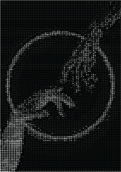
Contrast
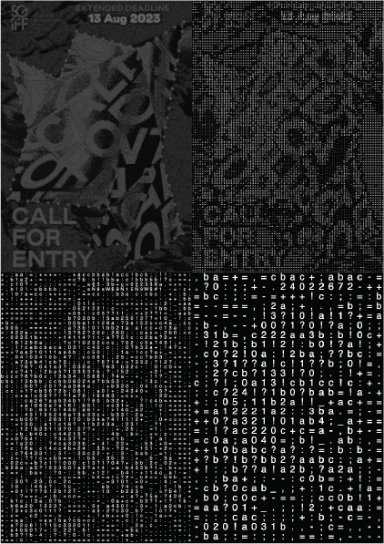
Pixel Ratio
Alpha Range
Font Size
Outcome: Zine
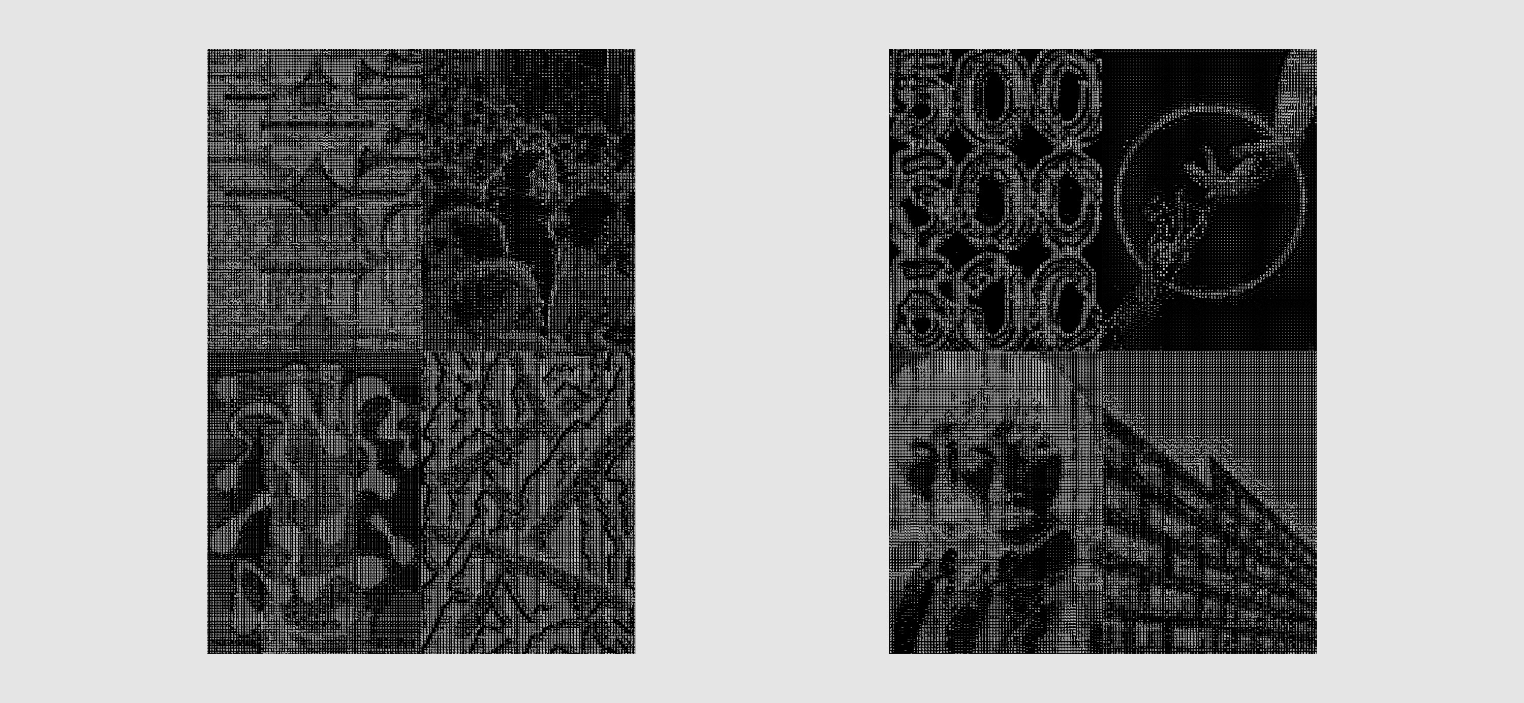
After gaining a deeper understanding of the variables that influence the final ASCII outcome, I found myself consistently generating visually interesting results. This extended to my process of selecting images. I then used these experiments to create a zine that Andreas tasked me. However, in retrospect, I recognized that I could have approached the curation process with a deeper level of contemplation. It dawned on me that I might have become overly preoccupied with the visual aesthetics, potentially overlooking the context and theme.
Zine Front, Back