▩▩▩▩▩▩▩ WEEK 14 ▩▩▩▩▩▩▩
Inclusivision (Prototype)
At this stage of my project, I've reached the point of choosing a name for my prototype. Among several options, "Inclusivision" emerged as a fitting choice, avoiding any potential corniness and aligning well with the speculative narrative I've developed.
While contemplating Week 16 submissions, I reconsidered Andreas's suggested format. A video mock documentation seemed inadequate since my prototype's essence revolves around planned focus groups. To address this, I thought of creating a website to serve as an informative platform about the prototype, considering its software nature and futuristic narrative.
The website could not only explain the prototype's functionality but also contribute to the speculative narrative. It won't offer a download option or an embedded version but will serve as a tool to attract participants to my focus groups. The unsuspecting contributors will believe they're offering feedback and improvements, unknowingly becoming subjects of my thought experiment and contributing to algorithm literacy measurement. The website will play a crucial role in presenting the prototype's concept effectively during the focus group sessions.

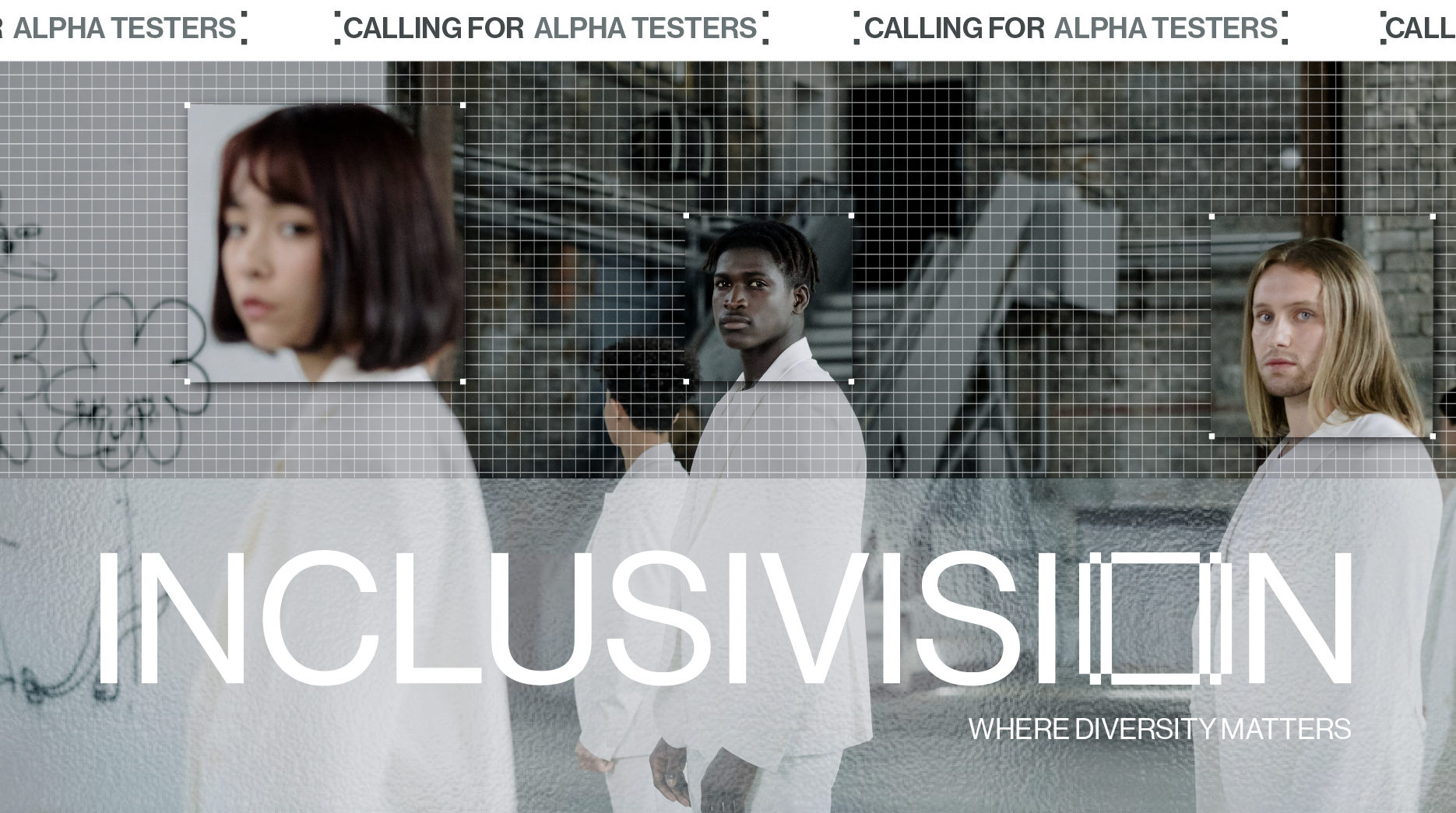
Landing page concept
Inclusivision Website and Prototype Wireframes
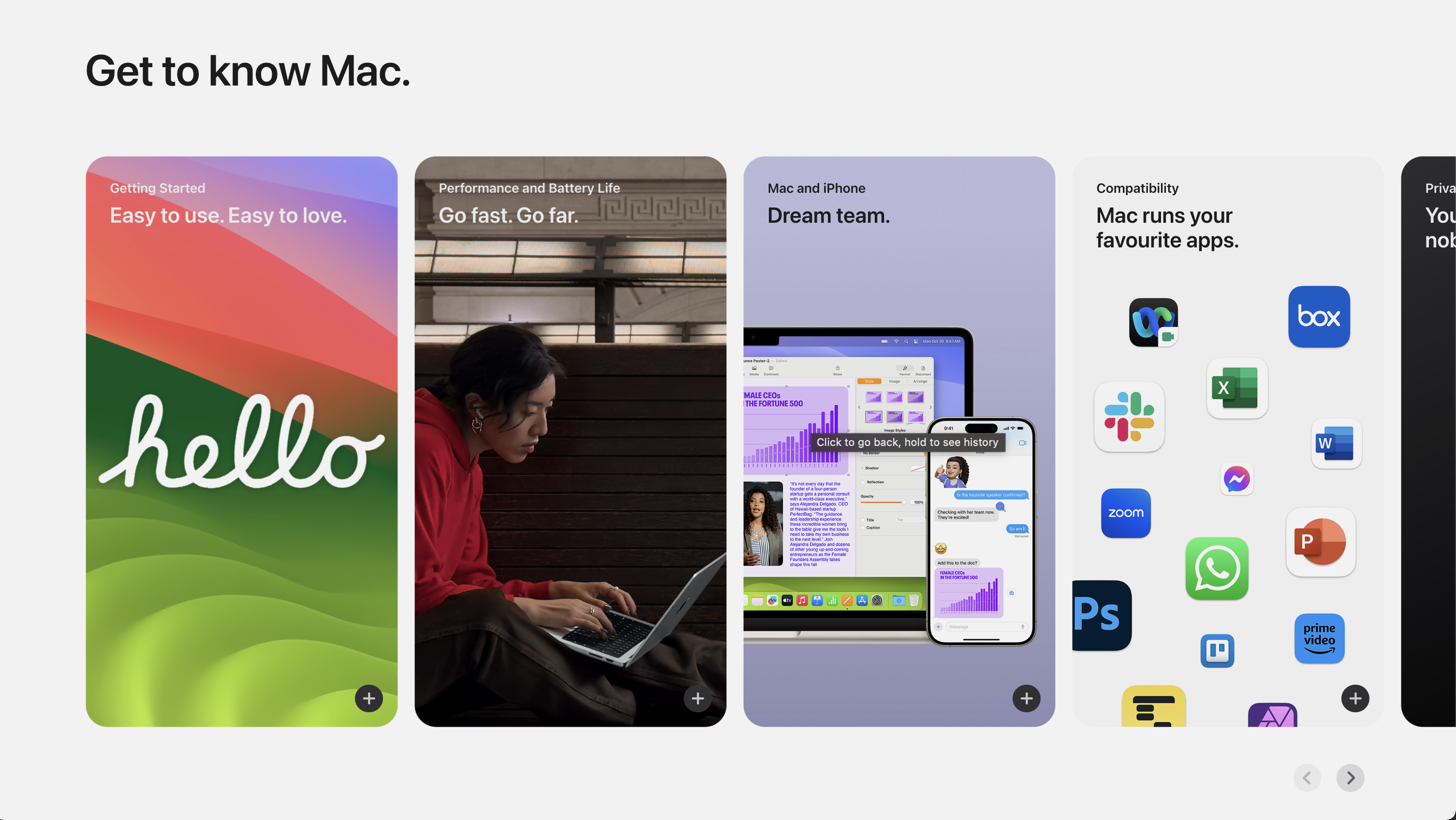
This is where the importance of visual aesthetics comes into play. Until now, I've prioritized the functionality and overall narrative of my prototype, somewhat neglecting the UI design system. My vision is to create a futuristic style, avoiding the retro-future look and steering clear of a Blade Runner aesthetic. Instead, I'm aiming for something reminiscent of Apple's presentation style during their latest events.
When I reference Apple's style, it's not about replicating their minimalism with excessive white space. What I admire is the seamless integration of Apple's brand system into their presentations and websites, mirroring the visual aesthetics of their products. My goal is to establish a visual coherence between my website and prototype, ensuring they come together harmoniously to effectively convey my speculative narrative.
To be honest, I don’t need to go too heavily on the branding aspect of my prototype, as suggested by Vikas (to not deviate into the theme of surveillance). Therefore, I could just go for a simple UI with distinct elements that can suggest the overall brand style. I started by looking at Pinterest and choosing distinct elements that would complement the ‘realistic’ aspect of my prototype. The prototype has to look real, that’s where the suspension of disbelief comes in.
About Us
This page serves as an overview of the project, elucidating the core concepts of the Diversity Scanner. It effectively communicates the platform's purpose, underscores its significance, and outlines the envisioned future that the initiative aspires to build. Additionally, the page provides insights into the target audience, delineating who can benefit from and when to utilize the Diversity Scanner. I can continue adding onto this page to make the narrative more convincing.
Demo
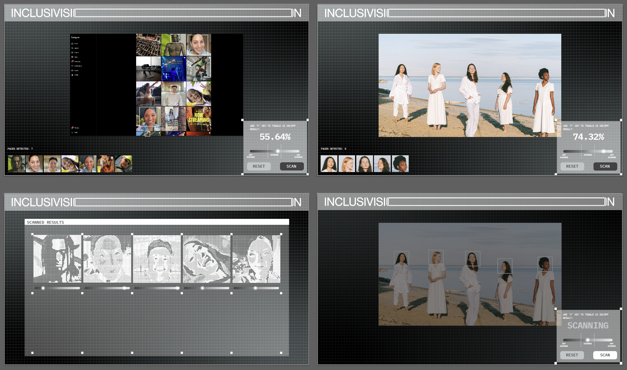
The demo page is the main section where the Diversity Scanner will be showcased. I will create 2 videos in After Effects just to simulate the UX and the animations. The first video is to demonstrate part A of the prototype, how the scanner works, and the second is for part B of the prototype, where I reveal a sneak preview of the algorithm decision making process.
I’ve also decided to break part A into A1 and A2, the first is to demonstrate how it works on an image with multiple faces, and the second part is to demonstrate how it can be used to analyze social media profiles like Instagram.
Summing up, this section should be enough to cover how the prototype will be informed by speculative design, to provoke critical thought.
Alpha Test
This section is a preempt to part C. In this section, I will create a survey form to collect interest from potential participants for my focus group. I will dress the survey with copy lying that I would be collecting feedback and am looking for people to be part of the development process. Through this, I will be able to use these participants as test subjects for algorithm literacy.
Furthermore, I’m also looking into how I can use the opportunity of the focus group, to generate outcomes of algorithm literacy in part C.

Apple Website Simplicity

Wireframes for Prototype
New Prototype Wireframes and Demo Videos
I thought the process of creating these videos would be a lot easier. There were so many considerations that I had to make now even though it wasn’t the actual prototype. Initially, I had wanted these demo videos will serve as the wireframes for the UI and UX flow, so I had to think a lot about the technical aspects.
Finding a tutorial on image galleries in TouchDesigner proved to be difficult enough, finding one that scrolls? I just couldn’t. Therefore, I needed to limit the number of faces the scanner could detect due to lack of space on screen, and also the inability to create a scrolling gallery.
This was the first problem. After that came a lot more challenges that I couldn’t simply find the solution to due to time constraints. I also wanted to invest more time into this so I decided to just ignore the technical aspects for now and create a demo video based on an ideal look that I wanted. After all, it was just a website, when I was showing the prototype to my focus group, it didn’t exactly have to look the same.
For the visual aspects of the prototype, I followed the same visual style I had already done for the landing. However, I decided to switch to a mono font just to give it a little more of a tech-futuristic UI feel. I also created an invisible frame where the content input will sit just so I have more white space around the screen.
I feel like these visuals wouldn’t be the final one that I’m trying to achieve. Due to my lack of software literacy, a lot of the decisions I make will be heavily based on the limitations of the software and my knowledge. I foresee this would be a challenge later on, but as always I’m still confident that I can work through it.
Scanning process
Image analysis process
Coding Website
This is currently the 3rd website I’ve created for FYP this year. All the websites are using Andreas’ CPJ template as a base reference so I don’t have to manually write the head, nav, body, and footer. Therefore, I’ve gotten pretty acquainted with the code, knowing what each class does and what I have to toggle or tweak.
Due to the simplicity of the website, I tried to add in quite a bit of animation to decorate the site, enhancing the user experience and making it more believable. These animations involved transitioning hover effects, the rotating logo, a scrolling ticker tape, and a morphing hamburger icon. Furthermore, I also created an additional simple video in AfterEffects to beautify the about page.
Problems Faced
What seemed like a simple adaptation task turned difficult when I realise there were issues with the overlay navigation. The overlay effect is created by the z-index styling, making it appear on top of the background image. However, the logo on the landing page is higher on the z-index due to Andreas’ styling, to make sure that the header is always on top. Initially, I couldn’t figure this out and spent a lot of time moving things around.
One crucial realization dawned on me: the overlay navigation wouldn't function properly within the header. While this initially struck me as odd, I comprehended that it likely resulted from overlapping styling issues, challenging to resolve without compromising the entire structure. To circumvent this, I relocated the main navigation to the article section, positioned below all page content. This adjustment proved effective, as the overlay navigation adopted fixed positioning and alignment using style="left:0;/right:0;".
Another challenge surfaced regarding the navigation overlay. Within the div, only the text was clickable, while the background image remained unresponsive. My research online revealed that background-image styling doesn't inherently register as a clickable link, causing this issue. However, the perplexing aspect was the hover effect, which functioned seamlessly with the background image despite the clickability dilemma.
Additionally, I implemented a form on my website to facilitate direct email submissions. Originally, I aimed for a more sophisticated form featuring a calendar, allowing viewers to select their preferred date and timeslot for the focus group. However, due to the ongoing stagnation in my algorithm prototype progress, I opted for simplicity. The form currently comprises two inputs: Name and Email, enabling direct communication with participants once the schedule is finalized.
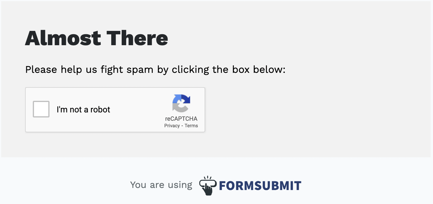
I aimed to replace the form div with a 'thank you' message upon participant submission. However, this proved challenging due to the form's redirection to an 'I'm not a robot' page on the hosting website. Additionally, I encountered inconsistency in loading times after form submission, ranging from instant rerouting to delays of up to a minute. While I explore alternative solutions, the current setup serves its purpose for the time being.
Upon completing the website, I enlisted a few friends for testing. Despite designing the site with responsiveness in mind, I encountered challenges with the navigation overlay, possibly linked to the position styling. After exploring alternative methods, this approach proved most effective. I'm still in the phase of contemplating the inclusion of a note, suggesting an optimal fullscreen experience for viewers to enhance navigation.
Copywriting
Crafting copy has always been a challenge for me, leading me to heavily rely on ChatGPT for rewording, rephrasing, and refining the tone of my words. This area proved difficult, given the paramount importance of persuasive narrative construction. Despite utilizing ChatGPT, consistent fine-tuning of prompts was necessary to achieve the desired style.
Initially, the copy sounded too much like call-to-actions, a tone I sought to avoid. My aim was for a more serious tone, striking a delicate balance—assertive but not overly so. It was crucial to refrain from making the product sound excessively 'revolutionary'. In essence, navigating the intricacies of copywriting involves a myriad of considerations, drawing from past experiences and impressions to strike the right balance between persuasion and modesty.
Future Considerations
Upon completion of my algorithm prototype, a crucial step would involve revisiting this website to optimize its mobile view, considering the predominant use of smartphones for browsing. Streamlining navigation for mobile devices and adjusting image scaling will be key. My preference for using percentages over measurements like px or rem aids responsiveness across various browser sizes.
The demo page will undergo updates concurrent with the algorithm prototype's finalization. Multiple rounds of focus groups provide opportunities to replace videos with enhanced prototype versions, contributing to an overall improvement in the narrative.
Navigation Overlay
Website Demo
Website Form

Form Verification